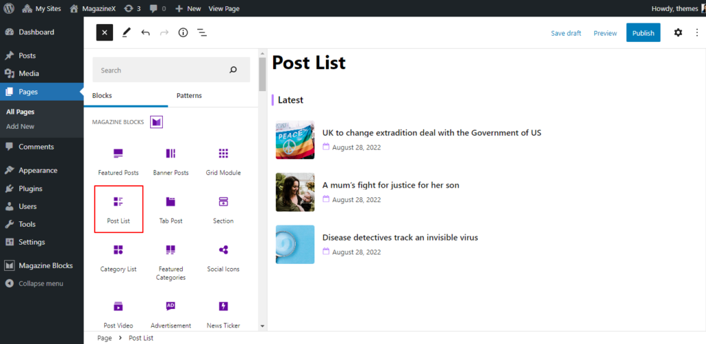
The Post List Block is suitable for displaying the post of your site in the list form. It displays the post with the thumbnail, post title, and date by default.
After you have chosen the Post List Block, you’ll get a block editing panel on the right-hand side. It has three options: General, Style, and Advanced. These options customize the design and other elements of the block. Let’s explore one by one below:
General #
It comes with the following options listed below:
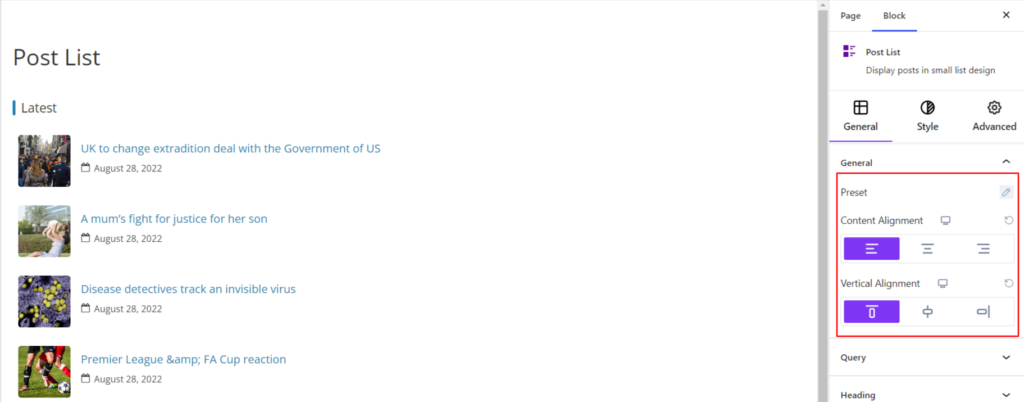
- Preset – It refers to the way in which the blog posts are organized or rearranged. Currenlty, the Post List block provides two layout styles with various styles on each layout for displaying the post.
- Content Alignment – It sets the position of the content to be on the Left, Center, and Right positions. Moreover, you can set the position of the content to be different on various devices (Desktop, Tablet, and Mobile).
- Vertical Alignment – It sets the position of the content to be on the Top, Center, and Bottom Vertically. Moreover, you can set the position of the content to be different on various devices (Desktop, Tablet, and Mobile).
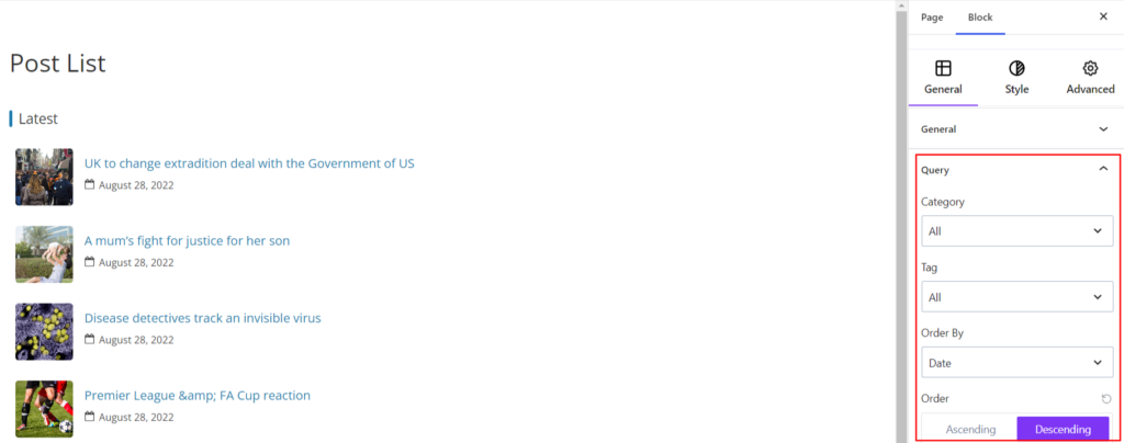
Query #
It consists of the settings related to the posts that are displayed on the front end. It allows you to choose posts depending on Category, Tag, Date, Title, etc.
Also, you can sort the posts in Ascending or Descending order. Likewise, you can choose the number of posts to be displayed.
Moreover, you can also exclude the specific category to be displayed.
Heading #
The Heading area refers to the Title that gets displayed at the top of the posts and comes with the following option to customize it:
- Enable – Switch the Toggle to the right area to enable the heading on your site. Enabling the option will display the Heading on your end.
- Preset – The Preset refers to the styles for displaying the heading area. Currently, it has two layout styles with various styles on each layout for displaying the heading.
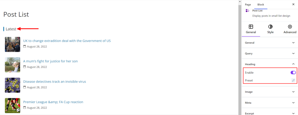
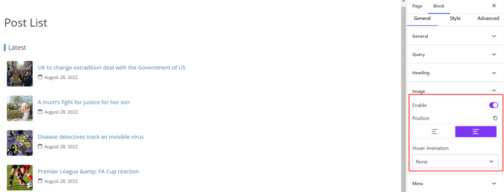
Image #
The option is for customizing the images of the post that appear while using the Post List block. It comes with the following customization options:
- Enable – Switch the Toggle to the right area to enable the featured image. Enabling the option will display the Featured Image of each post
- Position – It determines the position of the post list featured image.
- Hover Animation – It adds the animation effect while the featured image is being hovered on your end.
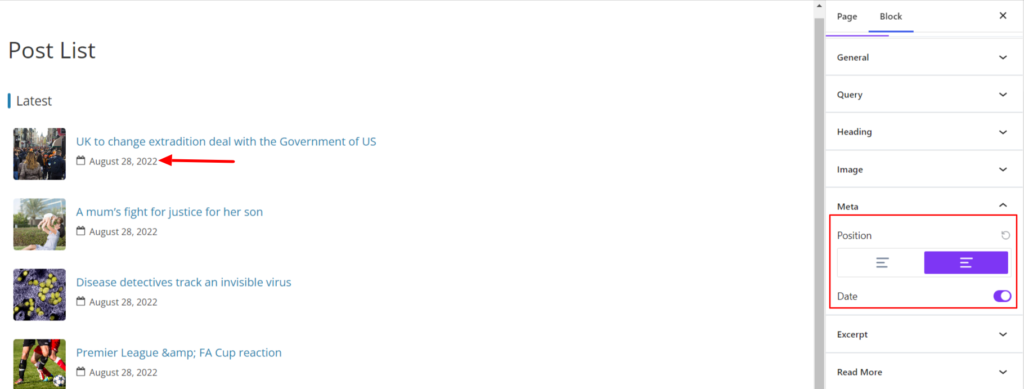
Meta #
Meta refers to the metadata that gets displayed on the post, such as Date. With the post list block, you’ll get the Date meta below the post title, which comes with the following customization options:
- Enable – Switch the Toggle to the right area to enable the meta on your site. Enabling the option will display the Metadata on your end.
- Position – It allows setting the Metadata to be displayed above or below the post title.
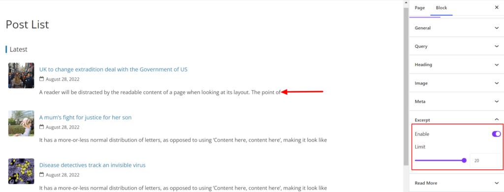
Excerpt #
An Excerpt is a summary or brief description of a post that provides readers with a quick overview of the content, allowing them to decide whether they want to read more. The Excerpt displays below the meta with the following options;
- Enable – Switch the Toggle to the right area to enable the Excerpt. Enabling the option will display the Excerpt text on your end.
- Limit – By default, the featured post blocks limit excerpts’ length upto 20 words. You can increase or decrease the excerpt length on your preference.
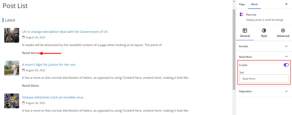
Read More #
The Banner Posts Block allows displaying the Read More tag on the post. Clicking the read more button will display the full contents of your post. It comes with the following options:
- Enable – Switch the Toggle to the right area to enable the Read More. Enabling the option will display the Read More tag below the excerpt text.
- Text – It allows you to change the Read More Label. By default, the label is read more, which can be changed.
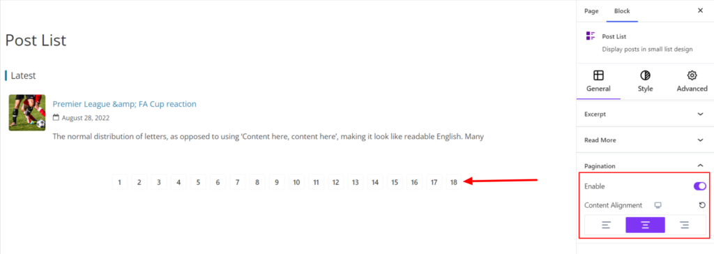
Pagination #
Pagination is a way of splitting the contents of your site into multiple pages. Banner Posts Block allows Pagination on the site with the options listed below:
- Enable – Switch the Toggle to the right area to enable the Pagination on your site. Enabling the option will display the Pagination below the page.
- Alignment – It sets the alignments for the Pagination. You can set the alignments as Left, Center, and Right. Moreover, you can also set the pagination position on different devices (Desktop, Tablet, and Mobile).
Style #
Under the style option, you’ll find the following options available:
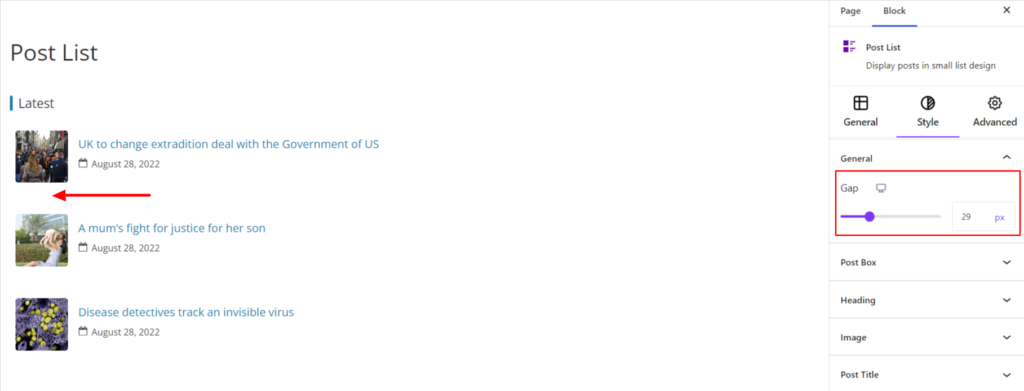
General #
- Gap – It refers to the space between the posts displayed on your site. You can enter a number straight into the field or use the slider to change the gap value in pixels. Moreover, you can set the gap value to be different on various devices (Desktop, Tablet, and Mobile).
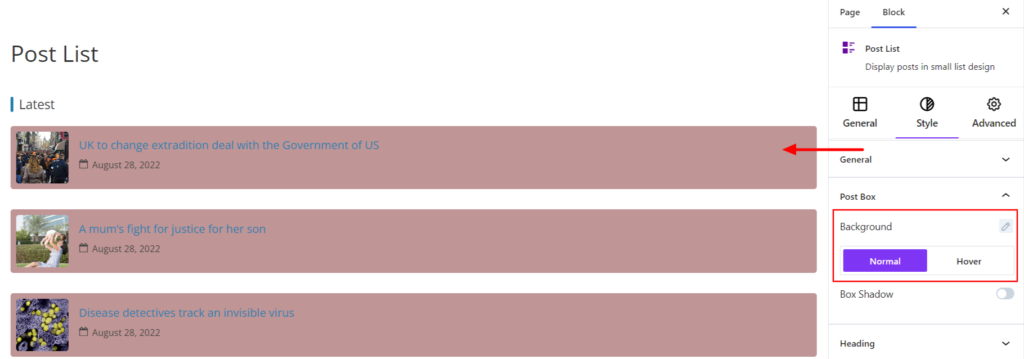
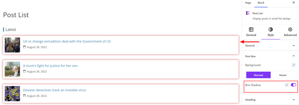
Post Box #
- Background – It sets the background color for the post box. You can change the visual appearance of the background by changing its color or adding an image. Moreover, you can set the different background colors on Normal and Hover Modes.
- Box Shadow – It adds a shadow effect around the box. When you enable the Box Shadow option, you will get the following customization options:
- Color – It allows you to select the appropriate box-shadow color for the section block.
- Horizontal-X – It displays the box shadows in the horizontal position.
- Vertical-Y – It displays the box shadows in the vertical position.
- Blur – You can set up the blur value of the box shadows appearing.
- Spread – The shadow’s spread value represents the distance to expand or contract a shadow in all directions. You can change the spread value according to the site’s requirements.
- Position – You can set the position of the box shadows as Inset or Outline.
Heading #
- Heading Color – It allows you to change the color of the heading Text in Normal and Hover modes.
- Border Color – It allows you to change the color of the heading Border in Normal and Hover modes.
- Background Color – It allows you to add the background on the heading area. You can add an image or use the color to set the background.
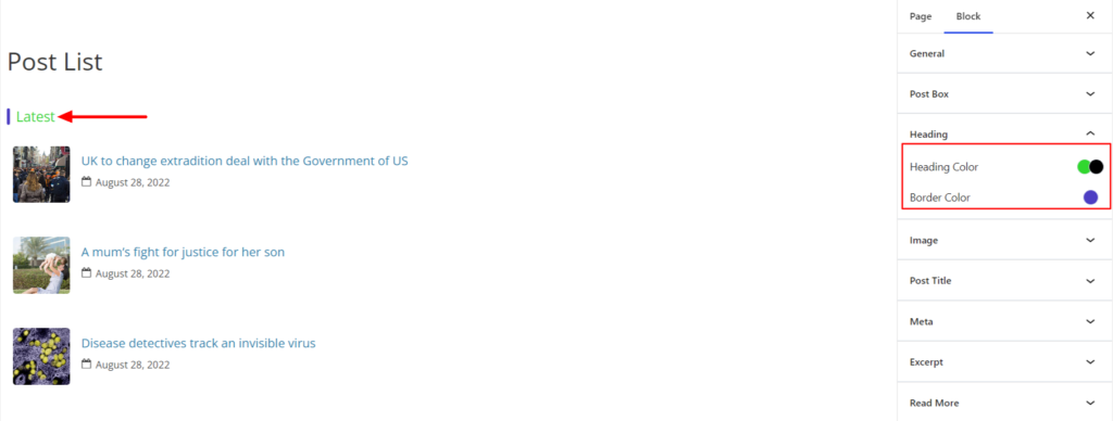
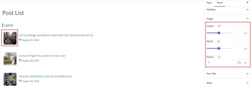
Image #
- Height – It sets the Height of the feature image. You can enter a number straight into the field or use the slider to change the image height in pixels. Moreover, you can set the height value to be different on various devices (Desktop, Tablet, and Mobile).
- Width – It sets the Width of the feature image. You can enter a number straight into the field or use the slider to change the image width in pixels. Moreover, you can set the width value to be different on various devices (Desktop, Tablet, and Mobile).
- Radius – It sets the curve of the images on the corners. Moreover, you can set the border-radius value to be different for various devices (Desktop, Tablet, and Mobile).
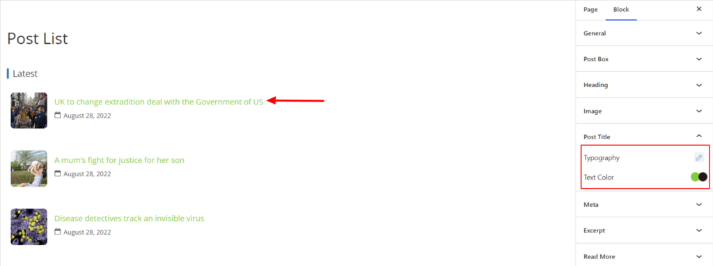
Post Title #
The options work for the post title of the Post Title block and provide the following options:
- Typography – It controls the Post title Font Family, Weight, and Font Size.
- Text Color – It allows you to change the color of the post title on Normal and Hover Mode.
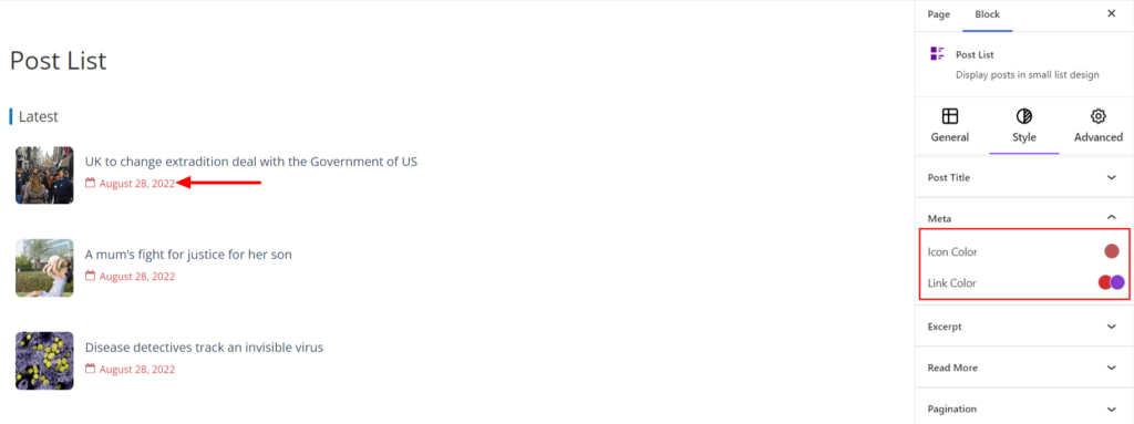
Meta #
- Icon Color – It allows changing the icon’s color representing the metadata.
- Link Color – It allows changing the color of the link representing the metadata. You can change the link color in Normal and Hover modes.
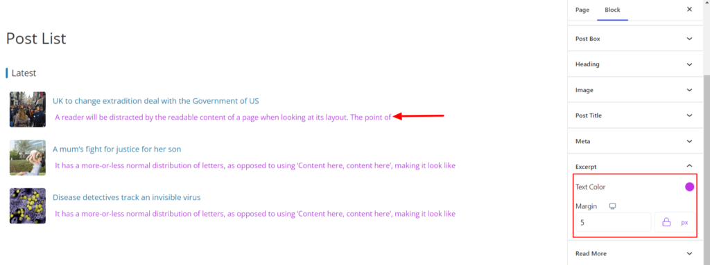
Excerpt #
- Text Color – It allows you to set the Excerpt Text color.
- Margin – It manages the margin value of the excerpt text.
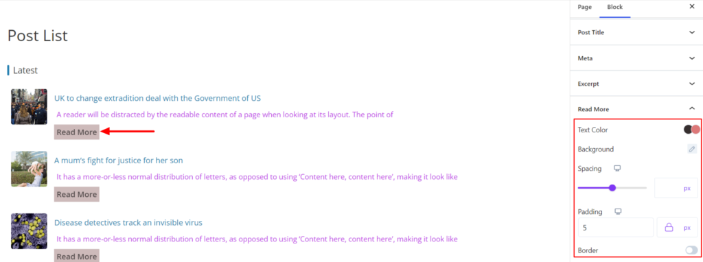
Read More #
- Text Color – It allows you to change the color of the Read More label on Normal and Hover Mode.
- Background – It allows you to add the background for the Read More Tag. You can add an image or use the color to set the background.
- Spacing – It manages the spaces in between the content appearing above the Read More tag.
- Padding – It sets the padding value for the Read More Tag.
- Border – It customizes the Border area added around the Read More Tag.
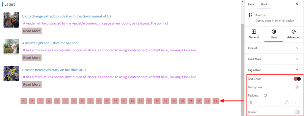
Pagination #
- Text Color – It allows you to change the color of the pagination on Normal and Hover Mode.
- Background – It allows you to add the background for the Pagination. You can add an image or use the color to set the background.
- Padding – It sets the padding value for the Pagination.
- Border – It customizes the Border area added around the Pagination.
Advanced #
The Advanced section consists of four options for the Post List block.
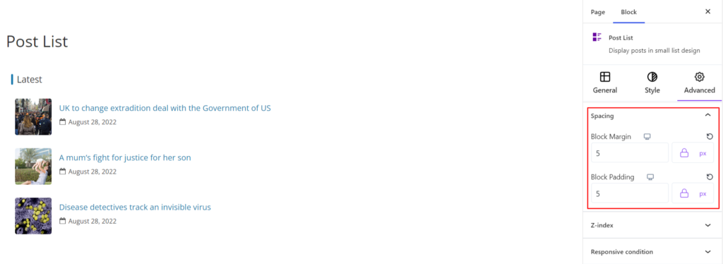
Spacing #
Under the spacing section, you can find the following options available:
- Block Margin – According to the site requirement, you can assign a specific margin value to the block along with units like px, em, %, and rem. Moreover, you can set the value of the different margins for various devices (Desktop, Tablet, and Mobile),
- Block Padding – According to the site requirement, you can assign a specific padding value to the block along with units like px, em, %, and rem. Moreover, you can set the value of the different margins for various devices (Desktop, Tablet, and Mobile).
Z-Index #
It allows you to set the priority of the Banner Posts block according to the site requirement.
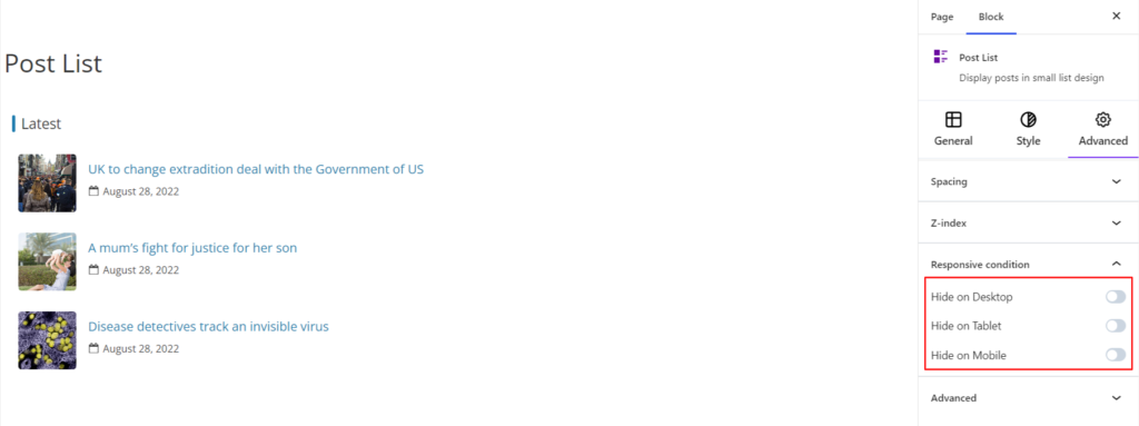
Responsive Condition #
Using the option, you can enable/disable displaying the block on various screen sizes:
- Hide on Desktop – It hides the Featured Post block on the Desktop.
- Hide on Tablet – It hides the Featured Post block on Tablet.
- Hide on Mobile – It hides the Featured Post block on Mobile.
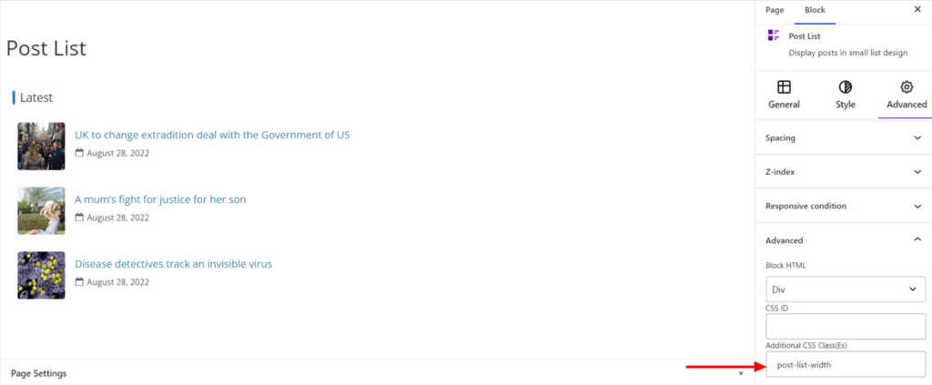
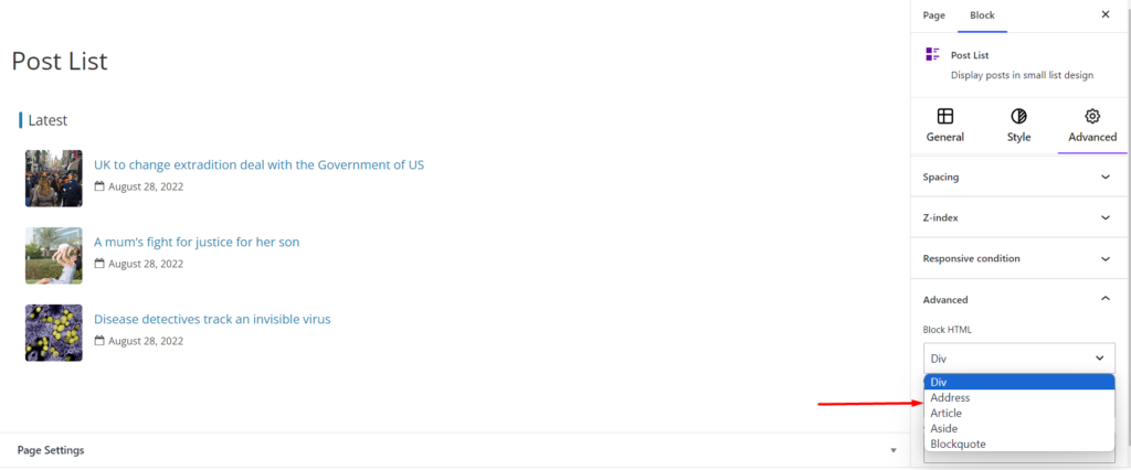
Advanced #
Under the option, you can set the CSS ID and Classes for this particular Post List block. The available options are listed below:
- Block HTML – It sets the HTML elements to your site requirements. By default, the HTML element is div; however, you can use another element such as Address, Article, Aside, etc.
- CSS ID – It allows you to set specific IDs to style this particular block. Once you have set the ID, you can write the CSS Code to style the block using that particular ID.
- Additional CSS Class(es) – It allows you to add a CSS class to your block, letting you write custom CSS to style this particular block.
For example, if you want to change the width of the Banner Posts block only, you can add a class such as post-list-width to the Additional CSS Class field. After that, visit your CSS editor and write a style for the class as below:
.post-list-width{
width:70%
}
Upon adding the code, it will make the changes only to this particular Post List block and not other blocks.