The Section Block is suitable for displaying the site content in various layout forms. You can add different contents/blocks to your site in each layout.
After you have chosen the Section Block, you’ll get a block editing panel on the right-hand side. It has three options, i.e., General, Style, and Advanced. These options customize the design and other elements of the block. Let’s explore one by one below:
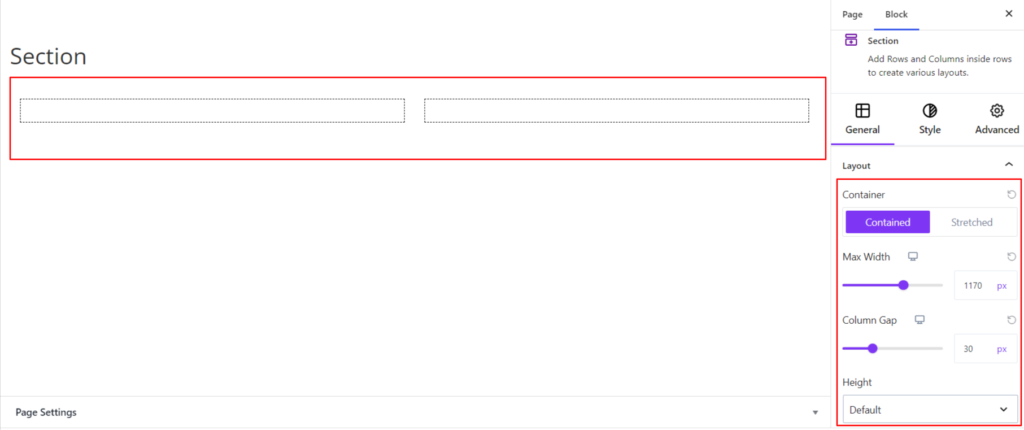
General #
Layout #
It provides the following four customization options for Section Block. These are listed below:
- Container – It lets you set the container length as Stretched or Contained. If you choose the container to be Contained, you get the following options:
- Max-Width: The option allows keeping the block’s max-width according to the site requirements. Moreover, you can also set the width for various devices (Desktop, Tablet, and Mobile).
- Column Gap – You can adjust the column gap length between the chosen layout. Moreover, you can also set the gap for various devices (Desktop, Tablet, and Mobile).
- Height – It allows setting up the height of the entire block to be Min Height, Default, and Fit to Screen.
However, if you choose the container to be Stretched, the following option is available:
- Column Gap – You can adjust the column gap length between the chosen layout.
- Height – It allows setting up the height of the entire block to be Min Height, Default, and Fit to Screen.
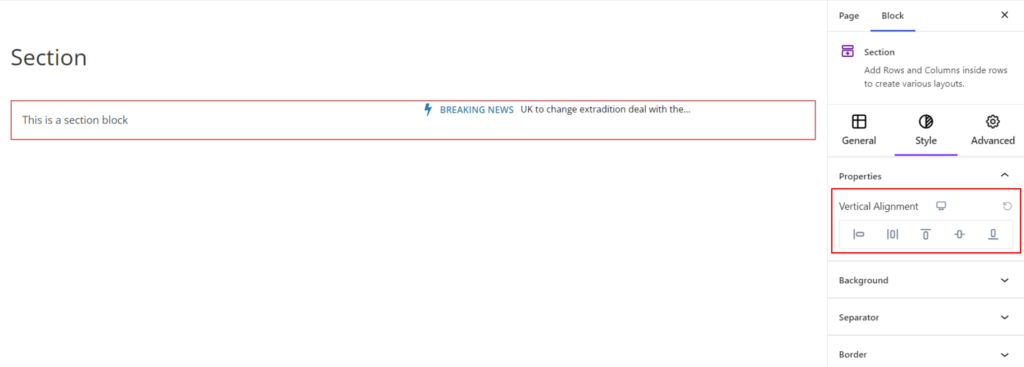
Style #
Under the style, you’ll find the following options available:
Properties #
- Vertical Alignments – It sets the vertical alignments for the Section Block. You can set the alignments as Baseline, Top, Middle, and Bottom. Moreover, you can set different alignments for various devices (Desktop, Tablet, and Mobile).
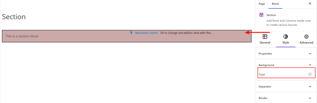
Background #
- Type -It sets the background color for the section block. You can change the visual appearance of the background by changing its color or adding an image. Moreover, you can set the different background colors on Normal and Hover Modes.
Separator #
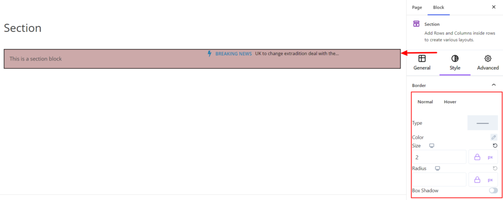
Border #
Inside the section, you can find the customization option for the column border. The options are listed below:
- Type – You can set the border type as Solid, Dotted, Dashed, Double, etc. Moreover, select the border type to be None if you do not want to add any borders for the section block.
When you select none, you will be given the following option:
- Radius – It allows you to fix the radius value to make the round corners for the column border.
- Box Shadow – When you enable the Box Shadow option, you will get the following customization options:
- Color – It allows you to select the appropriate box-shadow color for the section block.
- Horizontal-X – It displays the box shadows in the horizontal position.
- Horizontal-Y – It displays the box shadows in the vertical position.
- Blur – You can set up the blur value of the box shadows appearing.
- Spread – The shadow’s spread value represents the distance to expand or contract a shadow in all directions. You can change the spread value according to the site’s requirements.
- Position – You can set the position of the box shadows as Inset or Outline.
However, if you select the border type to be other than none, two more options will be added. The option is listed below:
- Border Color – It allows you to choose the appropriate border color for the section block.
- Size – It provides the option to select the border size.
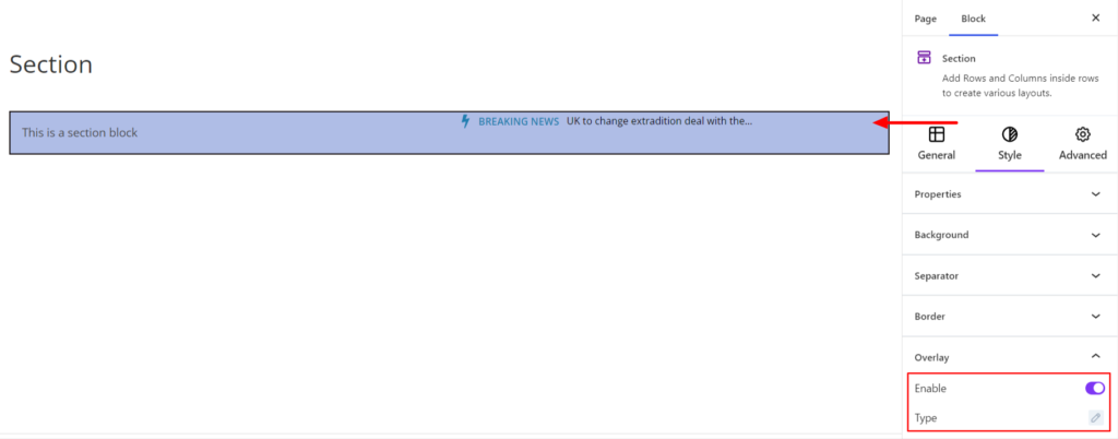
Overlay #
The overlay allows you to add the image or color over the block surface. When you enable overlay, it provides the following two options:
- Type – It allows you to choose the background color and image as an overlay effect for the section block.
Advanced #
The Advanced section consists of four options for the Section block.
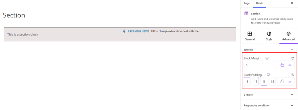
Spacing #
Under the spacing section, you can find the following options available:
- Block Margin – According to the site requirement, you can assign a specific margin value to the block along with units like px, em, %, and rem. Moreover, you can set the value of the different margins for various devices (Desktop, Tablet, and Mobile),
- Block Padding – According to the site requirement, you can assign a specific padding value to the block along with units like px, em, %, and rem. Moreover, you can set the value of the different margins for various devices (Desktop, Tablet, and Mobile).
Z-Index #
It allows you to set the priority of the Section block according to the site requirement.
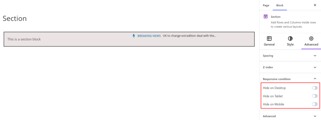
Responsive Condition #
Using the option, you can enable/disable displaying the block on various screen sizes:
- Hide on Desktop – It hides the Section block on the Desktop.
- Hide on Tablet – It hides the Section Post block on the Tablet.
- Hide on Mobile – It hides the Section Post block on Mobile.
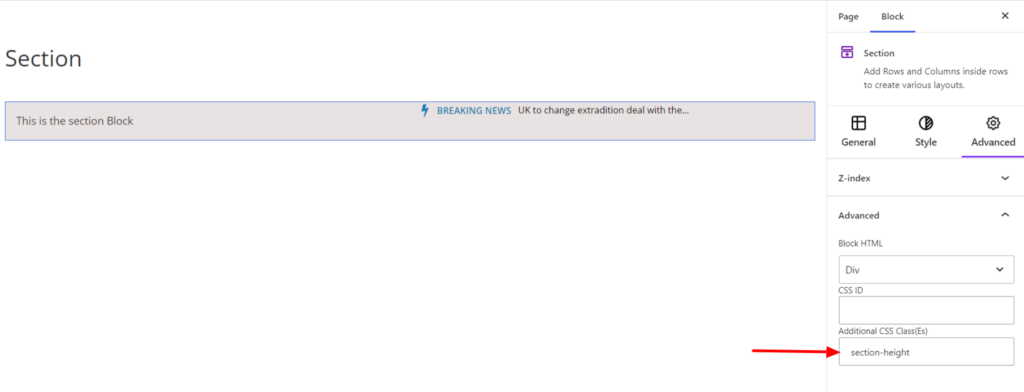
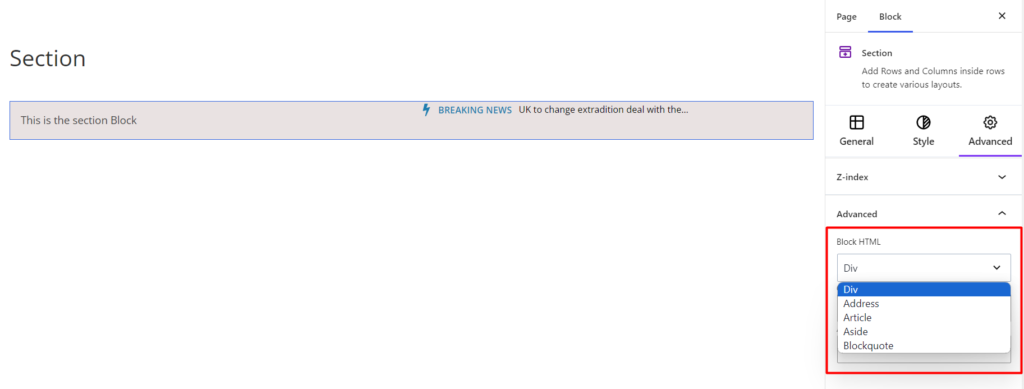
Advanced #
Under the option, you can set the CSS ID and Classes for this particular Section block. The available options are listed below:
- Block HTML – It sets the HTML elements to your site requirements. By default, the HTML element is div; however, you can use another element such as Address, Article, Aside, etc.
- CSS ID – It allows you to set specific IDs to style this particular block. Once you have set the ID, you can write the CSS Code to style the block using that particular ID.
- Additional CSS Class(es) – It allows you to add a CSS class to your Section block, letting you write custom CSS to style this particular block.
For example, if you want to change the height of the section, you can add a class, such as section-height, to the Additional CSS Class field. After that, visit your CSS editor and write a style for the class as below:
.mzb-section.section-height{
height:75px;
}
Upon adding the code, it will make the changes only to this particular block/section and not others.