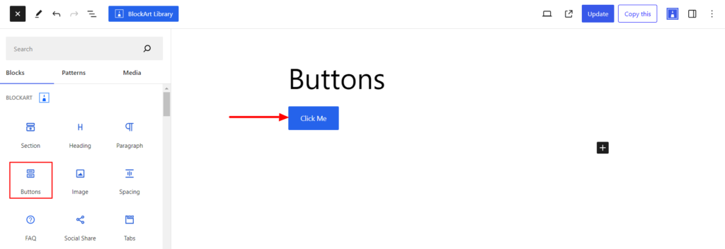
The Buttons block, available with the BlockArt plugin, allows you to add buttons to your site. A button is simply a text box that allows visitors to interact with the website.
After you have chosen the buttons block, you’ll get a block editing panel on the right-hand side. It has three options, i.e., General, Style, and Advanced. These options customize the design and other elements of the buttons block. Let’s explore one by one below:
General #
It provides the following customization options for the Block.
Layout #
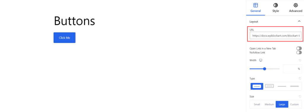
- URL – This option adds a link that redirects the user to a specified web address or page.
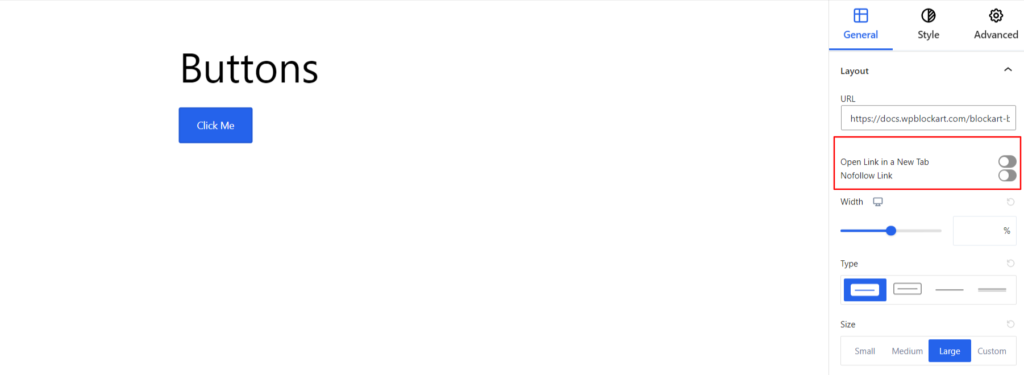
Moreover, enable the Open Link in a New Tab option if you want the added URL to open in a new tab once the user clicks on it. Also, if you want search engines to ignore the URL added, you can enable the NoFollow Link option.
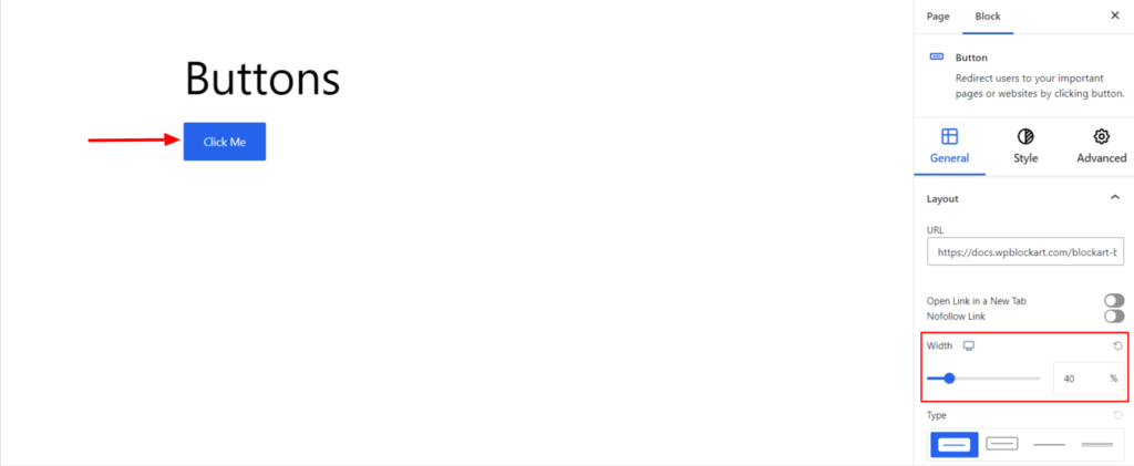
- Width – The option manages the width of the button added. Moreover, you can set the width for various devices (desktop, tablet, and mobile).
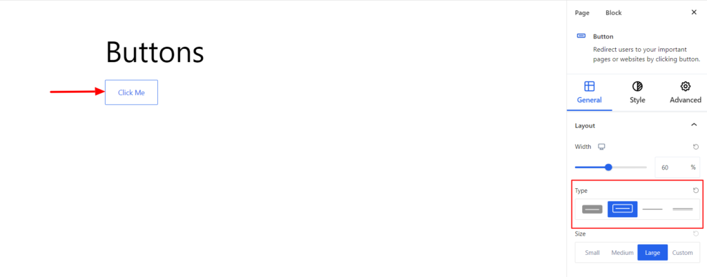
- Type – It determines the type of button. You can choose the button to be with a background inside a box or without it.
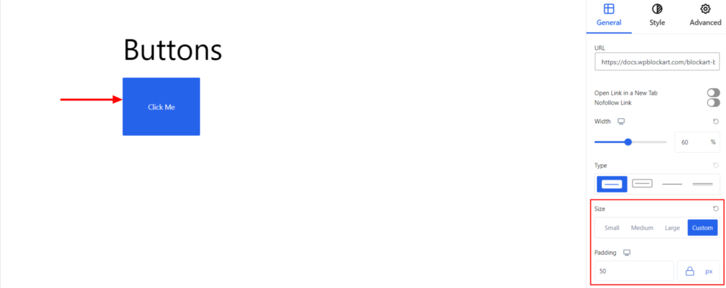
- Size – It sets the button size to Small (S), Medium (M), or Large (L) or add the Custom Value to determine the size.
Icons #
With the BlockArt Blocks, you can add the icons along with button text. It provides the following options:
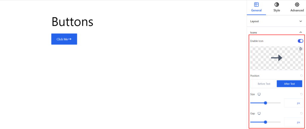
- Enable Icon – Switch the Toggle to the right area to enable the Icons for the Block. Enabling the option will provide you with an Icon Library through which you can choose the appropriate icon.
- Change Icon – Choose the appropriate Icon to be added to the button.
- Position – You can set the Icon to be displayed Before/After the text.
- Size – It determines the size of the Icon. Moreover, you can set the icon size for various devices (desktop, tablet, and mobile).
- Gap – It determines the space between the button text and the icon. You can increase/decrease the spacing between the button text and icon. Moreover, you can also set the gap for various devices (desktop, tablet, and mobile).
Style #
It provides the following styling options for the Buttons Block. These are listed below:
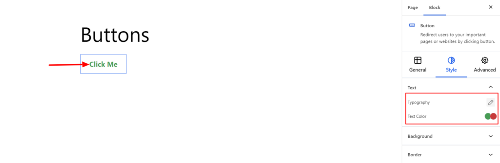
Text #
- Typography – It allows you to control the button text Typography, such as font family, weight, font size, line height, and other related styling properties. The options are listed below:
- Font Family – The option allows you to choose the appropriate font family for the button text.
- Weight – It refers to the thickness or boldness of the button text.
- Size – It controls the font size of the button text.
- Line Height – It manages the space above and below the button text.
- Letter Spacing – It controls the amount of space between characters in the button text.
- Style – Using the property, you can set the button text to be Italic or Oblique.
- Transformation – It changes the case of the text, such as lowercase, uppercase, and capitalized.
- Decoration – The styling is applied to the button text to make it more visually appealing. The options include underlining, overlining, and line-through.
- Text Color – It changes the color of the text added to the button.
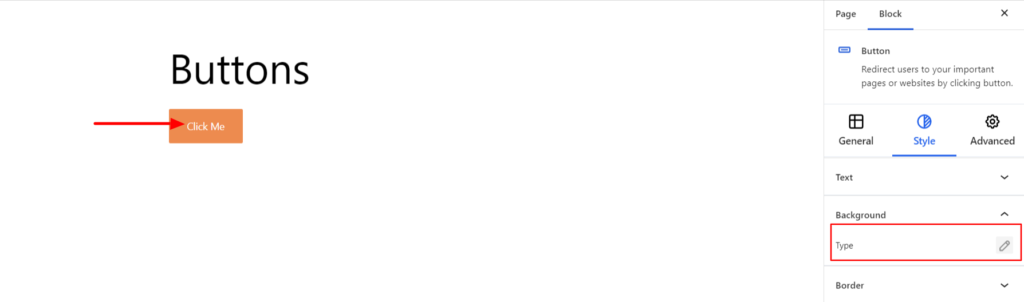
Background #
- Type – It sets the background color of the Button. You can change the background’s visual appearance by changing its color or adding an image. Moreover, you can set different background colors in Normal and Hover Modes.
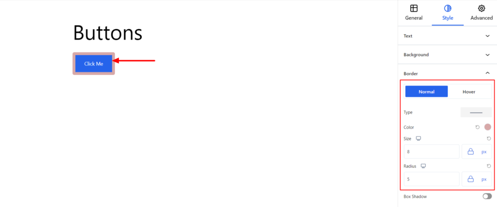
Border #
It customizes the Border area added around the button block and comes with the following options:
- Type – You can set the border type as Solid, Dotted, Dashed, Double, etc. Moreover, select None if you do not want to add borders for the button.
When you select none, you will be given the following option:
- Radius – It allows you to fix the radius value to make the round corners around the border.
However, if you select the border type to be other than none, two more options will be added. The option is listed below:
- Color – It allows you to choose the appropriate border color.
- Size – It provides the option to select the border size.
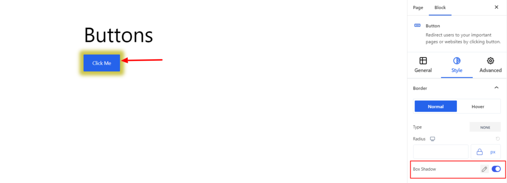
- Box Shadow – When you enable the Box Shadow option, you will get the following customization options:
- Color – It allows you to select the appropriate box-shadow color around the button.
- Horizontal-X – It displays the box shadows in the horizontal position.
- Horizontal-Y – It displays the box shadows in the vertical position.
- Blur – You can set up the blur value of the box shadows appearing.
- Spread – The shadow’s spread value represents the distance to expand or contract a shadow in all directions. You can change the spread value according to the site’s requirements.
- Position – You can set the position of the box shadows as Inset or Outline.
Note – You can apply the border settings option differently for Normal and Hover Modes.
Advanced #
The Advanced section consists of six customization options for the Block.
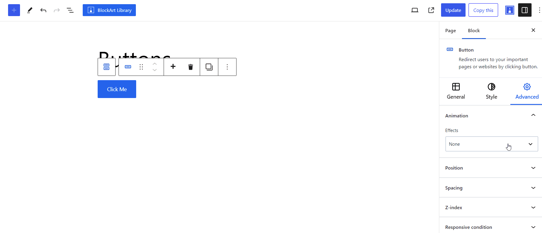
Animation #
With the BlockArt Blocks, you can add the animation effect to the button while it loads on your end. Adding animation effects on buttons enhances user experience and creates engaging visual effects.
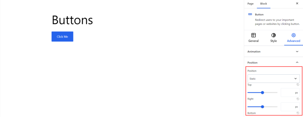
Position #
The property determines how the button is positioned within its containing element or within the viewport. The positions values available with the Buttons Blocks are listed below:
- Static
- Relative
- Absolute
- Fixed
- Sticky
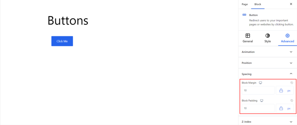
Spacing #
Under the spacing section, you can find the following options available:
- Block Margin – According to the site requirement, you can assign a specific margin value to the block along with units like px, em, %, and rem. Moreover, you can set different margin values for various devices (Desktop, Tablet, and Mobile).
- Block Padding – According to the site requirement, you can assign a specific padding value to the block along with units like px, em, %, and rem. Moreover, you can set different padding values for various devices (Desktop, Tablet, and Mobile).
Z-Index #
It allows you to set the priority of the Buttons block according to the site requirement.
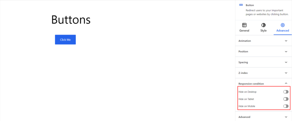
Responsive Condition #
Using the option, you can enable/disable displaying the block on various screen sizes:
- Hide on Desktop – It hides the Buttons block on the Desktop.
- Hide on Tablet – It hides the Buttons block on the Tablet.
- Hide on Mobile – It hides the Buttons block on the Mobile.
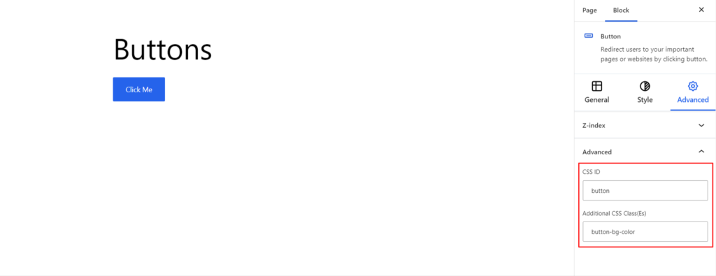
Advanced #
Under the option, you can set the CSS ID and Classes for this particular Buttons block. The available options are listed below:
- CSS ID – It allows you to set specific IDs to style this particular block. Once you have set the ID, you can write the CSS Code to style the block using that particular ID.
- Additional CSS Class(es) – It allows you to add a CSS class to your block and write custom CSS to style this particular block.
After creating the separate ID and Classes, visit your CSS editor and write a style for the ID and class.