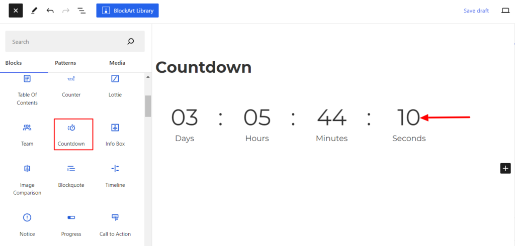
The Countdown block displays the timer of any upcoming events. This is often used for time-limited promotions, sales, or other time-sensitive activities. It counts down the days, hours, minutes, and seconds until a specific deadline, event, or moment is met.
After you have chosen the Countdown block, you’ll get a block editing panel on the right-hand side. It has three options, i.e., General, Style, and Advanced. These options customize the design and other elements of the block. Let’s explore one by one below:
General #
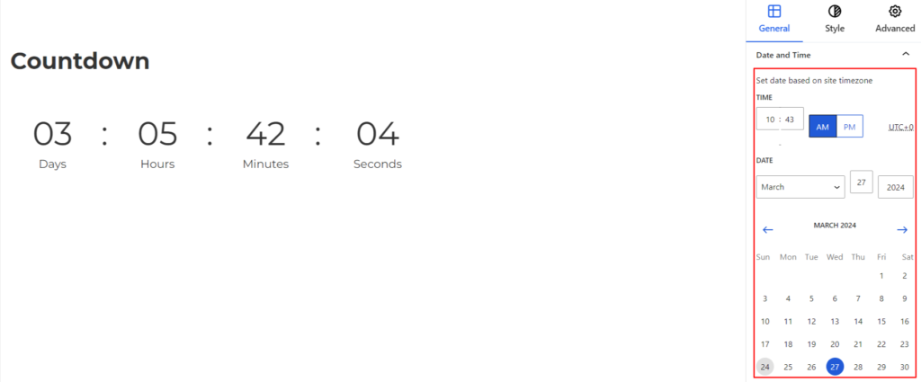
Date & Time #
It allows you to set up the time and date based on your time zone.
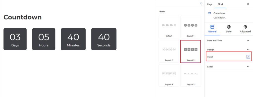
Design #
- Preset – It changes the design of the Countdown Block. The Counter can be displayed in Rectangular, Rounded, or Circular Form, depending on your requirements.
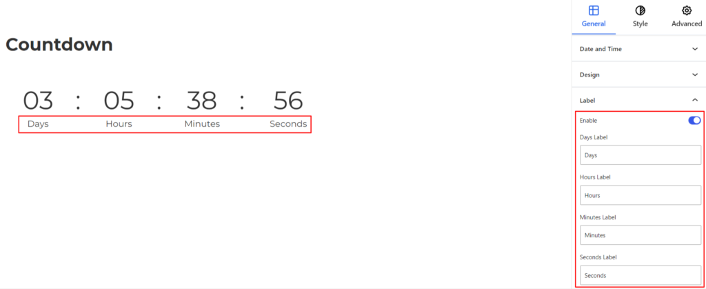
Label #
It customizes the label appearing below the counter and comes up with the following options:
- Enable – Switch the Toggle to the right area to enable the label below each above the counter value. Once enabled, you can add the label for Days, Hours, Minutes, and Seconds of your choice.
Style #
It provides the following styling options for the Countdown Block. These are listed below:
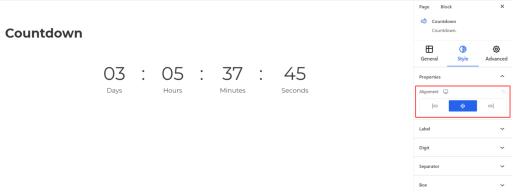
Properties #
- Text Alignment – It sets the alignments for the Countdown Block. You can set the alignments as Left, Center, and Right. Moreover, you can also set the alignment position on different devices (Desktop, Tablet, and Mobile).
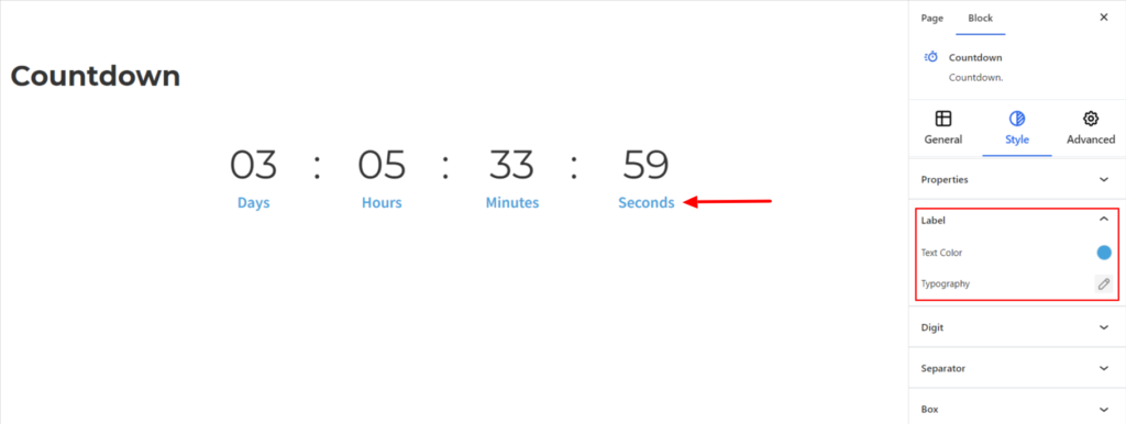
Label #
- Text Color– It changes the color of the label text.
- Typography – It allows you to control the Typography, such as font family, weight, font size, line height, and other related styling properties for the label. The options are listed below:
- Font Family – The option allows you to choose the appropriate Font Family for the label.
- Weight – It refers to the thickness or boldness of the label.
- Size – It controls the font size of the label.
- Line Height – It manages the space above and below the label.
- Letter Spacing – It controls the amount of space between characters in the label.
- Style – Using the property, you can set the label to be Italic or Oblique.
- Transformation – It changes the case of the label such as lowercase, uppercase, and capitalize.
- Decoration – The styling is applied to the label to make it more visually appealing. The options include underline, overline, and line through.
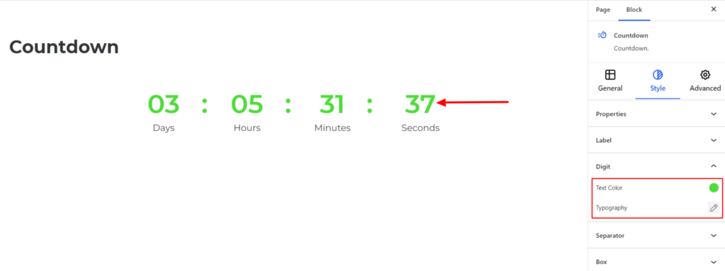
Digit #
The settings work for the Numeric Digit of the Countdown block and come with the following options:
- Text Color – It changes the color of the Digit.
- Typography – It controls the Digit typography option, such as font family, font size, line spacing, text decoration, etc.
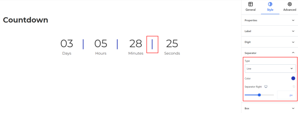
Separator #
The Separator in the Countdown block refers to a symbol or character used to separate different components of the countdown display. While using the block, you might see digits separated by colons or other symbols to indicate hours, minutes, and seconds. They help distinguish between the hours, minutes, and seconds, making it easier for people to read and understand the remaining time.
To customize the Countdown block, it comes with the following options:
- Type – You can set the Separator type to None, Colon, Slash, and Line.
- Color – It allows you to choose the appropriate color for the separator.
- Separator Right – It determines the space from the right side between the digit and separator. Moreover, you can set the right spacing values for various devices (desktop, tablet, and mobile).
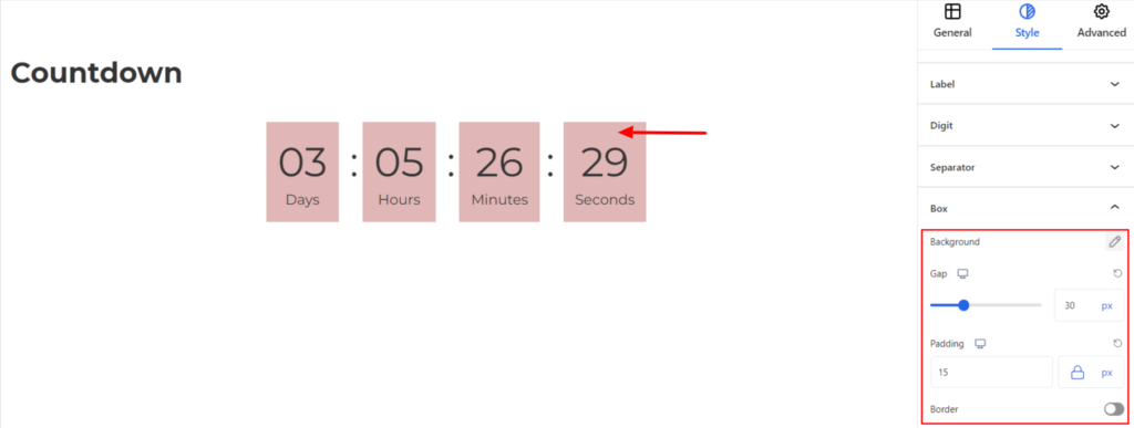
Box #
The settings allow displaying the countdown inside the box and come with the following options:
- Background – It sets the background color of the Countdown block. You can change the visual appearance of the background by changing its color or adding an image.
- Gap – It adjusts the gap between each Countdown item. Moreover, you can adjust that value for different devices (Desktop, Tablet, and Mobile).
- Padding – It manages the spacing on all four sides of the Countdown item box.
- Border – It customizes the Border area added around the Countdown items box and comes with the following options:
- Type – You can set the border type as Solid, Dotted, Dashed, Double, etc. Moreover, select the border type to be None if you do not want to add any borders.
When you select none, you will be given the following option:
- Radius – It allows you to fix the radius value to make the round corners of the border.
However, if you select the border type to be other than none, two more options will be added. The option is listed below:
- Border Color – It allows you to choose the appropriate border color.
- Size – It provides the option to select the border size.
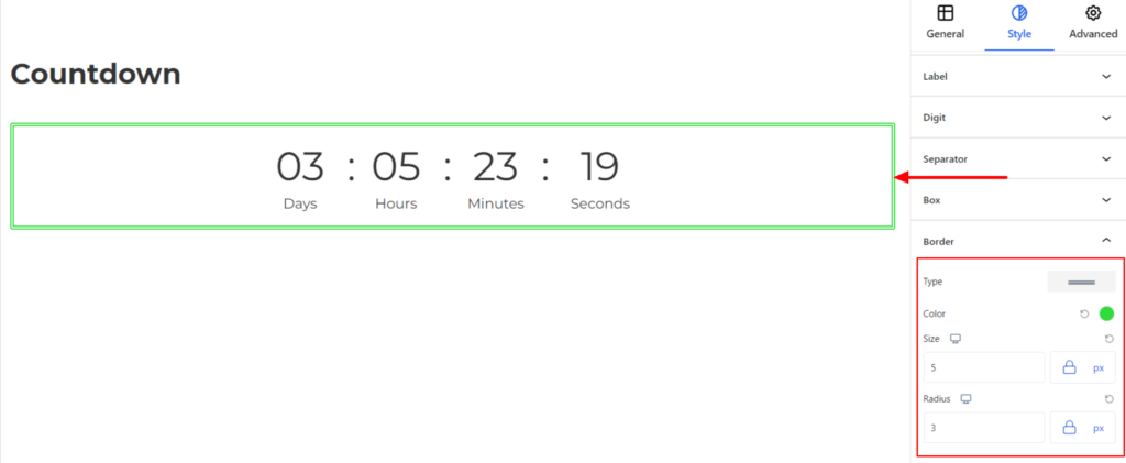
Border #
It customizes the Border area added around the Countdown and comes with the following options:
- Type – You can set the border type as Solid, Dotted, Dashed, Double, etc. Moreover, select None if you do not want to add borders.
When you select none, you will be given the following option:
- Radius – It allows you to fix the radius value to make the round corners for the Counter Block.
However, if you select the border type to be other than none, two more options will be added. The option is listed below:
- Border Color – It allows you to choose the appropriate border-color.
- Size – It provides the option to select the border size.
Advanced #
The Advanced section consists of four customization options for the Countdown Block.
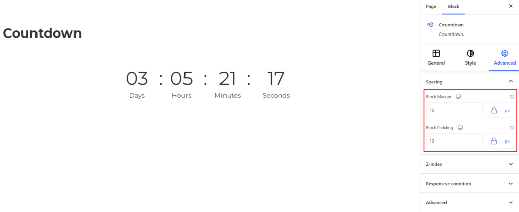
Spacing #
Under the spacing section, you can find the following options available:
- Block Margin – According to the site requirement, you can assign a specific margin value to the block along with units like px, em, %, and rem. Moreover, you can set different margin values for various devices (Desktop, Tablet, and Mobile).
- Block Padding – According to the site requirement, you can assign a specific padding value to the block along with units like px, em, %, and rem. Moreover, you can set different padding values for various devices (Desktop, Tablet, and Mobile).
Z-Index #
It allows you to set the priority of the Countdown Block according to the site requirement.
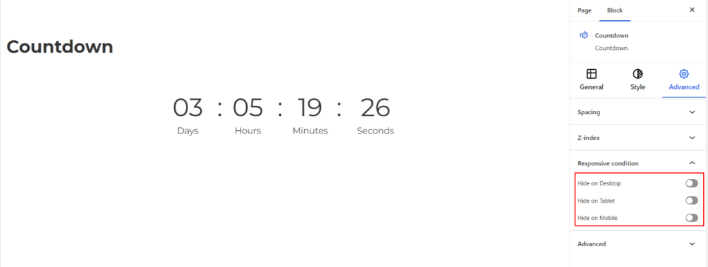
Responsive Condition #
Using the option, you can enable/disable displaying the block on various screen sizes:
- Hide on Desktop – It hides the Countdown block on the Desktop.
- Hide on Tablet – It hides the Countdown block on the Tablet.
- Hide on Mobile – It hides the Countdown block on theMobile.
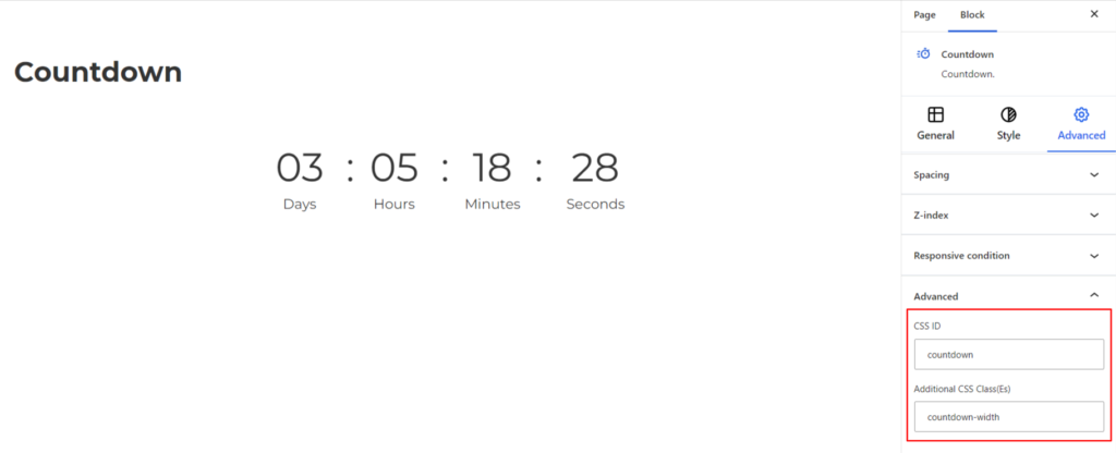
Advanced #
Under the option, you can set the CSS ID and Classes for this particular Countdown block. The available options are listed below:
- CSS ID – It allows you to set specific IDs to style this particular block. Once you have set the ID, you can write the CSS Code to style the block using that particular ID.
- Additional CSS Class(es) – It allows you to add a CSS class to your block and write custom CSS to style this particular block.
After creating the separate ID and Classes, visit your CSS editor and write a style for the ID and class.


