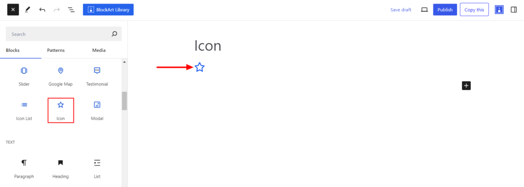
The Icon Block allows you to add SVG icons to pages and posts. It comes with a WordPress icon library with 290+ SVG icons to choose from.
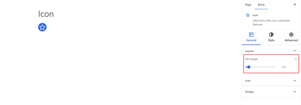
After you have chosen the Icon Block, you’ll get a block editing panel on the right-hand side. It has three options: General, Style, and Advanced. These options customize the design and other elements of the block. Let’s explore one by one below:
General #
Layout #
- Min Height – It determines the minimum height of the icon.
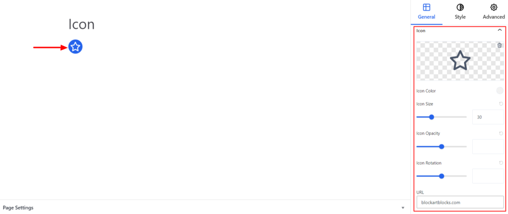
Icon #
- Icon – Choose the appropriate Icon on your end. You can choose the appropriate icons from the list available.
- Icon Color – It allows you to choose the appropriate color for the icons added.
- Icon Size – It determines the size of the social icon.
- Icon Opacity – It determines the transparency level of an icon and is represented as a value between 0 and 1. When the value is set to 0, it’s completely transparent (invisible); if it is set to 1, it’s completely opaque (fully visible).
- Icon Rotation – It rotates the icon around its center point.
- URL – The option allows you to add a link redirecting the user to a specified web address or page when they click the icon.
Moreover, enabling the Open Link in a New Tab option will open the URL in a new tab.
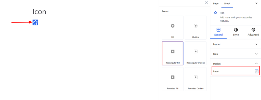
Design #
- Preset – It refers to the predefined styles of the icons that includes Fill, Outine, Rectangular Fill etc.
Style #
It provides the following styling options for the Icon Block. These are listed below:
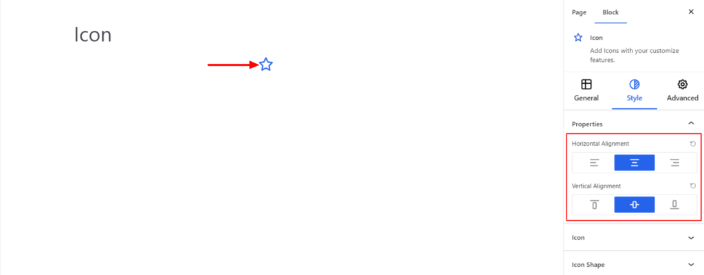
Properties #
- Horizontal Alignment – It sets the block’s position to the Left, Center, and Right Horizontally.
- Vertical Alignment – It sets the block’s position vertically to the top, center, and button.
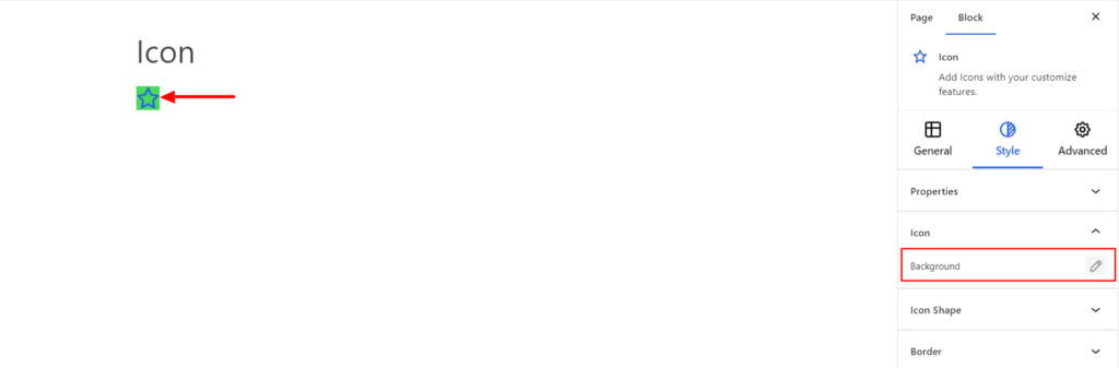
Icon #
- Background – It sets the background color of the Icon You can change the background’s visual appearance by changing its color or adding an image.
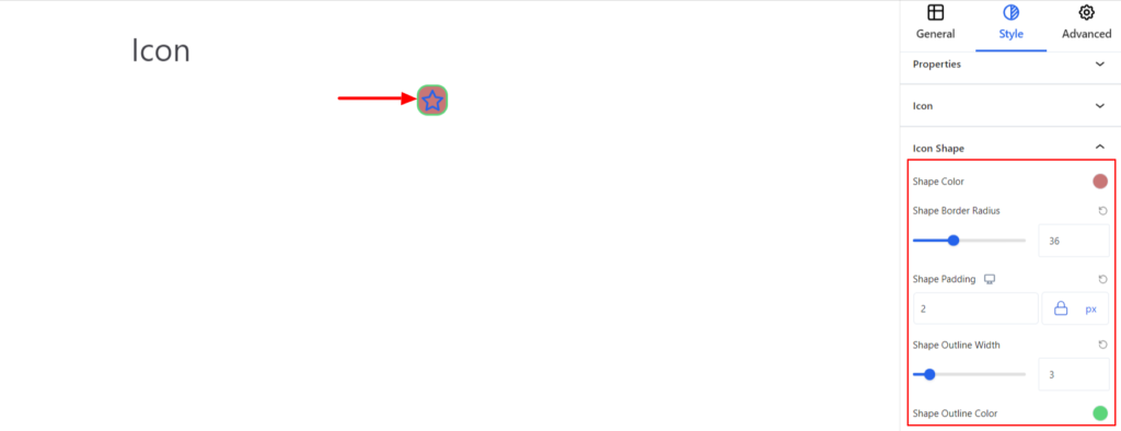
Icon Shape #
- Shape Color – It allows adding the background color to the icon.
- Shape Border Radius – It allows you to set the radius value to make the round corners for the border.
- Shape Padding – It sets the icon shape padding value.
- Shape Outer Width – It sets the outer shape width.
- Shape Outline Color – It sets the color of the outline.
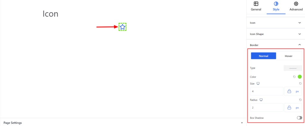
Border #
It customizes the Border area added around the Icon and comes with the following options:
- Type – You can set the border type as Solid, Dotted, Dashed, Double, etc. Moreover, select the border type to be None if you do not want to add borders for icons.
When you select none, you will be given the following option:
- Radius – It allows you to fix the radius value to make the round corners for the border.
However, if you select the border type to be other than none, two more options will be added. The option is listed below:
- Border Color – It allows you to choose the appropriate color for the border.
- Size – It provides the option to select the border size.
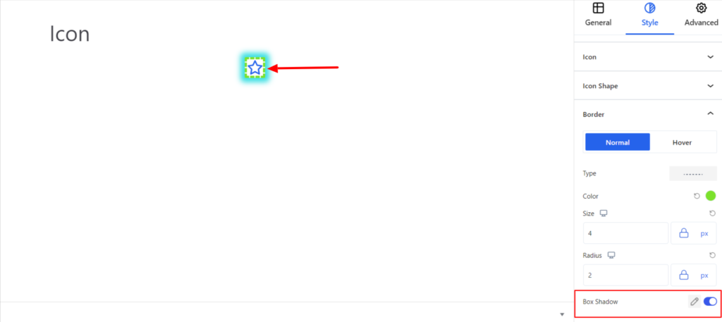
- Box Shadow – When you enable the Box Shadow option, you will get the following customization options:
- Color – It allows you to select the appropriate box-shadow color for the icon.
- Horizontal-X – It displays the box shadows in the horizontal position.
- Horizontal-Y – It displays the box shadows in the vertical position.
- Blur – You can set up the blur value of the box shadows appearing.
- Spread – The shadow’s spread value represents the distance to expand or contract a shadow in all directions. You can change the spread value according to the site’s requirements.
- Position – You can set the position of the box shadows as Inset or Outline.
Note – You can apply the border and box-shadow settings option differently for Normal and Hover Modes.
Advanced #
The Advanced section consists of four customization options for the Icon Block.
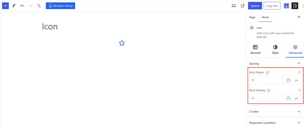
Spacing #
Under the spacing section, you can find the following options available:
- Block Margin – According to the site requirement, you can assign a specific margin value to the block along with units like px, em, %, and rem. Moreover, you can set different margin values for various devices (Desktop, Tablet, and Mobile).
- Block Padding – According to the site requirement, you can assign a specific padding value to the block along with units like px, em, %, and rem. Moreover, you can set different padding values for various devices (Desktop, Tablet, and Mobile).
Z-Index #
It allows you to set the priority of the icon block according to the site’s requirements.
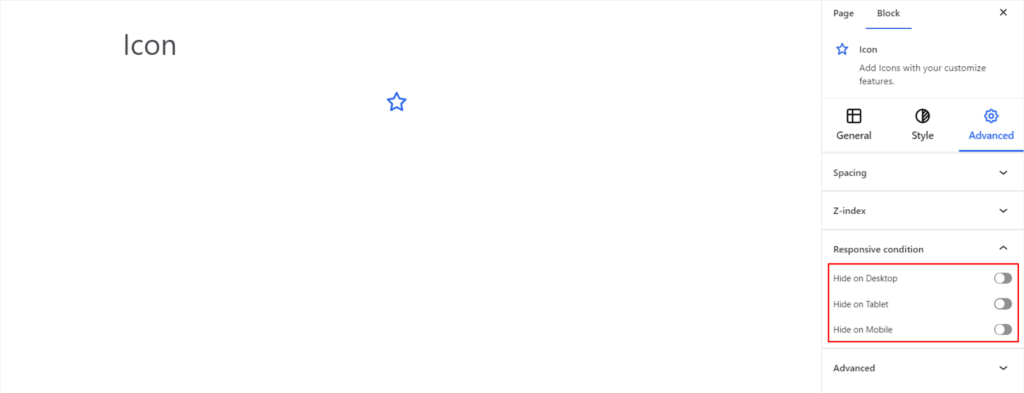
Responsive Condition #
Using the option, you can enable/disable displaying the block on various screen sizes:
- Hide on Desktop – It hides the Icon block on the Desktop.
- Hide on Tablet – It hides the Icon block on the Tablet.
- Hide on Mobile – It hides the Icon block on the Mobile.
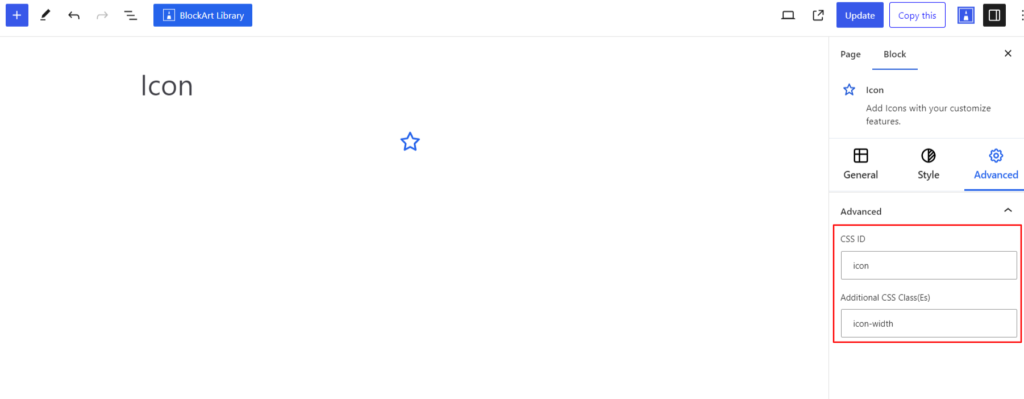
Advanced #
Under the option, you can set the CSS ID and Classes for the Icon block. The available options are listed below:
- CSS ID – It allows you to set specific IDs to style this particular block. Once you have set the ID, you can write the CSS Code to style the block using that particular ID.
- Additional CSS Class(es) – It allows you to add a CSS class to your block and write custom CSS to style this particular block.
After creating the separate ID and Classes, visit your CSS editor and write a style for the ID and class.


