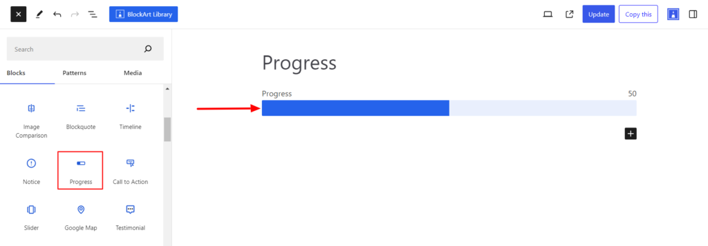
The Progress Block allows you to display data on how much progress has been made with a certain task or skill. It presents the data in a horizontal bar or circle, depending on the user’s requirement.
After you have chosen the Progress block, you’ll get a block editing panel on the right-hand side. It has three options, i.e., General, Style, and Advanced. These options customize the design and other elements of the block. Let’s explore one by one below:
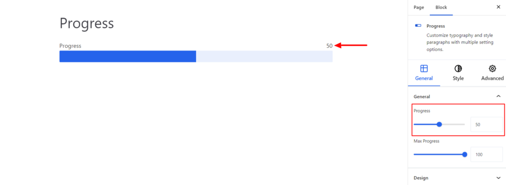
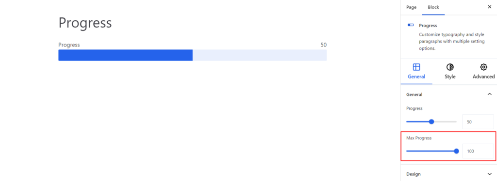
General #
General #
- Progress – Inside the option, you can set the value that denotes a task’s completion status. If you have completed half of the task, you can set the value to 50%, and so on.
- Max-progress – It is the reference point against which the current progress is measured. This value indicates the completeness or the endpoint of the task or project.
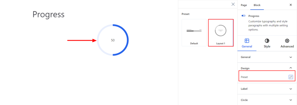
Design #
- Preset – The option lets you choose the progress bar to display either horizontally or in a circle.
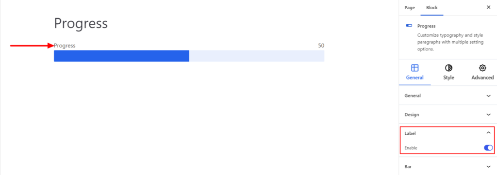
Label #
- Enable – Enabling the label will allow you to display the text above the progress bar.
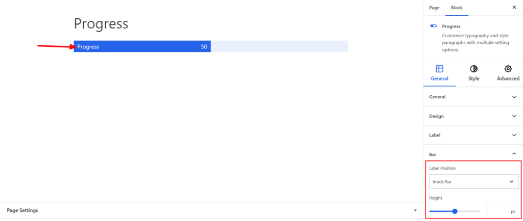
Bar #
- Label Position – You can set the label position to be outside or inside the progress bar.
- Height – It determines the height of the Label text.
Style #
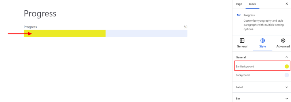
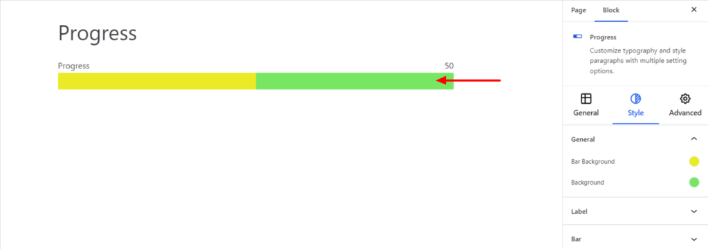
General #
- Bar Background – It sets the background of the progress bar.
- Background – It sets the background of the area beside the progress bar.
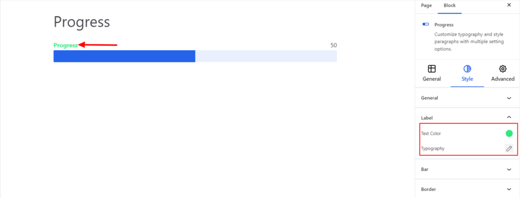
Label #
The options work for the label text and provide the following options:
- Text Color – It allows you to change the color of the label text.
- Typography – It controls the label text font family, weight, and font size.
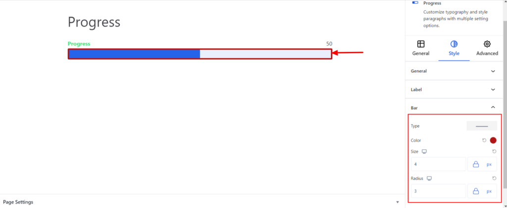
Bar #
It adds the border around the bar and comes up with the following options:
- Type – You can set the border type as Solid, Dotted, Dashed, Double, etc. Moreover, select the border type to be none if you do not want to add any borders.
When you select none, you will be given the following option:
- Radius – It allows you to fix the radius value to make the round corners for the border.
However, if you select the border type to be other than none, two more options will be added. The option is listed below:
- Color – It allows you to choose the appropriate border color.
- Size – It provides the option to select the border size.
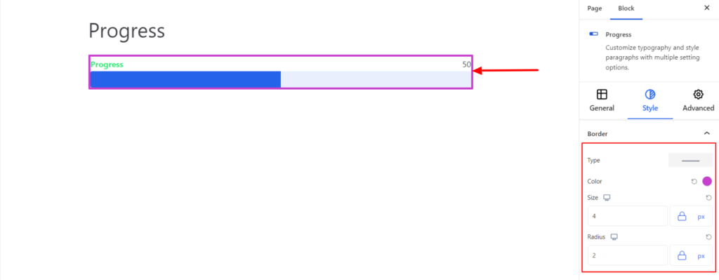
Border #
It adds the border around the progress bar and comes up with the following options:
- Type – You can set the border type as Solid, Dotted, Dashed, Double, etc. Moreover, select the border type to be None if you do not want to add any border.
When you select none, you will be given the following option:
- Radius – It allows you to fix the radius value to make the round corners of the border.
However, if you select the border type to be other than none, two more options will be added. The option is listed below:
- Color – It allows you to choose the appropriate border color.
- Size – It provides the option to select the border size.
Advanced #
The Advanced section consists of four options for the Progress Block.
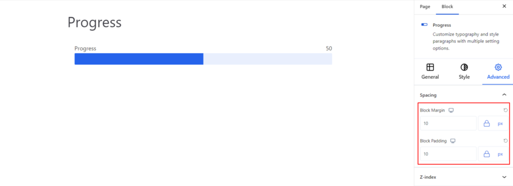
Spacing #
Under the spacing section, you can find the following options available:
- Block Margin – According to the site requirement, you can assign a specific margin value to the block along with units like px, em, %, and rem. Moreover, you can set the value of the different margins for various devices (Desktop, Tablet, and Mobile).
- Block Padding – According to the site requirement, you can assign a specific padding value to the block along with units like px, em, %, and rem. Moreover, you can set the different padding values for various devices (Desktop, Tablet, and Mobile).
Z-Index #
It allows you to set the priority of the Progress block according to the site requirement.
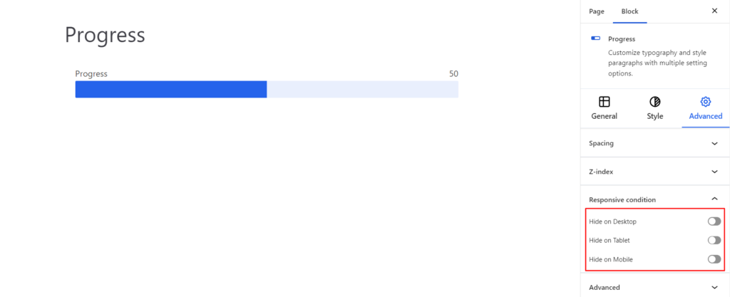
Responsive Condition #
Using the option, you can enable/disable displaying the Progress block on various screen sizes:
- Hide on Desktop – It hides the Progress block on the Desktop.
- Hide on Tablet – It hides the Progress block on the Tablet.
- Hide on Mobile – It hides the Progress Block on the Mobile.
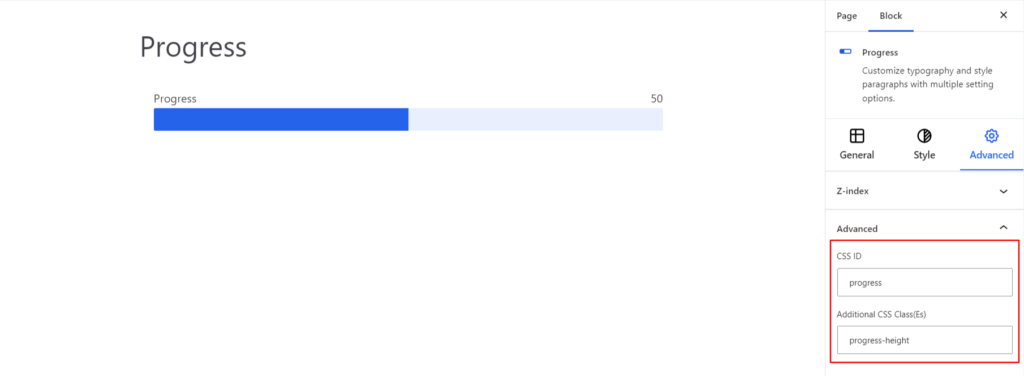
Advanced #
Under the option, you can set the CSS ID and Classes for this particular Progress block. The available options are listed below:
- CSS ID – It allows you to set specific IDs to style this particular block. Once you have set the ID, you can write the CSS Code to style the block using that particular ID.
- Additional CSS Class(es) – It allows you to add a CSS class to your block and write custom CSS to style this particular block.
After creating the separate ID and Classes, visit your CSS editor and write a style for the ID and class.


