By the name Counter, it determines the numeric value of anything. The Counter is generally added on the site to provide users with real-time updates, statistics, progress indicators, or other information in a visually engaging format. BlockArt plugin allows you to create a counter on your site using the Counter Block.
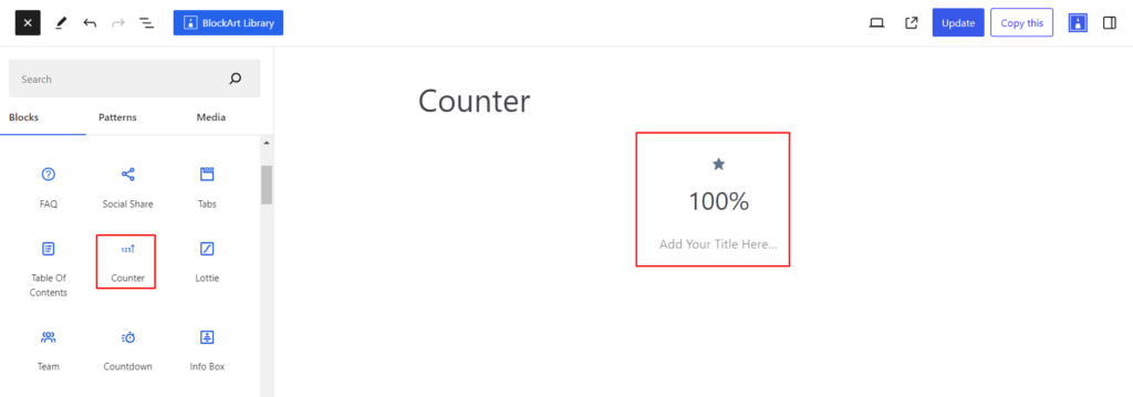
After you have chosen the Counter block, you’ll get a block editing panel on the right-hand side. It has three options, i.e., General, Style, and Advanced. These options customize the design and other elements of the block. Let’s explore one by one below:
General #
Layout #
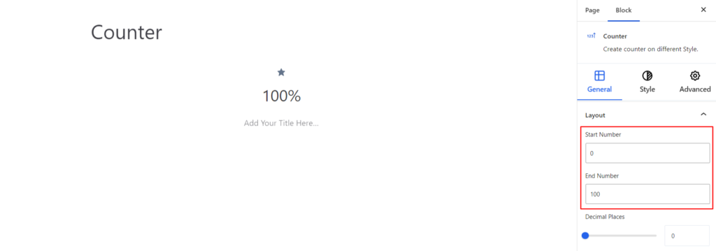
- Start Number – The Start Number refers to the initial numerical value from which counting begins.
- End Number – The End number refers to the final numeric value of the counter progresses.
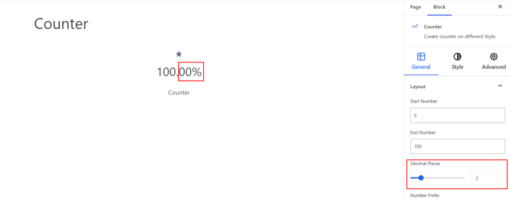
- Decimal Places – It refers to the number of digits to the right of the decimal point in a number. Basically, it is used to determine the precision and accuracy of the numerical value.
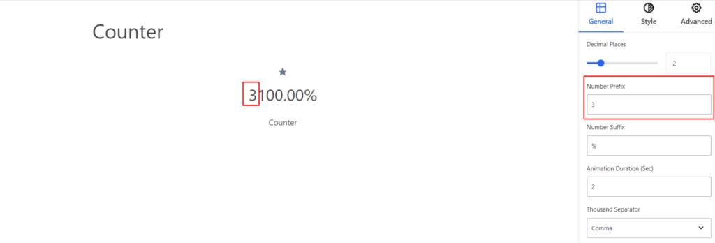
- Number Prefix – It adds a constant number before the actual counter value.
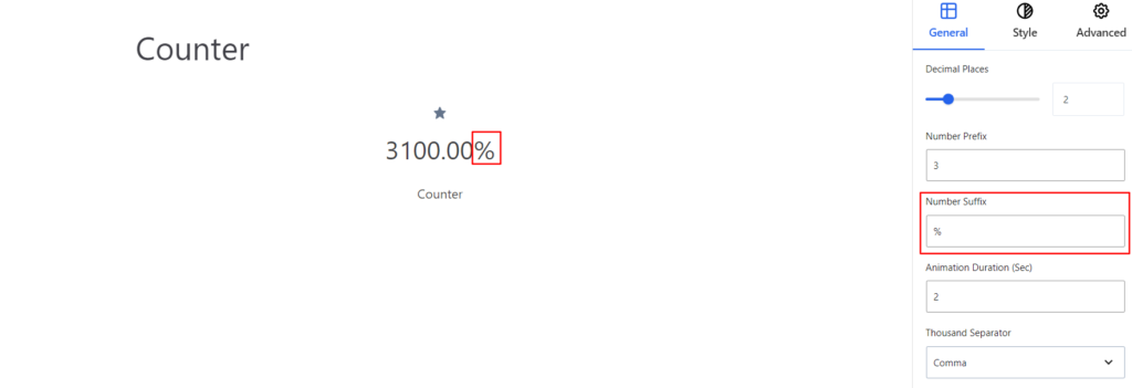
- Number Suffix – It adds a constant number after(end) the actual counter value.
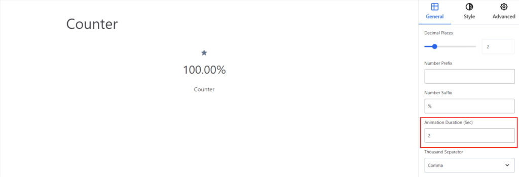
- Animation Duration – It determines the total time for the counter to display the final value and is measured in sec.
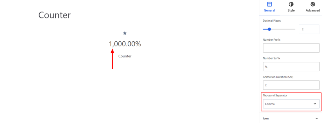
- Thousand Separator – The thousand separator separates a large digit number into a group of three. To distinguish the group a symbol is used such as Comma, Dot, White Space, etc. Using the option you can change the symbol that distinguishes the group of three (thousand).
Icon #
- Enable – Switch the Toggle to the right area to enable the Icon above the counter value. After you have enabled the icon, you can choose the icon that you want to display.
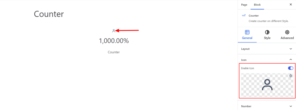
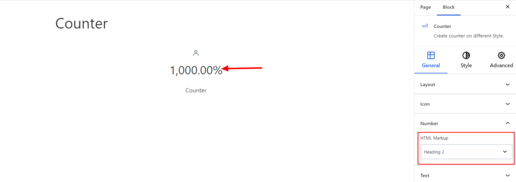
Number #
- HTML Markup – Under the Markup option, select the required markup for your counter number value. You can set the value to be in Heading, Paragraph, or Div.
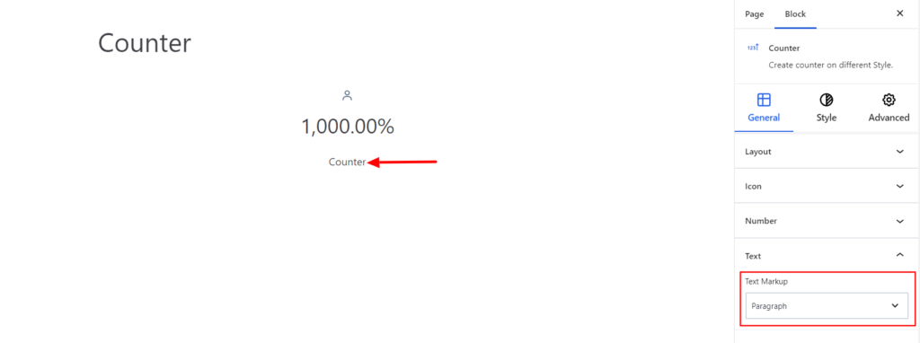
Text #
- Text Markup – Under the Markup option, select the required markup for your Title Text within the counter block. You can set the value to be in Heading, Paragraph, or Div.
Style #
It provides the following styling options for the Counter Block. These are listed below:
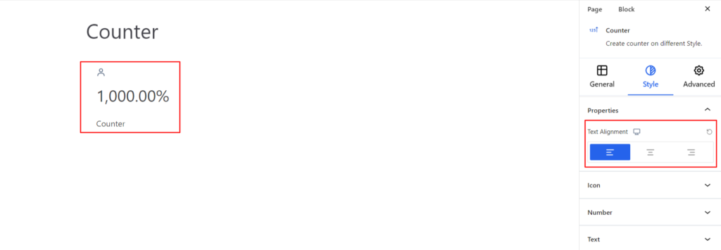
Properties #
- Text Alignment – It sets the alignments for the Counter Block. You can set the alignments as Left, Center, Right, and Justify. Moreover, you can also set the alignment position on different devices (Desktop, Tablet, and Mobile).
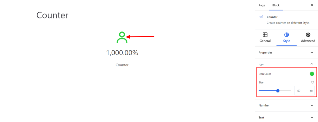
Icon #
The setting applies to the Icons and comes with the following options:
- Icon Color – It changes the color of the Icon.
- Size – It determines the size of the Icon.
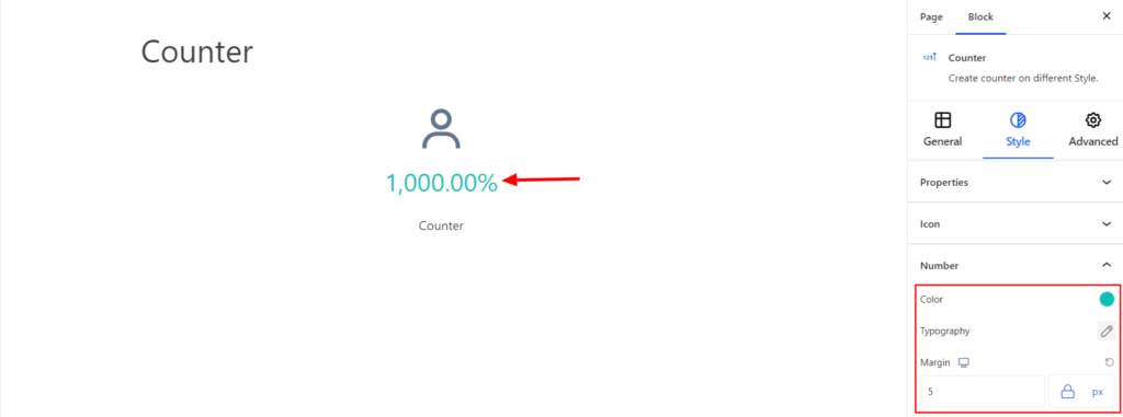
Number #
The setting applies to the Numeric Value of the Counter Block and comes with the following options:
- Color – It changes the color of the Numeric Value.
- Typography – It allows you to control the Typography, such as Font Family, Weight, Font size, Line height, and other related styling properties for the text. The options are listed below:
- Font Family – The option allows you to choose the appropriate font family for the number.
- Weight – It refers to the thickness or boldness of the number.
- Size – It controls the font size of the number.
- Line Height – It manages the space above and below the number.
- Letter Spacing – It controls the amount of space between characters in the number.
- Style – Using the property, you can set the number to be Italic or Oblique.
- Transformation – It changes the case of the numbers such as lowercase, uppercase, and capitalize.
- Decoration – The styling is applied to the number to make it more visually appealing. The options include underline, overline, and line through.
- Margin – It sets the space around the counter number. Moreover, you can set the space value to be different on various devices (Desktop, Tablet, and Mobile).
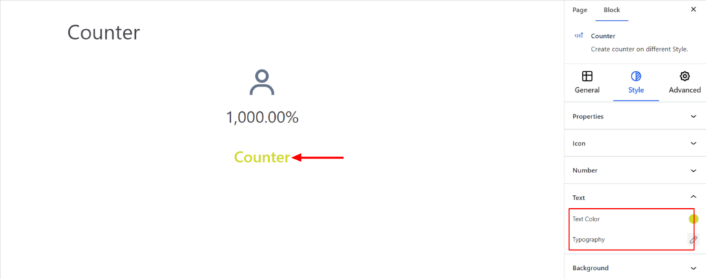
Text #
The settings work for the Text added on the block and come with the following options:
- Text Color – It changes the color of the Text.
- Typography – It controls the Text typography options, such as font family, font size, line spacing, and text Decoration.
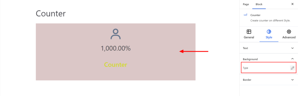
Background #
- Type – It sets the background color of the Counter Block. You can change the background’s visual appearance by changing its color or adding an image.
Border #
It customizes the Border area added around the Counter block and comes with the following options:
- Type – You can set the border type as Solid, Dotted, Dashed, Double, etc. Moreover, select None if you do not want to add any borders.
When you select none, you will be given the following option:
- Radius – It allows you to fix the radius value to make the round corners for the Counter Block.
However, if you select the border type to be other than none, two more options will be added. The option is listed below:
- Border Color – It allows you to choose the appropriate border color.
- Size – It provides the option to select the border size.
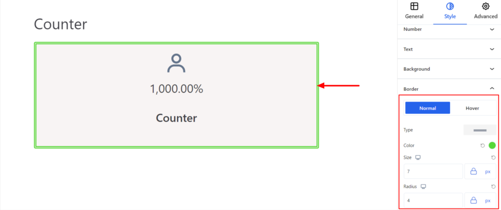
Note – You can apply the border settings option differently for Normal and Hover Modes.
Advanced #
The Advanced section consists of four customization options for the Counter Block.
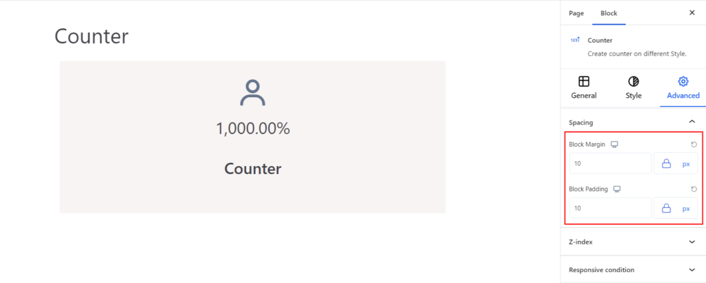
Spacing #
Under the spacing section, you can find the following options available:
- Block Margin – According to the site requirement, you can assign a specific margin value to the block along with units like px, em, %, and rem. Moreover, you can set different margin values for various devices (Desktop, Tablet, and Mobile).
- Block Padding – According to the site requirement, you can assign a specific padding value to the block along with units like px, em, %, and rem. Moreover, you can set different padding values for various devices (Desktop, Tablet, and Mobile).
Z-Index #
It allows you to set the priority of the counter block according to the site requirement.
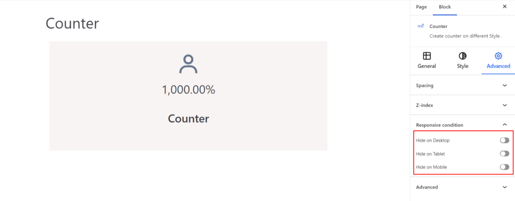
Responsive Condition #
Using the option, you can enable/disable displaying the block on various screen sizes:
- Hide on Desktop – It hides the Counter block on the Desktop.
- Hide on Tablet – It hides the Counter block on the Tablet.
- Hide on Mobile – It hides the Counter block on the Mobile.
Advanced #
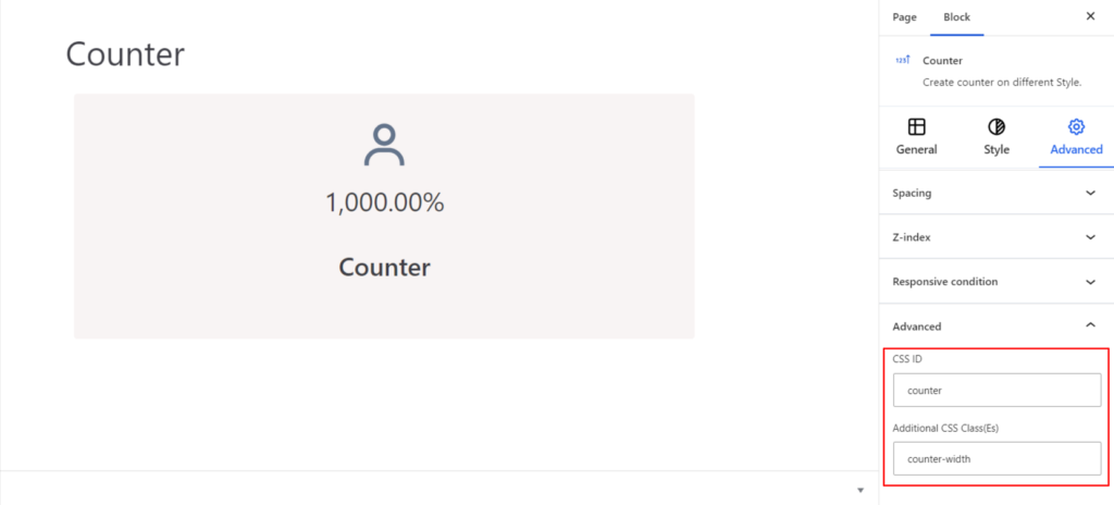
Under the option, you can set the CSS ID and Classes for the Counter Block. The available options are listed below:
- CSS ID – It allows you to set specific IDs to style to the title. Once you have set the ID, you can write the CSS Code to style the title using that particular ID.
- Additional CSS Class(es) – It allows you to add a CSS class to your block and write custom CSS to style the title.