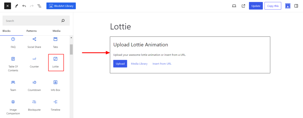
Lottie Block, provided by the BlockArt plugin, allows you to add the Lottie animation on your end. Moreover, you can customize the animation based on how it plays, control the speed, loops, etc.
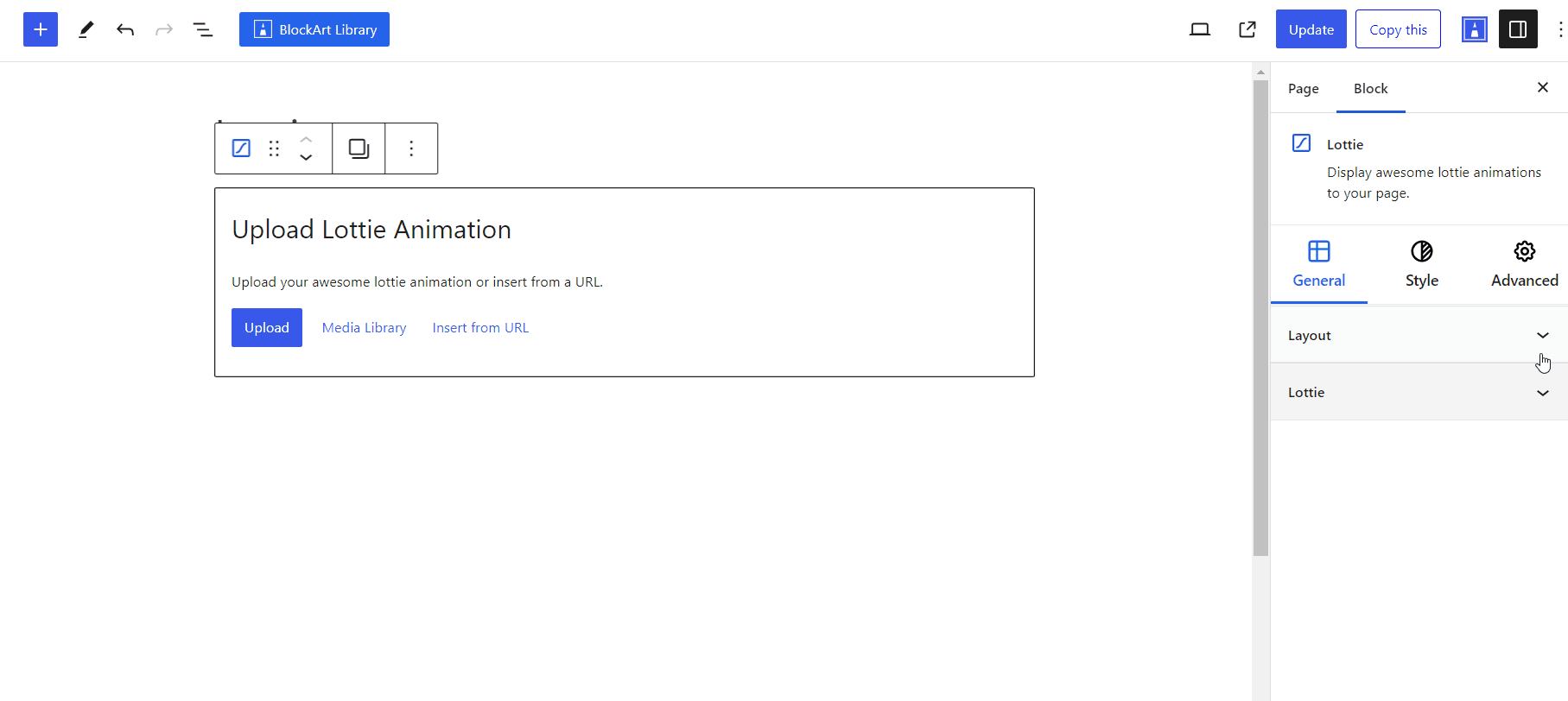
After you have chosen the Lottie block, you’ll get a block editing panel on the right-hand side. It has three options, i.e., General, Style, and Advanced. These options customize the design and other elements of the block. Let’s explore one by one below:
General #
Layout #
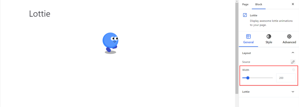
- Source – Under the option, you can upload the animation JSON file or add the URL of the JSON to display animations with the Lottie block. You can get the animation JSON URL via the link: https://lottiefiles.com/
- Width – It sets the width of the animation added.
Lottie #
- Play On – It refers to the triggering of an animation to play and comes up with the following options:
- Auto – It plays the animation automatically without the need for any external actions.
- Hover – It plays the animation on hover.
- ViewPort – It plays the animation when it enters the viewport.
- On Scroll – It plays the animation when the site is scrolled.
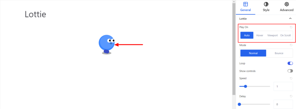
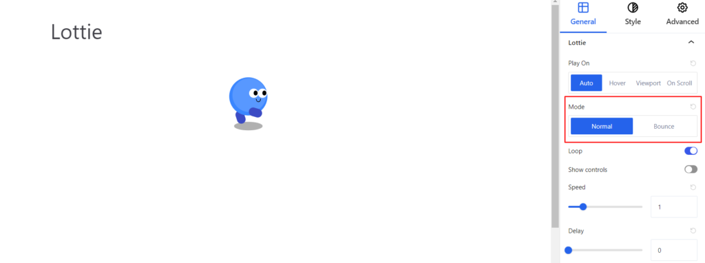
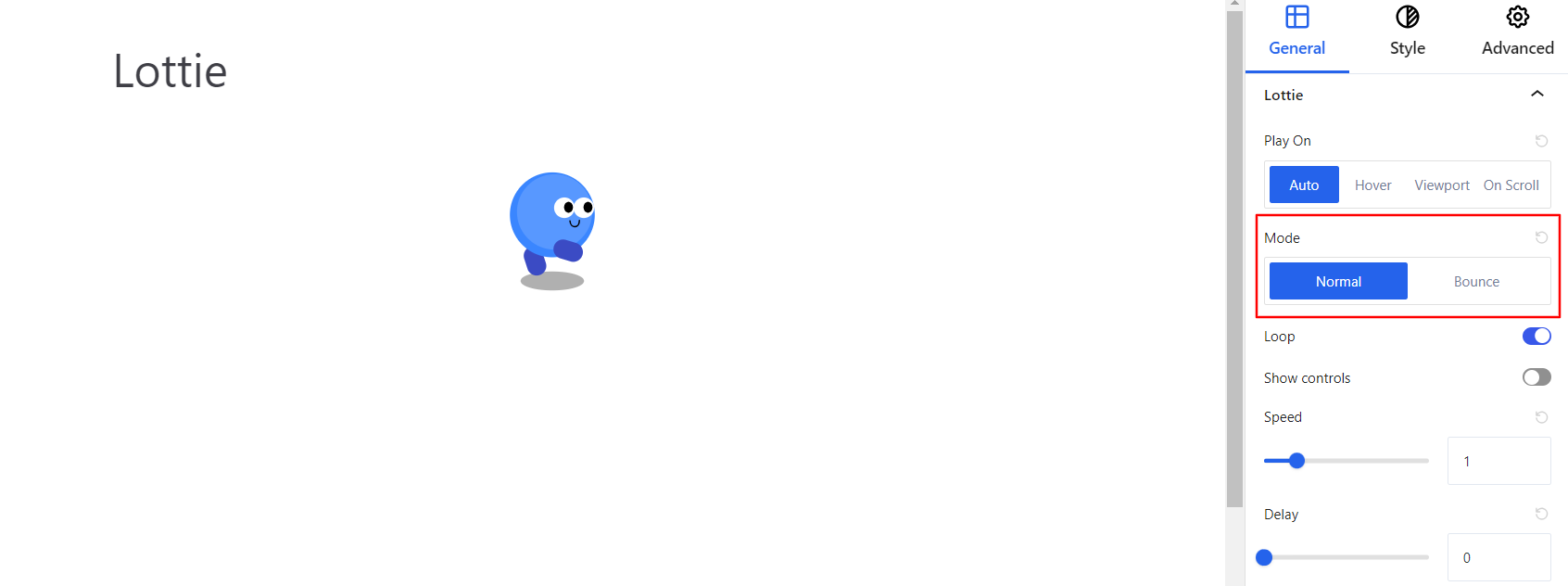
- Mode – It refers to a specific effect or alternation in the moment of animation and comes up with the following options:
- Normal – In this mode, the animation plays from start to finish without any external effects.
- Bounce – In this mode, when the animation reaches the end, instead of stopping, it overshoots slightly and then returns.
- Loop – Looping in animation refers to an animation’s ability to repeat itself continuously. Once the option is enabled, the animation plays from start to finish and then starts again from the beginning, creating a repetitive motion.
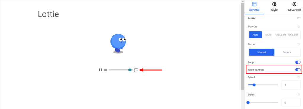
- Show Control – Enabling this option displays various animation controls, such as Play, Stop, Range, and Toggle.
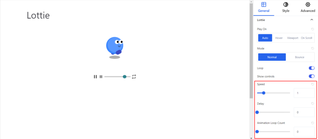
- Speed – It controls the speed of the animation, which determines how slowly or quickly the animation moves.
- Delay – It refers to the pause or waiting period between the start of an animation.
- Animation Loop Count – It refers to the number of times an animation should play before stopping.
Styling #
It provides the following styling options for the Block. These are listed below:
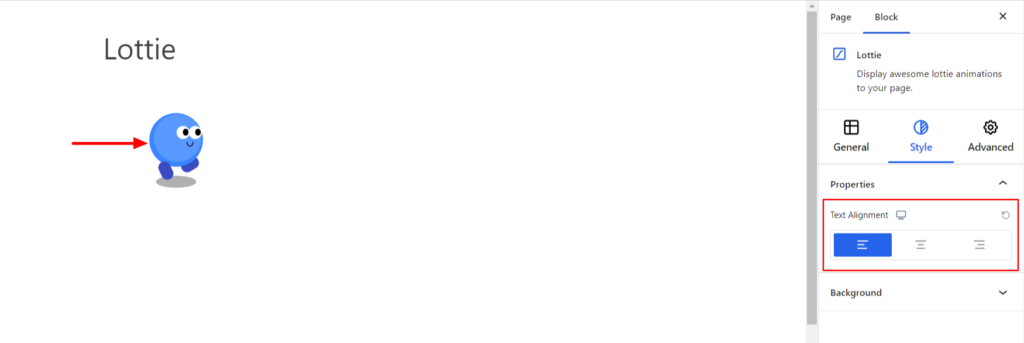
Properties #
- Alignment -It sets the alignments for the animation. You can set the alignments as Left, Center, Right, and Justify. Moreover, you can also set the alignment position on different devices (Desktop, Tablet, and Mobile).
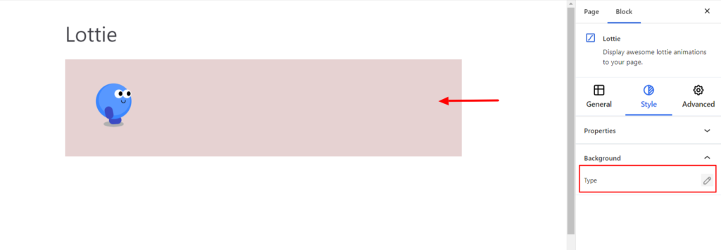
Background #
- Type – It sets the background color of the animation. You can change the visual appearance of the background by changing its color or adding an image. Moreover, you can set the different background colors on Normal and Hover Modes.
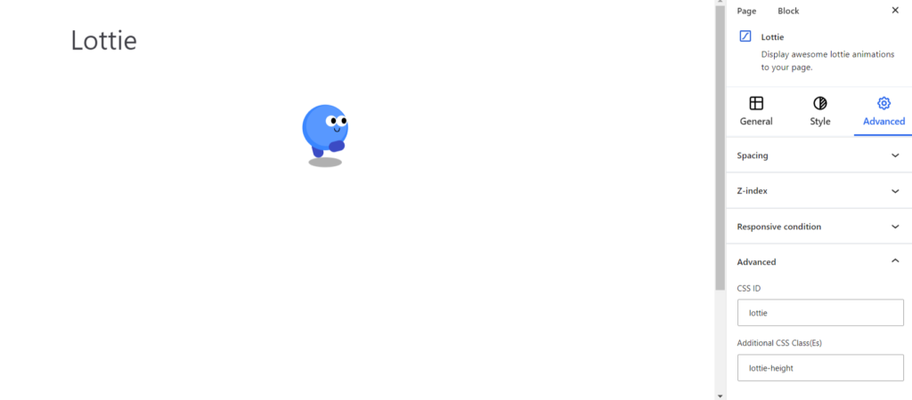
Advanced #
The Advanced section consists of four customization options for the Lottie Block.
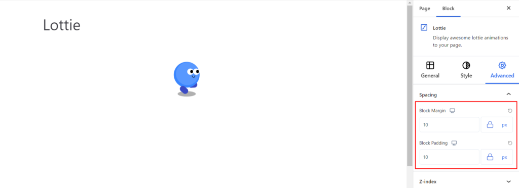
Spacing #
Under the spacing section, you can find the following options available:
- Block Margin – According to the site requirement, you can assign a specific margin value to the block along with units like px, em, %, and rem. Moreover, you can set different margin values for various devices (Desktop, Tablet, and Mobile).
- Block Padding – According to the site requirement, you can assign a specific padding value to the block along with units like px, em, %, and rem. Moreover, you can set different padding values for various devices (Desktop, Tablet, and Mobile).
Z-Index #
It allows you to set the priority of the Lottie block according to the site requirement.
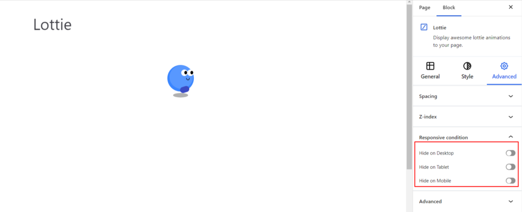
Responsive Condition #
Using the option, you can enable/disable displaying the block on various screen sizes:
- Hide on Desktop – It hides the Lottie block on the Desktop.
- Hide on Tablet – It hides the Lottie block on the Tablet.
- Hide on Mobile – It hides the Lottie block on the Mobile.
Advanced #
Under the option, you can set the CSS ID and Classes for this particular Lottie block. The available options are listed below:
- CSS ID – It allows you to set specific IDs to style this particular block. Once you have set the ID, you can write the CSS Code to style the block using that particular ID.
- Additional CSS Class(es) – It allows you to add a CSS class to your block and write custom CSS to style this particular block.
After creating the separate ID and Classes, visit your CSS editor and write a style for the ID and class.


