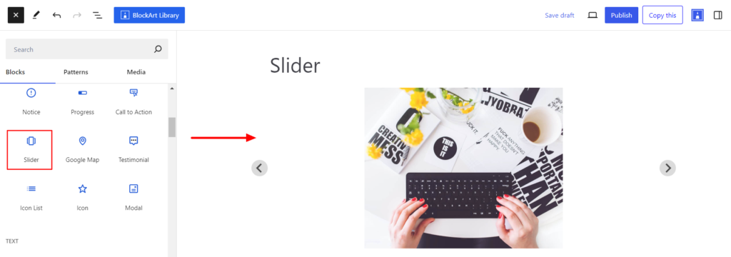
The Slider Block allows displaying the content in the slider on the site page and posts. Moroever, the block provides options to select content to display in the slider, as well as settings to customize the slider’s appearance and behavior, such as autoplay, navigation arrows, etc.
After you have chosen the Slider Block, you’ll get a block editing panel on the right-hand side. It has three options: General, Style, and Advanced. These options customize the design and other elements of the block. Let’s explore one by one below:
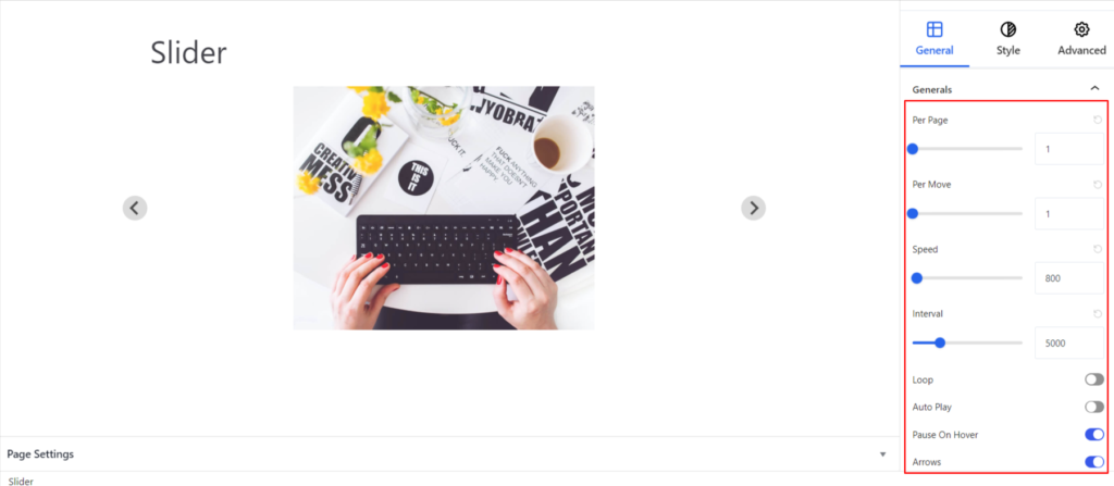
General #
General #
- Per Page – It determines the number of slides displayed on a page.
- Per Move – It determines the number of slides the slider will move each time the navigation controls (like arrows or dots) are clicked.
- Speed – It determines the speed of the slider on rotation.
- Interval – It determines how long each slide is displayed before the slider moves to the next slide automatically.
- Loop – Loop in slider refers to a slider’s ability to repeat itself continuously. Once the option is enabled, the slider plays from start to finish and then starts again from the beginning, creating a repetitive motion.
- Autoplay – It slides the slider automatically without the need for any external actions.
- Pause on Hover – It stops/pauses the slider while hovering on it.
- Arrows – Enabling the arrow displays the icons (left and right) that help manually move the slider forward and backward.
- Pagination – It adds dot icons to the slider area that indicate the current slide position and number of total slides in the slider.
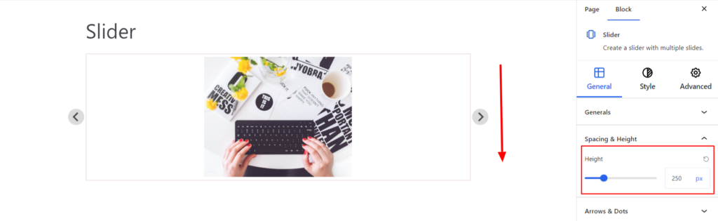
Spacing & Height #
- Height – It determines the height of the slider.
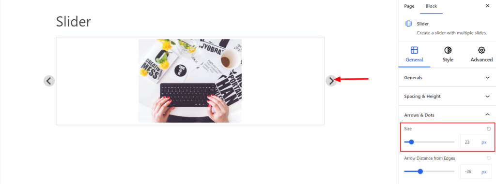
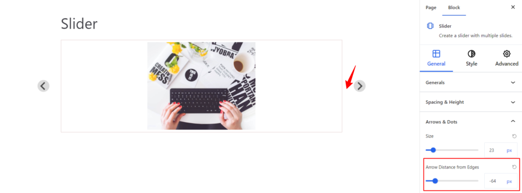
Arrows and Dots #
- Size – It determines the size of the arrow icon.
- Arrow Distance from Edges – It determines the distance between the arrow icon and the slider image.
Style #
Under the style settings, you’ll find the following options available:
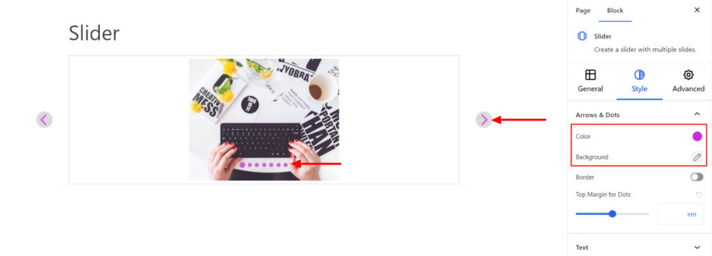
Arrows & Dots #
- Color – It allows you to change the color of the arrow and dots.
- Background – It sets the background color of the arrow.
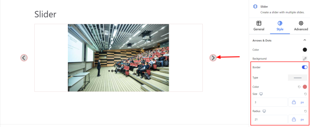
- Border – It customizes the Border area added around the arrow and comes with the following options:
- Type – You can set the border type as Solid, Dotted, Dashed, Double, etc. Moreover, select the border type to be None if you do not want to add any border. When you select none, you will be given the following option:
- Radius – It allows you to fix the radius value to make the round corners.
- Type – You can set the border type as Solid, Dotted, Dashed, Double, etc. Moreover, select the border type to be None if you do not want to add any border. When you select none, you will be given the following option:
However, if you select the border type to be other than none, two more options will be added. The option is listed below:
- Border Color – It allows you to choose the appropriate border color.
- Size – It provides the option to select the border size.
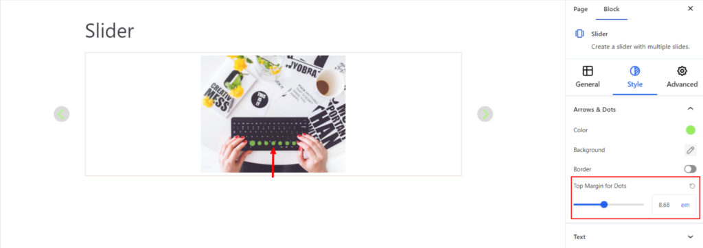
- Top Margins for Dots – It sets the top margin value for the dots/pagination added to the slider.
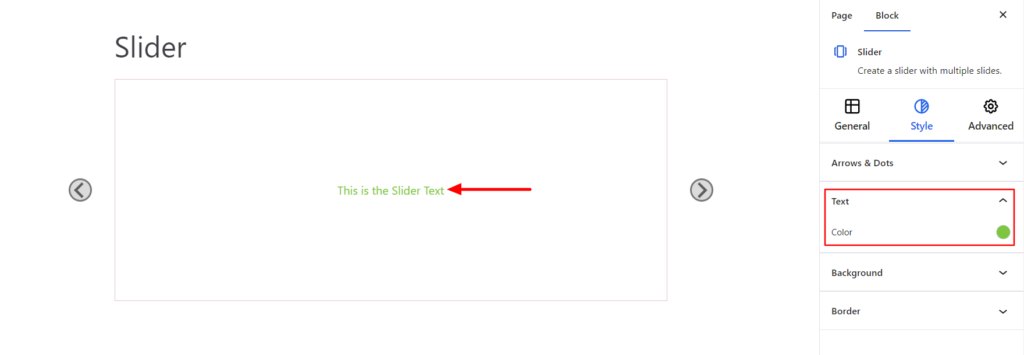
Text #
- Color – It allows changing the text color added to the slider.
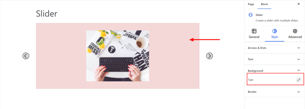
Background #
- Type – It sets the background color of the slider.
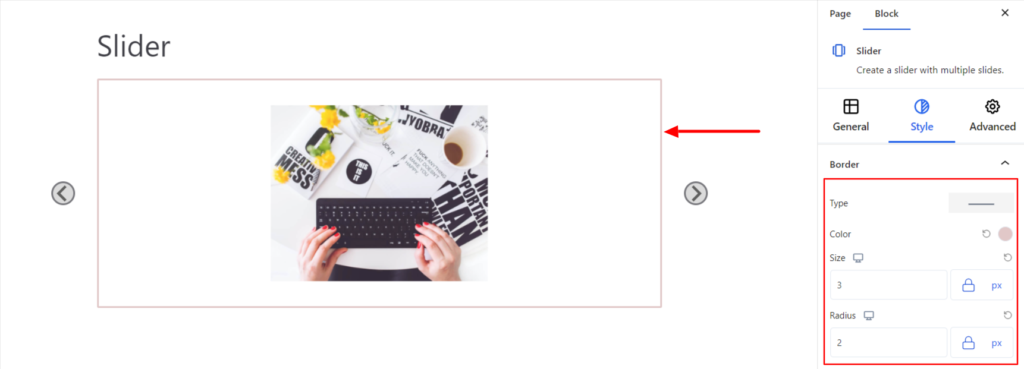
Border #
It customizes the Border area added around the Slider and comes with the following options:
- Type – You can set the border type as Solid, Dotted, Dashed, Double, etc. Moreover, select the border type to be None if you do not want to add any border. When you select none, you will be given the following option:
- Radius – It allows you to fix the radius value to make the round corners for the border.
However, if you select the border type to be other than none, two more options will be added. The option is listed below:
- Border Color – It allows you to choose the appropriate border color.
- Size – It provides the option to select the border size.
Advanced #
The Advanced section consists of four customization options for the Slider Block.
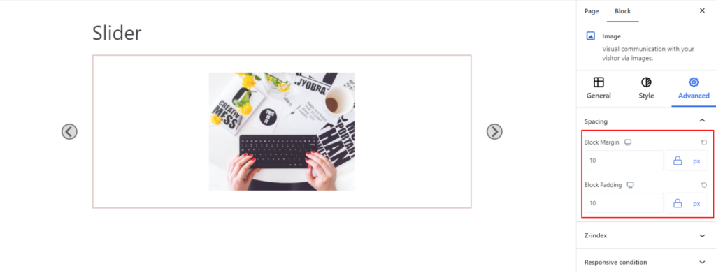
Spacing #
Under the spacing section, you can find the following options available:
- Block Margin – According to the site requirement, you can assign a specific margin value to the block along with units like px, em, %, and rem. Moreover, you can set different margin values for various devices (Desktop, Tablet, and Mobile).
- Block Padding – According to the site requirement, you can assign a specific padding value to the block along with units like px, em, %, and rem. Moreover, you can set different padding values for various devices (Desktop, Tablet, and Mobile).
Z-Index #
It allows you to set the priority of the Slider block according to the site requirement.
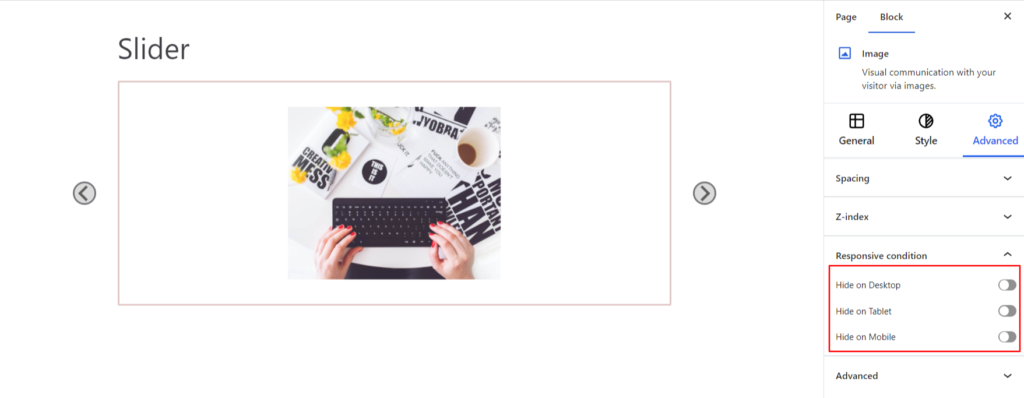
Responsive Condition #
Using the option, you can enable/disable displaying the block on various screen sizes:
- Hide on Desktop – It hides the Slider block on the Desktop.
- Hide on Tablet – It hides the Slider block on the Tablet.
- Hide on Mobile – It hides the Slider block on the Mobile.
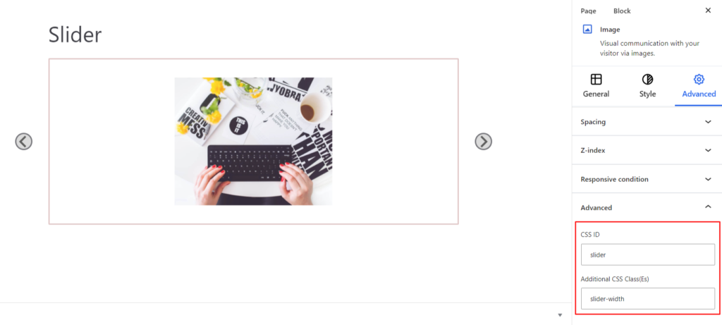
Advanced #
Under the option, you can set the CSS ID and Classes for this particular Slider block. The available options are listed below:
- CSS ID – It allows you to set specific IDs to style this particular block. Once you have set the ID, you can write the CSS Code to style the block using that particular ID.
- Additional CSS Class(es) – It allows you to add a CSS class to your block and write custom CSS to style this particular block.
After creating the separate ID and Classes, visit your CSS editor and write a style for the ID and class.