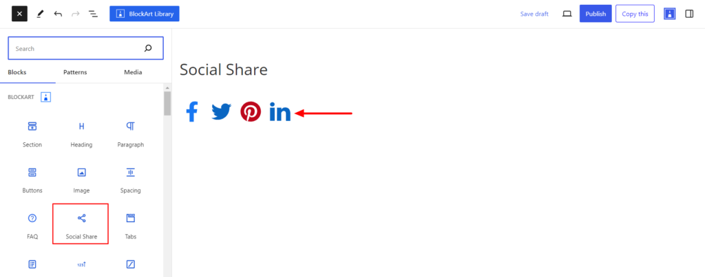
The Social Share block allows you to share the site content directly to different social media profiles. Adding Social Share Icons allows users to easily distribute website content across various social media platforms, enhancing visibility and engagement.
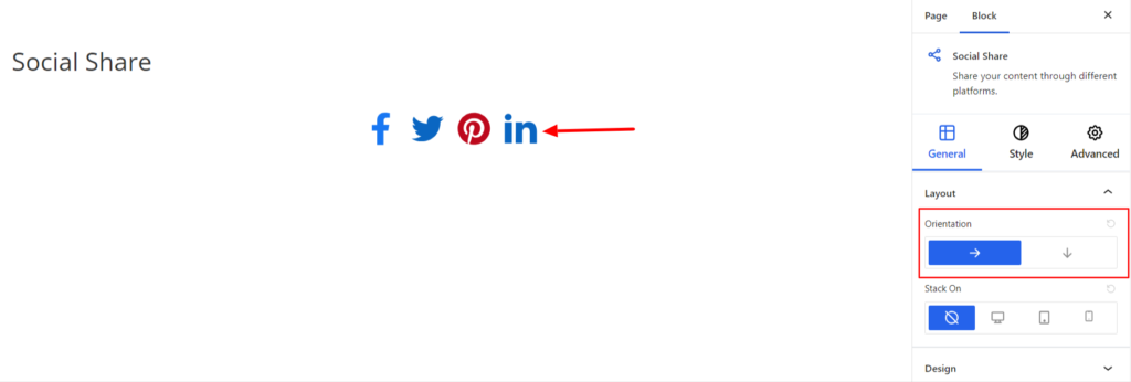
After you have chosen the Social Share block, you’ll get a block editing panel on the right-hand side. It has three options, i.e., General, Style, and Advanced. These options customize the design and other elements of the block. Let’s explore one by one below:
General #
It provides the following customization options for the Social Share Block.
Layout #
- Orientation – It allows the display of the icons horizontally or vertically. However, choosing the horizontal layout for the Social Share Block might make it look wide on responsive devices. So, we have added the Stack-On option, which allows icons to be stacked on responsive devices.
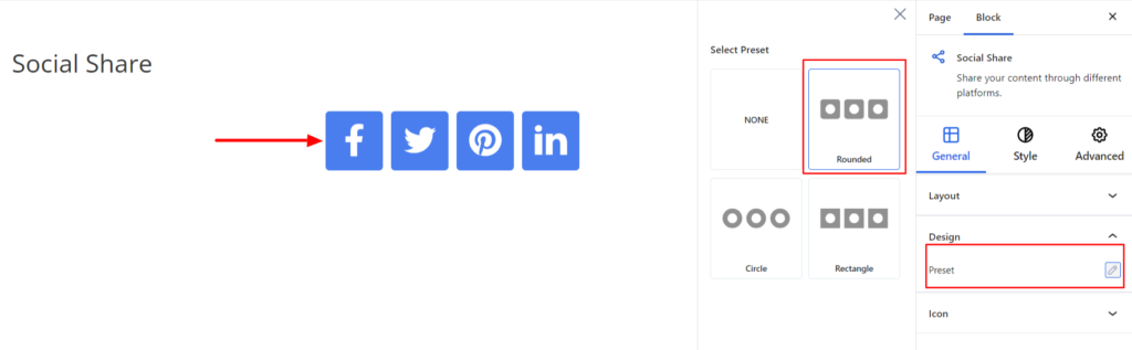
Design #
- Preset – It changes the design of the Social Share Block. The Social Icons can be displayed either in Rectangular, Rounded, or Circle depending on your requirements.
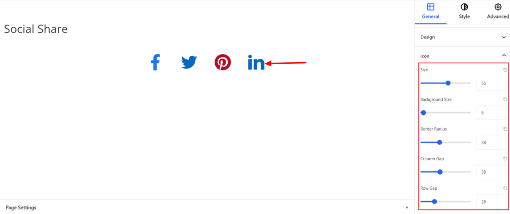
Icon #
The setting applies for the social icons and comes with the following options:
- Size – It determines the size of the social icon.
- Background Size – It adjusts the background size of social icons.
- Border Radius – It sets the Curve of the border on the corners of the box. You can move the slider to the right area to increase the radius value.
- Column Gap – It sets the distance between the Social Share Block and other blocks added around it.
- Row Gap – It determines the space between the social Icons block when set vertically.
Style #
It provides the following styling options for the Social Share Block. These are listed below:
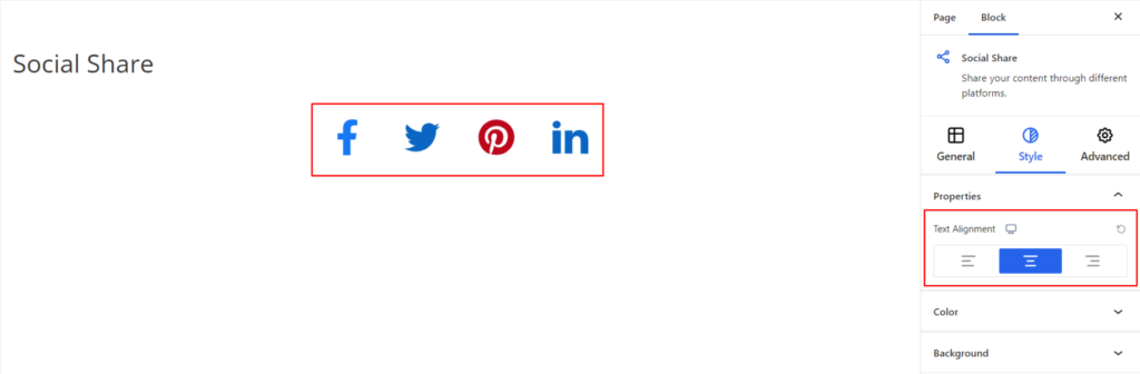
Properties #
- Text Alignment – It sets the alignments for the Social Share Block. You can set the alignments as Left, Center, and Right. Moreover, you can also set the alignment position on different devices (Desktop, Tablet, and Mobile).
Color #
It changes the color of the Social Icons. You can set the different colors on Normal and Hover Modes.
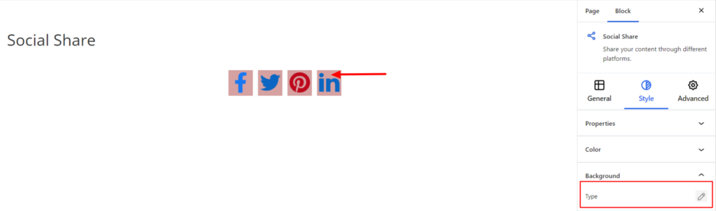
Background #
- Type – It sets the background color of the Social Icons Block. You can change the visual appearance of the background by changing its color or adding an image. Moreover, you can set the different background colors on Normal and Hover Modes.
Advanced #
The Advanced section consists of four customization options for the Social Share Block.
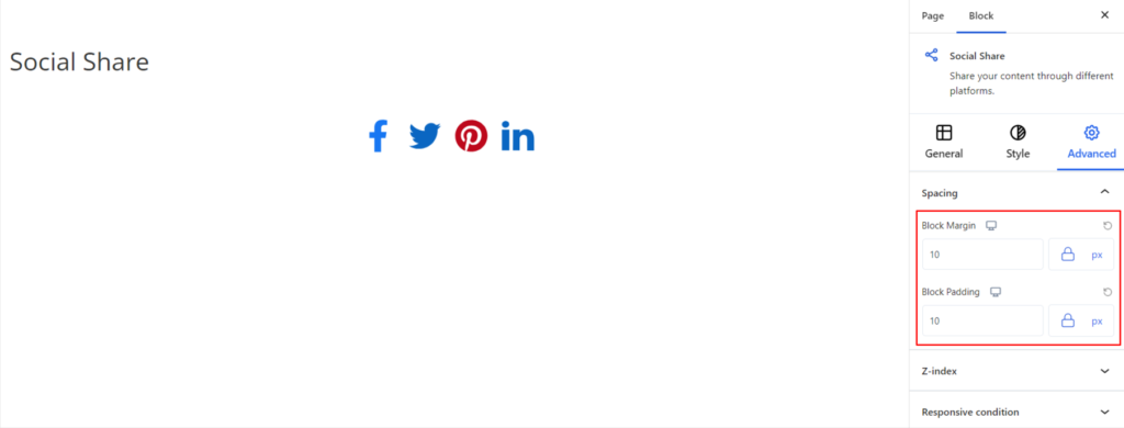
Spacing #
Under the spacing section, you can find the following options available:
- Block Margin – According to the site requirement, you can assign a specific margin value to the block along with units like px, em, %, and rem. Moreover, you can set different margin values for various devices (Desktop, Tablet, and Mobile).
- Block Padding – According to the site requirement, you can assign a specific padding value to the block along with units like px, em, %, and rem. Moreover, you can set different padding values for various devices (Desktop, Tablet, and Mobile).
Z-Index #
It allows you to set the priority of the Social Share block according to the site requirement.
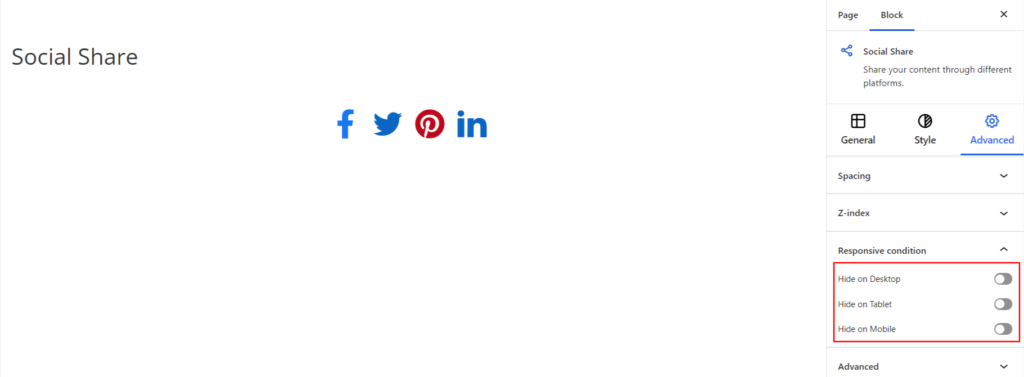
Responsive Condition #
Using the option, you can enable/disable displaying the block on various screen sizes:
- Hide on Desktop – It hides the Social Share block on the Desktop.
- Hide on Tablet – It hides the Social Share block on the Tablet.
- Hide on Mobile – It hides the Social Share Block on the Mobile.
Advanced #
Under the option, you can set the CSS ID and Classes for this particular Social Share block. The available options are listed below:
- CSS ID – It allows you to set specific IDs to style this particular block. Once you have set the ID, you can write the CSS Code to style the block using that particular ID.
- Additional CSS Class(es) – It allows you to add a CSS class to your block and write custom CSS to style this particular block.
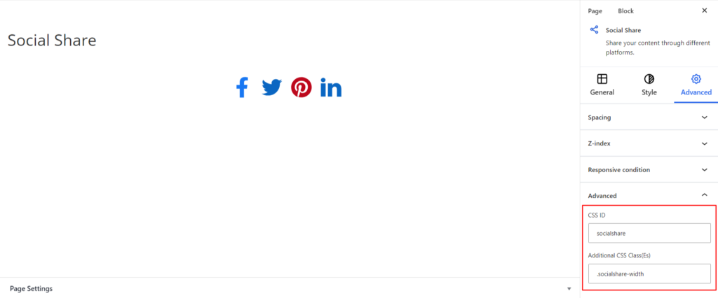
After creating the separate ID and Classes, visit your CSS editor and write a style for the ID and class.
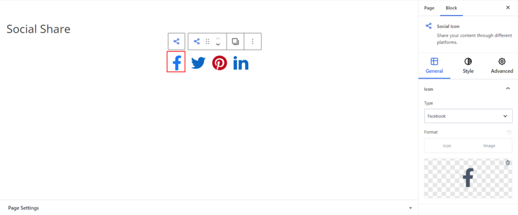
Individual Social Icon #
The above setting applies to all the social icons added to your site. However, if you want to make changes to the specific social icon block, the plugin allows you to do so. The settings are listed below:
Note – In the guideline below, I have provided an example of a Facebook Icon. You can follow a similar method for customizing other social icons.
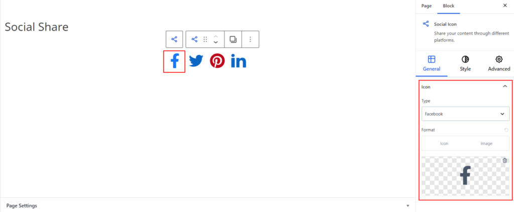
If you click on the Facebook Icon, you’ll get a block editing panel on the right-hand side. It has three options, i.e., General, Style, and Advanced. Let’s explore one by one below:
General #
Icon #
It comes with the following option for customizing the Icons added:
- Type – It determines the types of social media like Facebook, Instagram, Linkedin, and so on.
- Format – In order to display the social icons, you can either use the Image or the Icons provided by the plugin.
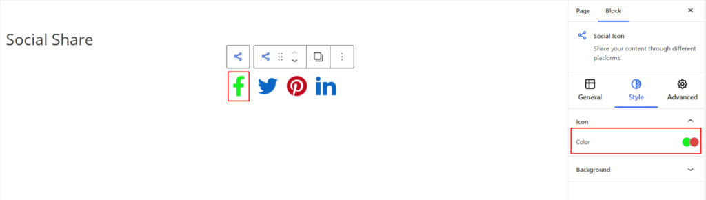
Style #
It provides the following styling options for the Individual Social Share Block. These are listed below:
Icon #
- Color – It changes the color of the Social Icons. You can set the different colors on Normal and Hover Modes.
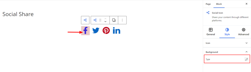
Background #
- Type – It sets the background color of the individual Social Icons Block. You can change the background’s visual appearance by changing its color or adding an image. Moreover, you can set different background colors in Normal and Hover Modes.
Advanced #
The Advanced section consists of four customization options for the specific social icon.
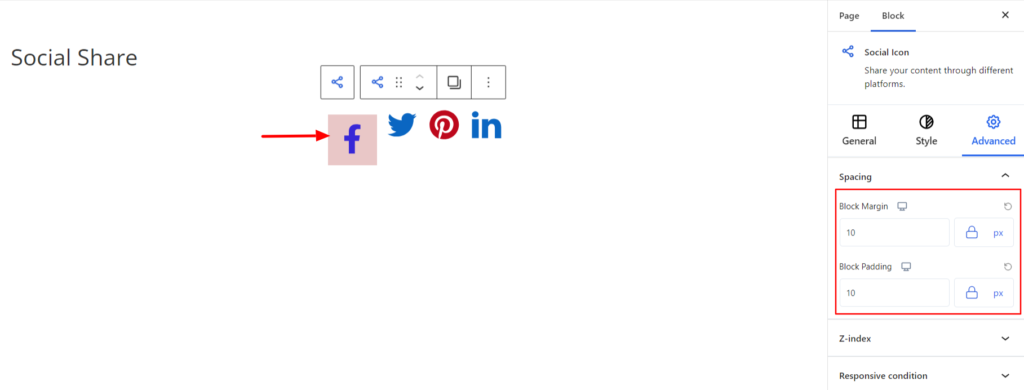
Spacing #
Under the spacing section, you can find the following options available:
- Block Margin – According to the site requirement, you can assign a specific margin value to the block along with units like px, em, %, and rem. Moreover, you can set the values of the different margins for various devices (Desktop, Tablet, and Mobile).
- Block Padding – According to the site requirement, you can assign a specific padding value to the block along with units like px, em, %, and rem. Moreover, you can set different padding values for various devices (Desktop, Tablet, and Mobile).
Z-Index #
It allows you to set the priority of each Social Icon according to the site requirement.
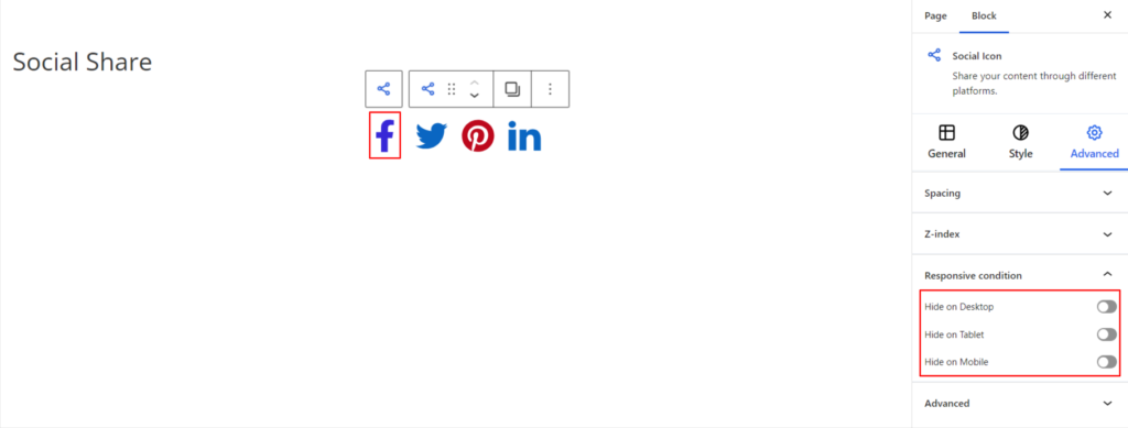
Responsive Condition #
Using the option, you can enable/disable displaying the individual icon on various screen sizes:
- Hide on Desktop – It hides the chosen icon on the Desktop.
- Hide on Tablet – It hides the chosen icon on the Tablet.
- Hide on Mobile – It hides the chosen icon on the Mobile.
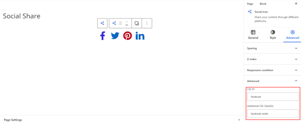
Advanced #
Under the option, you can set the CSS ID and Classes for the particular social icon. The available options are listed below:
- CSS ID – It allows you to set specific IDs to style the specific icon. Once you have set the ID, you can write the CSS Code to style the icon using that particular ID.
- Additional CSS Class(es) – It allows you to add a CSS class to the specific icon and write custom CSS to style for it.


