A Modal Block allows you to create a modal window or pop-up box on a webpage. It’s the perfect block for displaying conditional content like signup forms, notifications, etc, that gets presented in a popup window without redirecting to a new page.
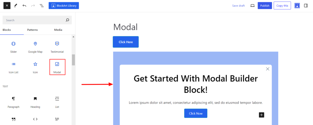
After you have chosen the Modal Block, you’ll get a block editing panel on the right-hand side. It has three options: General, Style, and Advanced. These options customize the design and other elements of the block. Let’s explore one by one below:
General #
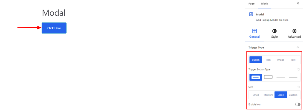
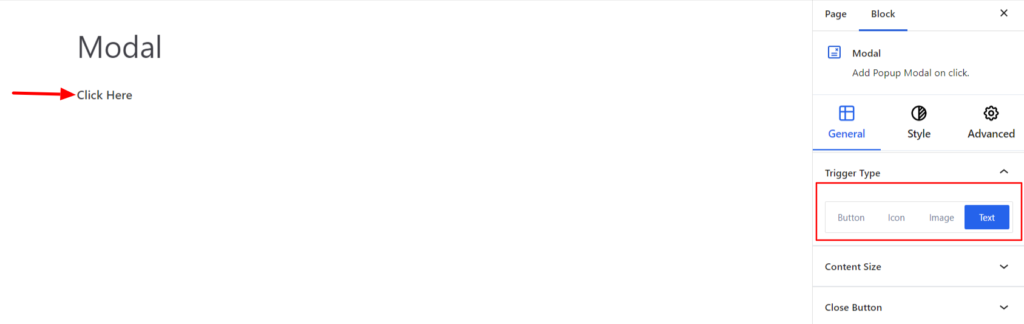
Trigger Type #
It refers to the specific action type that displays the popup window upon clicking. With the Modal Plugin, you can find four Trigger types listed below:
- Button – Using the Button Trigger, clicking on the Button will display the popup window. Moreover, you can choose different button types and determine their style. You can also add icons to the buttons.
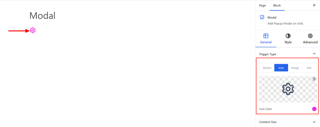
- Icon – You can also use the icon to display the popup window. Choose the appropriate icon from the Icon library and set the appropriate color for the icon.
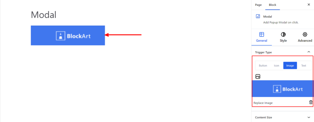
- Image – The block also supports displaying the popup window by clicking an image. Choose an appropriate image according to your site requirement and click on the image to display popup window.
- Text – You can add the text to display the popup window after clicking on it.
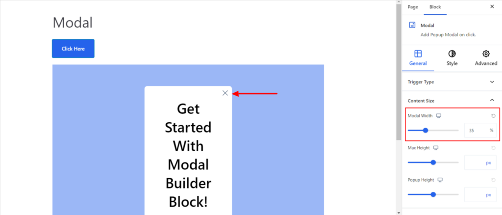
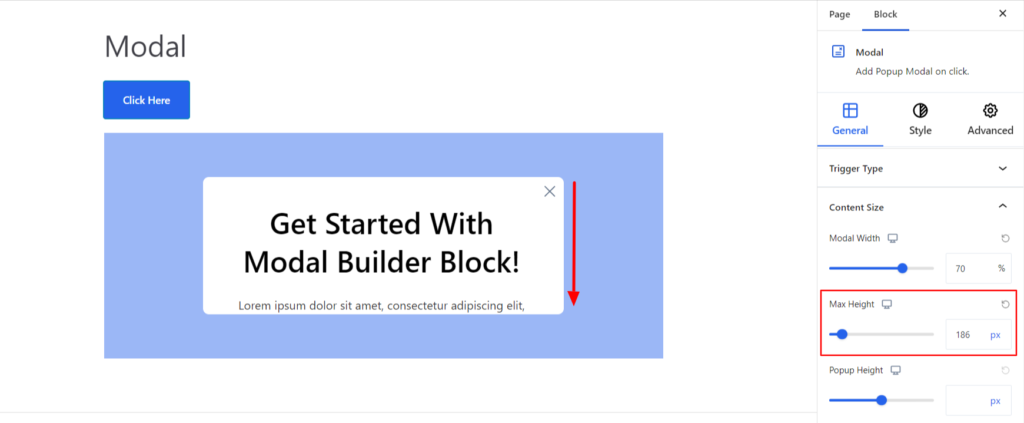
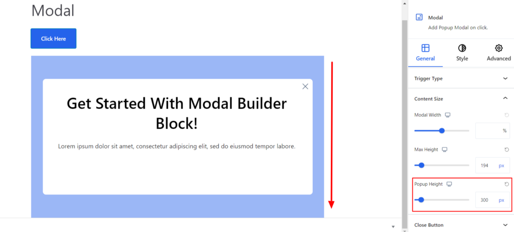
Content Size #
It manages the popup window content size and comes up with the following options:
- Modal Width – It determines the width of the modal, i.e., content area appearing inside the popup window. Moreover, you can set the width of the box to be different depending on the device, i.e., desktop, tablet, or mobile.
- Max Height – It determines the height of the modal i.e content area appearing inside the popup window. Moreover, you can also set the height of the box to be different depending on the device, i.e., desktop, tablet, or mobile.
- Popup Height – It determines the height of the popupbox. Moreover, you can also set the height of the box to be different depending on the device, i.e., desktop, tablet, or mobile.
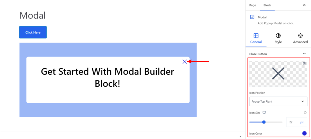
Close Button #
It customizes the close icon appearing on the popup window and comes up with the following options:
- Change Icon – By default, a close icon is displayed, but you can change the icon depending on your site’s requirements.
- Icon Position – You can set the icon to be displayed on either the left or right side.
- Icon Size – It determines the size of the social icon. Moreover, you can change the size of the icon to be different depending on the device, i.e., desktop, tablet, or mobile.
- Icon Color – It allows you to choose the appropriate color for the cross icon added.
Style #
It provides the following styling options for the Modal Block. These are listed below:
Properties #
- Alignment – It sets the alignments for the Trigger Style. You can set the alignments as Left, Center, or Right. Moreover, you can also set the alignment position on different devices (Desktop, Tablet, and Mobile).
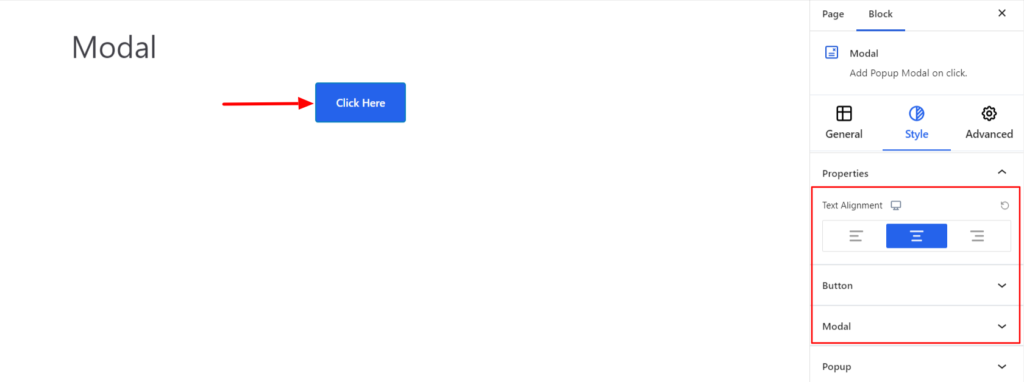
Button/Text #
Depending on the Trigger type, you’ll get each styling option. If you choose the button, styling options will be available. Likewise, if you choose text, you’ll get styling options for the text.
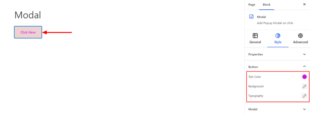
For the Button Trigger type, the following options are available:
- Text Color – It changes the Text Color of the button.
- Background – It sets the background color of the Button. You can change the visual appearance of the background by changing its color or adding an image.
- Typography – It allows you to control the button text typography, such as font family, weight, font size, line height, and other related styling properties for the text. The options are listed below:
- Family – The option allows you to choose the appropriate font family for the button text.
- Weight – It refers to the thickness or boldness of the button text.
- Size – It controls the font size of the button text.
- Line Height – It manages the space above and below the button text.
- Letter Spacing – It controls the amount of space between characters in the button text.
- Style – Using the property, you can set the button text to be Italic or Oblique.
- Transformation – It changes the case of the text, such as lowercase, uppercase, and capitalize.
- Decoration – The styling is applied to the button text to make it more visually appealing. The options include underlining, overlining, and line-through.
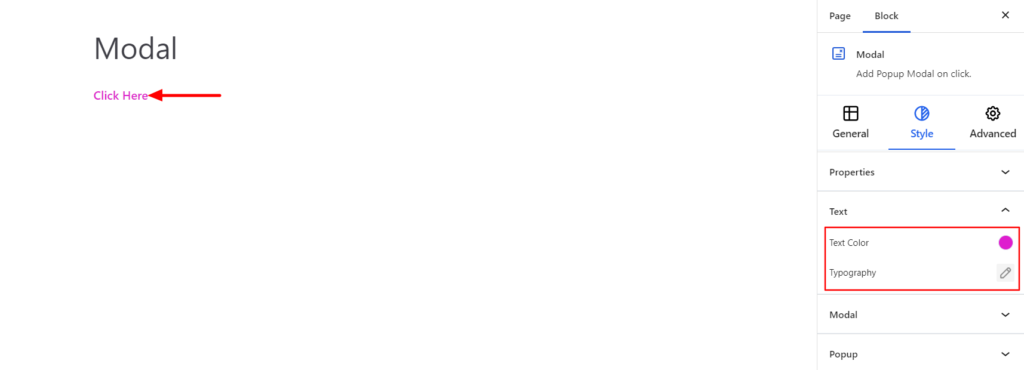
For the Text Trigger type, the following styling options are available:
- Text Color – It changes the color of the text.
- Typography – It allows you to control the text’s typography, such as font family, weight, font size, line height, and other related styling properties for the text.
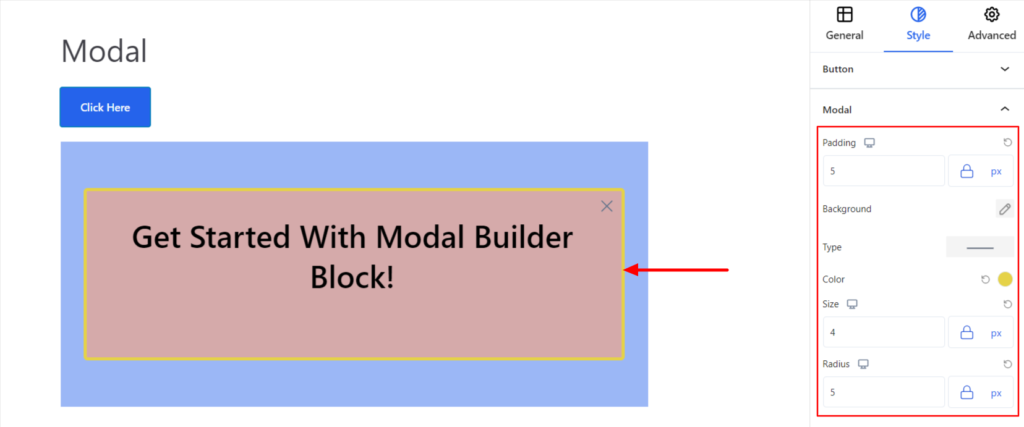
Modal #
It changes the styling of the Modal appearing inside the popup window and comes up with the following options:
- Padding – It sets the padding value around the content of the text. Moreover, you can also set the padding value to be different on different devices (Desktop, Tablet, and Mobile).
- Background – It sets the background color of the modal box. You can change the visual appearance of the background by changing its color or adding an image.
- Border – It customizes the Border area added around the Modal box and comes with the following options:
- Type – You can set the border type as Solid, Dotted, Dashed, Double, etc. Moreover, select the border type to be None if you do not want to add any borders.
When you select none, you will be given the following option:
- Radius – It allows you to fix the radius value to make the round corners for borders.
However, if you select the border type to be other than none, two more options will be added. The option is listed below:
- Border Color – It allows you to choose the appropriate border color.
- Size – It provides the option to select the border size.
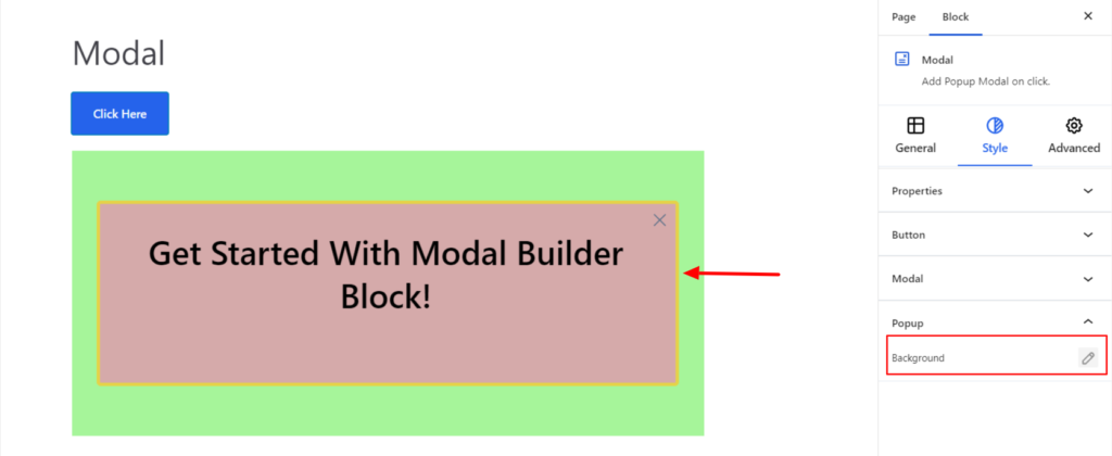
Popup #
- Background – It sets the background color of the popup box. You can change the visual appearance of the background by changing its color or adding an image.
Advanced #
The Advanced section consists of four options for the Modal block.
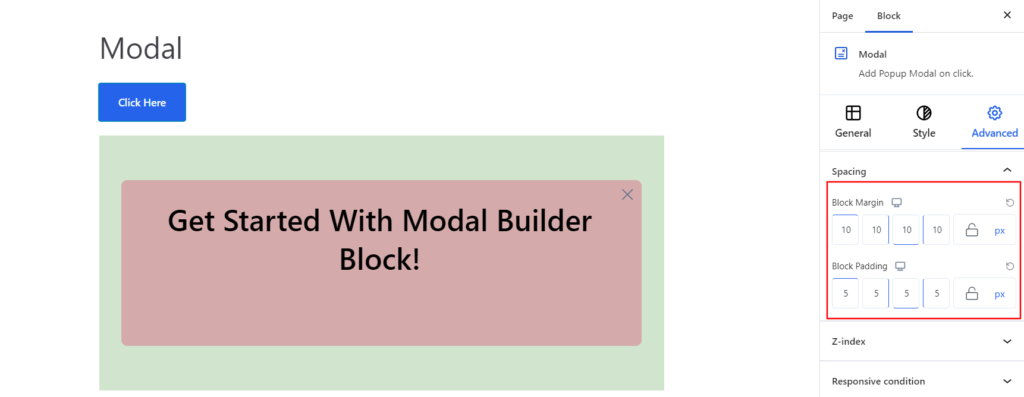
Spacing #
Under the spacing section, you can find the following options available:
- Block Margin – According to the site requirement, you can assign a specific margin value to the block along with units like px, em, %, and rem. Moreover, you can set the value of the different margins for various devices (Desktop, Tablet, and Mobile).
- Block Padding – According to the site requirement, you can assign a specific padding value to the block along with units like px, em, %, and rem. Moreover, you can set the value of the different padding for various devices (Desktop, Tablet, and Mobile).
Z-Index #
It allows you to set the priority of the Modal block according to the site requirement.
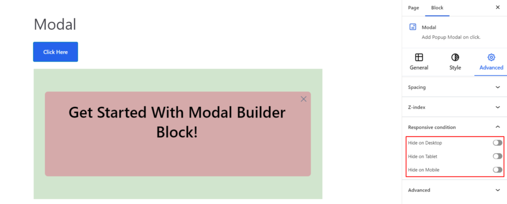
Responsive Condition #
Using the option, you can enable/disable displaying the block on various screen sizes:
- Hide on Desktop – It hides the Modal block on the Desktop.
- Hide on Tablet – It hides the Modal block on the Tablet.
- Hide on Mobile – It hides the Modal block on the Mobile.
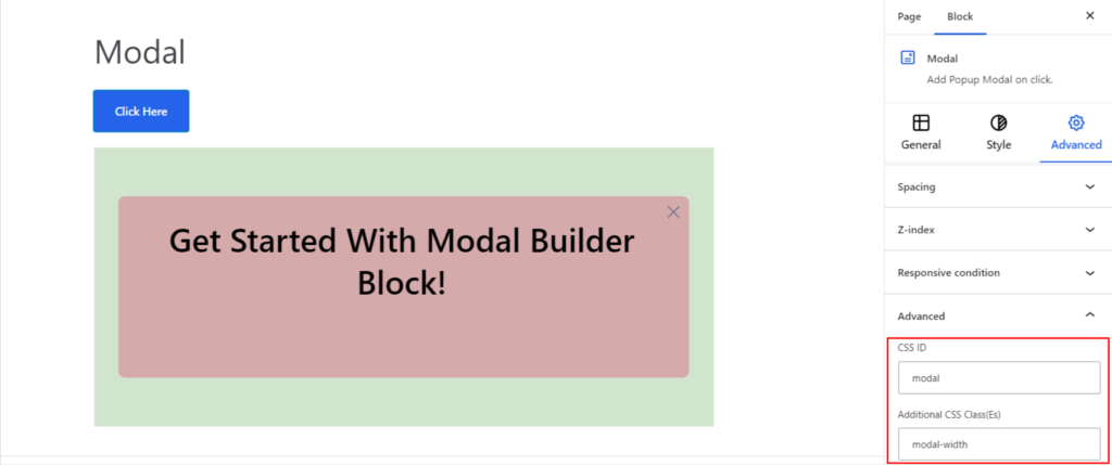
Advanced #
Under the option, you can set the CSS ID and Classes for this particular Modal block. The available options are listed below:
- CSS ID – It allows you to set specific IDs to style this particular block. Once you have set the ID, you can write the CSS Code to style the block using that particular ID.
- Additional CSS Class(es) – It allows you to add a CSS class to your block and write custom CSS to style this particular block.
After creating the separate ID and Classes, visit your CSS editor and write a style for the ID and class.


