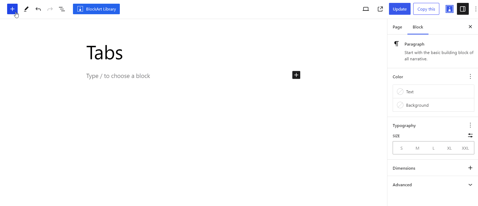
The Tabs Block is useful provided by the BlockArt Plugin. The block is useful if you want to display various content on a page in tab form so that users can access the information from the same page without navigating away from the main page.
To add the tabs block on your page, select it from your block list. After that, click on the + (plus) icon to increase the number of tabs you want to add to your end.
After you have chosen the Tabs Block, you’ll get a block editing panel on the right-hand side. It has three options, i.e., General, Style, and Advanced. These options customize the design and other elements of the block. Let’s explore one by one below:
General #
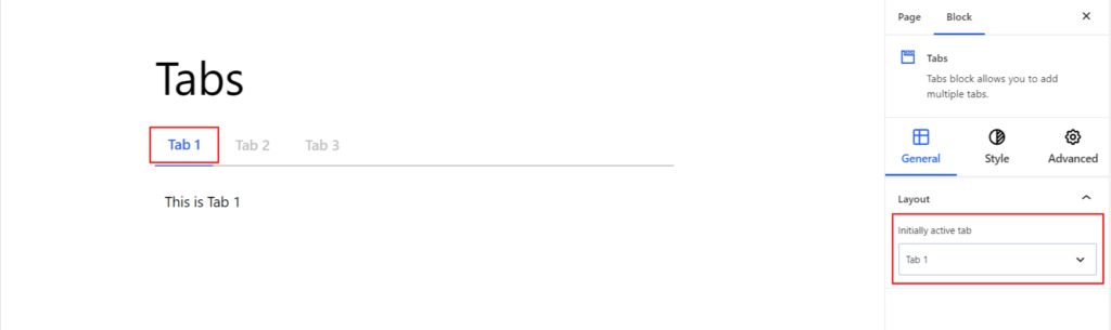
Layout #
- Initially Active Tab – Initially active tabs refer to the tabs that are selected or displayed by default when visitors first access your page. You can choose the tab number you want to display by default on your end.
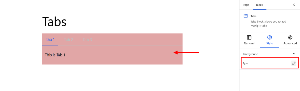
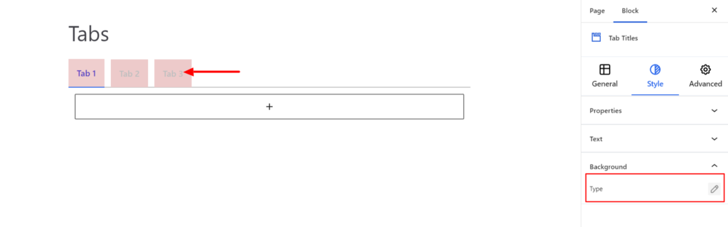
Style #
Background #
- Type – It sets the background color of the Tabs Block. You can change the visual appearance of the background by changing its color or adding an image.
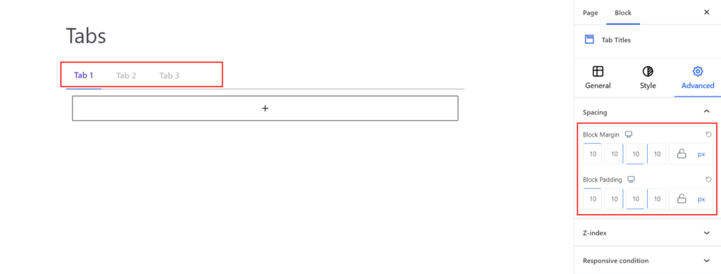
Advanced #
The Advanced section consists of four customization options for the Tabs Block.
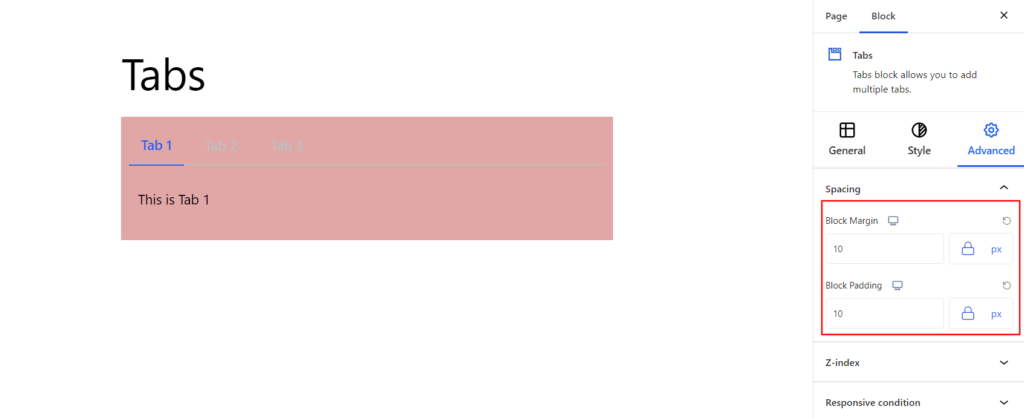
Spacing #
Under the spacing section, you can find the following options available:
- Block Margin – According to the site requirement, you can assign a specific margin value to the block along with units like px, em, %, and rem. Moreover, you can set different margin values for various devices (Desktop, Tablet, and Mobile).
- Block Padding – According to the site requirement, you can assign a specific padding value to the block along with units like px, em, %, and rem. Moreover, you can set different padding values for various devices (Desktop, Tablet, and Mobile).
Z-Index #
It allows you to set the priority of the Tabs block according to the site requirement.
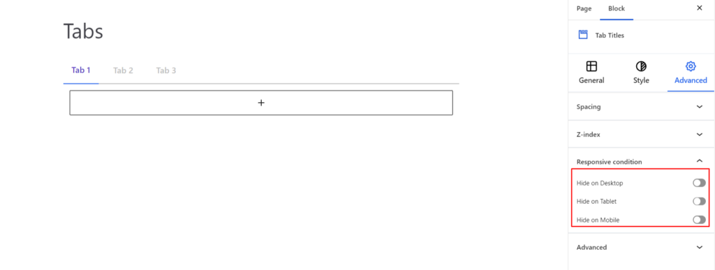
Responsive Condition #
Using the option, you can enable/disable displaying the block on various screen sizes:
- Hide on Desktop – It hides the Tabs block on the Desktop.
- Hide on Tablet – It hides the Tabs block on the Tablet.
- Hide on Mobile – It hides the Tabs block on the Mobile.
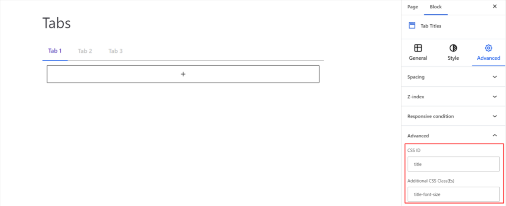
Advanced #
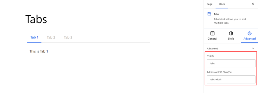
Under the option, you can set the CSS ID and Classes for this particular Tabs block. The available options are listed below:
- CSS ID – It allows you to set specific IDs to style this particular block. Once you have set the ID, you can write the CSS Code to style the block using that particular ID.
- Additional CSS Class(es) – It allows you to add a CSS class to your block and write custom CSS to style this particular block.
After creating the separate ID and Classes, visit your CSS editor and write a style for the ID and class.
Tabs Titles #
The above setting applies to the overall Tabs Block. The plugin provides more options for customizing tab titles and layouts. The options are listed below:
General #
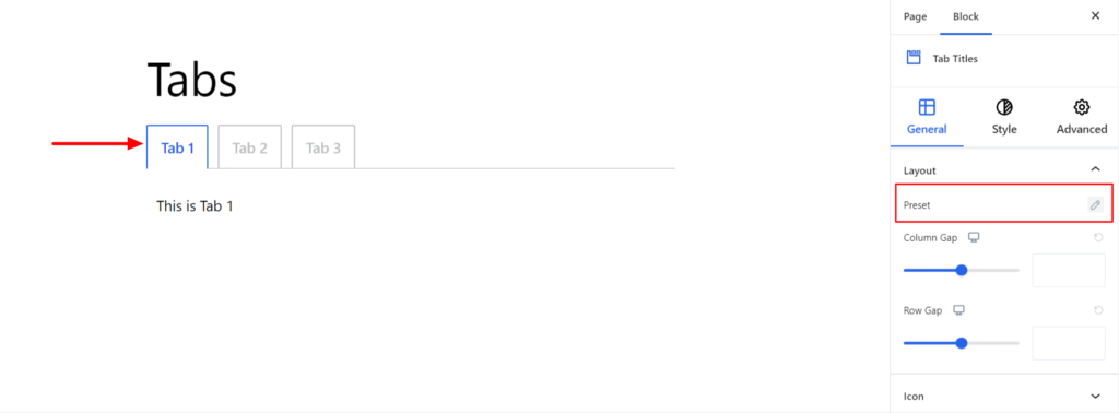
Layout #
- Preset – It determines the layout of the tabs. You can display it either horizontally/ vertically with various other options available, such as underline, fill, and outline.
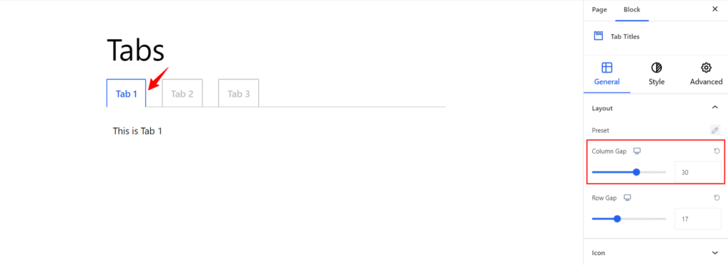
- Column Gap – It manages the space between two tabs if placed horizontally. Moreover, you can adjust the spacing for different devices (Desktop, Tablet, and Mobile).
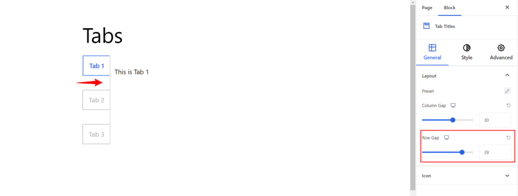
- Row Gap – It manages the space between two tabs if placed vertically. Moreover, you can adjust the spacing for different devices (Desktop, Tablet, and Mobile).
Icon #
The features allow you to add the Icons align with the Tab title. It comes with the following option to customize the icons appearing on tab titles:
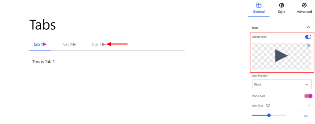
- Enable – Switch the Toggle to the right area to enable the Icon to the tab title on your site. Enabling the option will display the icon on the tab title.
After enabling you can choose the appropriate icons from the list of icon library
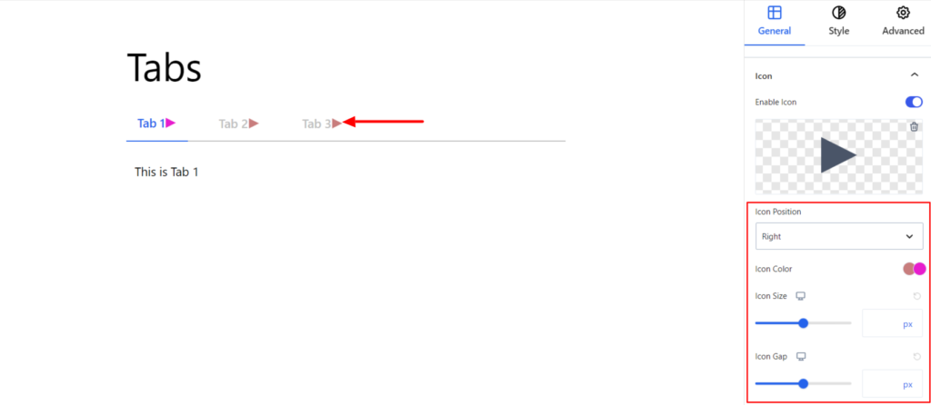
- Icon Position – It sets the Icon position to be on the title’s Left, Right, Top, and Bottom.
- Icon Color – It changes the color of the Icons. You can set different colors in Normal and Active Modes.
- Icon Size – It determines the size of the Icon. Moreover, you can also set the size to be different on various devices (Desktop, Tablet, and Mobile).
- Icon Gap – It adjusts the gap between the Title and Icon. Moreover, you can adjust for different devices (Desktop, Tablet, and Mobile).
Style #
It provides the following styling options for the Tab Titles. These are listed below:
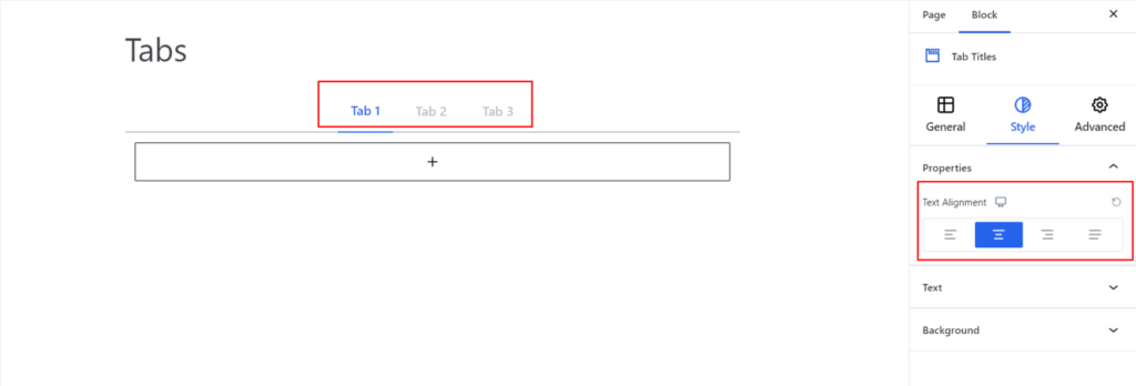
Properties #
- Text Alignment – It sets the alignments for the tab titles. You can set the alignments as Left, Center, Right, and Justify. Moreover, you can also set the alignment position on different devices (Desktop, Tablet, and Mobile).
Text #
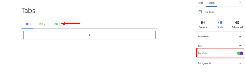
- Text Color – It changes the color of the tab title. You can set the different colors on Normal and Active Modes.
Background #
- Type – It sets the background color of the Tab Titles. You can change the background’s visual appearance by changing its color or adding an image. Moreover, you can set different background colors in Normal and Active Modes.
Advanced #
The Advanced section consists of four customization options for the Tabs Titles.
Spacing #
Under the spacing section, you can find the following options available:
- Block Margin – According to the site requirement, you can assign a specific margin value to the block along with units like px, em, %, and rem. Moreover, you can set different margin values for various devices (Desktop, Tablet, and Mobile).
- Block Padding – According to the site requirement, you can assign a specific padding value to the block along with units like px, em, %, and rem. Moreover, you can set different padding values for various devices (Desktop, Tablet, and Mobile).
Z-Index #
It allows you to set the priority of the Title according to the site requirement.
Responsive Condition #
Using the option, you can enable/disable displaying the block on various screen sizes:
- Hide on Desktop – It hides the Tab Title on the Desktop.
- Hide on Tablet – It hides the Tab Title on the Tablet.
- Hide on Mobile – It hides the Tab Title on the Mobile.
Advanced #
Under the option, you can set the CSS ID and Classes for the Title Tab. The available options are listed below:
- CSS ID – It allows you to set specific IDs to style to the title. Once you have set the ID, you can write the CSS Code to style the title using that particular ID.
- Additional CSS Class(es) – It allows you to add a CSS class to your block and write custom CSS to style to the title.
After creating the separate ID and Classes, visit your CSS editor and write a style for the ID and class.


