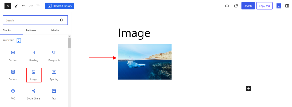
The Image Block lets you display an image on your site. You can upload the image directly from your PC or use an external link.
After you have chosen the Image Block, you’ll get a block editing panel on the right-hand side. It has three options: General, Style, and Advanced. These options customize the design and other elements of the block. Let’s explore one by one below:
General #
The general settings consist of the following options listed below:
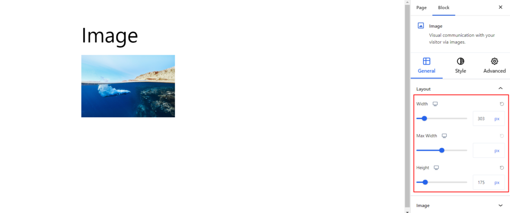
- Layout – Using the option, you can set the Width, Max-Width, and Height of the Image. Moreover, you can select the value for different devices (Desktop, Mobile, and Tablet).
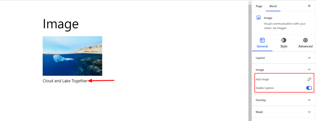
- Image – The option allows you to add the image and also enable the image caption.
- Overlay – The option adds the text over the image and comes up with various customization options listed below:
- Enable – Switch the Toggle to the right area to enable the overlay in the image. Enabling the option will display the Overlay Text on the image.
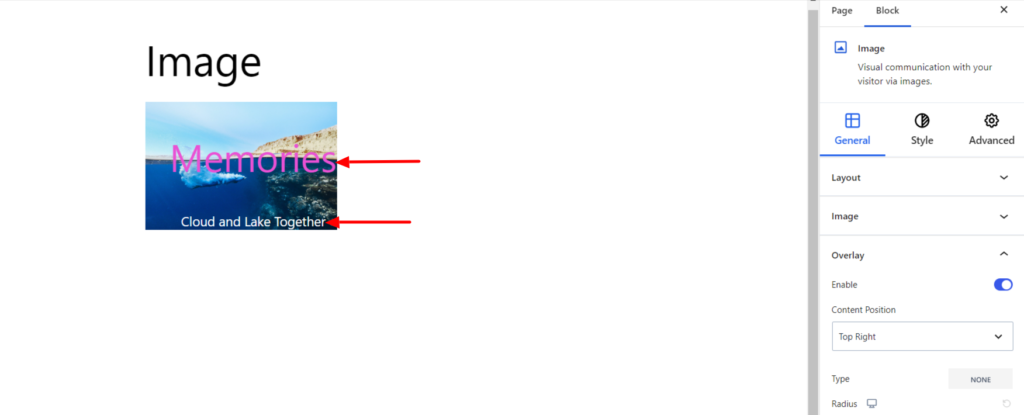
- Content Position – It sets the overalay position. You can set the image position to top, center, and bottom.
- Border – It customizes the Border area added around the Overlay and comes with the following options:
- Type – You can set the border type as Solid, Dotted, Dashed, Double, etc. Moreover, select the border type to be None if you do not want to add any borders. If you select the border type to be other than none, you’ll get the following options:
- Border Color – It allows you to choose the appropriate color for the border.
- Size – It provides the option to select the border size.
- Radius – It allows you to fix the radius value to make the round corners for the border.
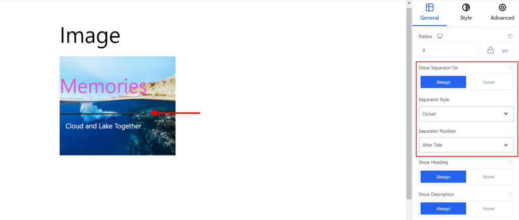
- Show Separator On – It allows the separator to be displayed between the overlay heading and description in hover and normal mode.
- Separator Style – It allows choosing the Separator Style.
- Separator Position – Using the option, you can set the separator position before or after the title.
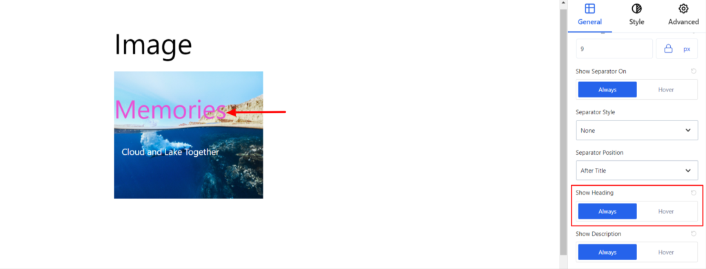
- Show Heading – You can set the heading to be displayed Always or only in Hover mode.
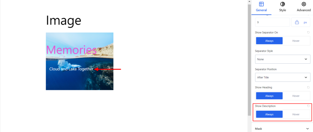
- Show Description – You can set the description to be displayed Always or only in Hover mode.
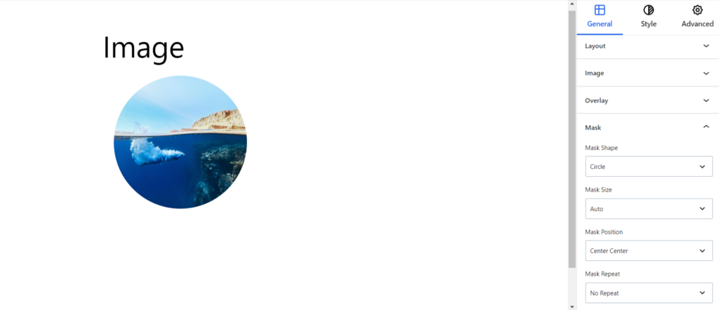
- Mask – You can add masks of different shapes and sizes to your images using the option. Moreover, you can choose the Mask shape, size, position, and repetition.
Style #
Under the style option, you’ll find the following options available:
Properties #
- Text Alignment – It sets the position of the image on the left, center, and right. Moreover, you can set the position of the image to be different on various devices (desktop, tablet, and mobile).
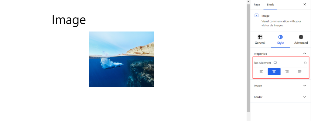
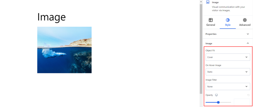
Image #
It changes the styling of the image added on your end and provides the following options:
- Object Fit – Using this option, you can determine if the image should fit inside the container or be stretched to fill the container entirely.
- On Hover Image – The option lets you add animation effects while hovering the image.
- Image Filter – The option lets you add the effect to the image.
- Opacity – It controls the transparency of the image.
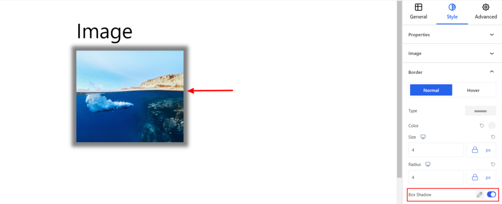
Border #
It customizes the Border area added around the Image and comes with the following options:
- Type – You can set the border type as Solid, Dotted, Dashed, Double, etc. Moreover, select the border type to be None if you do not want to add any borders. If you select the border type to be other than none, you’ll get the following options:
- Border Color – It allows you to choose the appropriate color for the border.
- Size – It provides the option to select the border size.
- Radius – It allows you to fix the radius value to make the round corners for the image.
- Box Shadow – When you enable the Box Shadow option, you will get the following customization options:
- Color – It allows you to select the appropriate box-shadow color.
- Horizontal-X – It displays the box shadows in the horizontal position.
- Horizontal-Y – It displays the box shadows in the vertical position.
- Blur – You can set up the blur value of the box shadows appearing.
- Spread – The shadow’s spread value represents the distance to expand or contract a shadow in all directions. You can change the spread value according to the site’s requirements.
- Position – You can set the position of the box shadows as Inset or Outline.
Note – You can apply the settings option differently for Normal and Hover Modes.
Advanced #
The Advanced section consists of four options for the Image block.
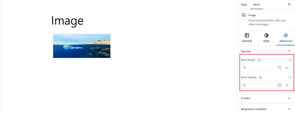
Spacing #
Under the spacing section, you can find the following options available:
- Block Margin – According to the site requirement, you can assign a specific margin value to the block along with units like px, em, %, and rem. Moreover, you can set the values of the different margins for various devices (Desktop, Tablet, and Mobile).
- Block Padding – According to the site requirement, you can assign a specific padding value to the block along with units like px, em, %, and rem. Moreover, you can set the different padding values for various devices (Desktop, Tablet, and Mobile).
Z-Index #
It allows you to set the priority of the Image block according to the site requirement.
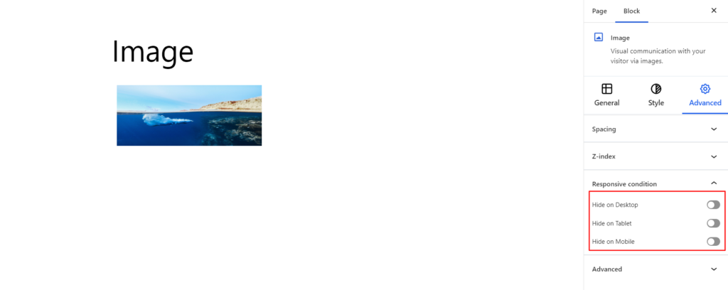
Responsive Condition #
Using the option, you can enable/disable displaying the block on various screen sizes:
- Hide on Desktop – It hides the Image block on the Desktop.
- Hide on Tablet – It hides the Image block on the Tablet.
- Hide on Mobile – It hides the Image on the Mobile.
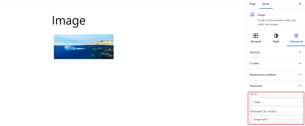
Advanced #
Under the option, you can set the CSS ID and Classes for this particular Image block. The available options are listed below:
- CSS ID – It allows you to set specific IDs to style this particular block. Once you have set the ID, you can write the CSS Code to style the block using that particular ID.
- Additional CSS Class(es): This allows you to add a CSS class to your block, allowing you to write custom CSS to style this particular block.
It allows you to add a CSS class to your block and write custom CSS to style this particular block. After creating the separate ID and Classes, visit your CSS editor and write a style for the ID and class.