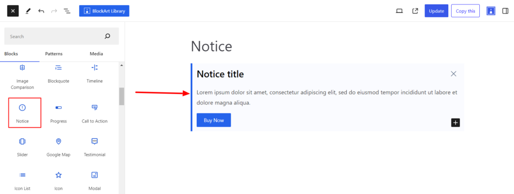
The Notice Block allows you to display key points, warnings, and important messages on your site. It is a combination of Paragraph, Heading, and Button Blocks.
After you have chosen the Notice block, you’ll get a block editing panel on the right-hand side. It has three options, i.e., General, Style, and Advanced. These options customize the design and other elements of the block. Let’s explore one by one below:
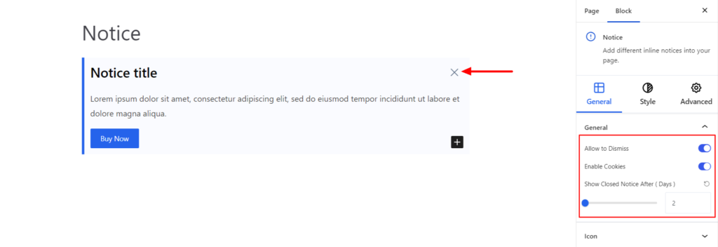
General #
General #
- Allow to Dismiss – Enabling the option adds a cross icon above the notice. Clicking the cross icon dismisses the notice on the front end.
- Enable Cookies – Using the option, you can set the notice closing date.
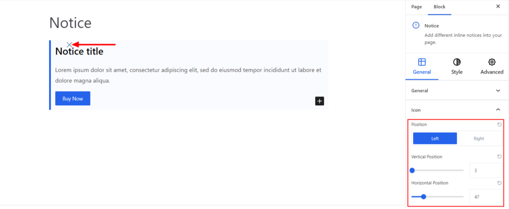
Icon #
The option works for the cross icon that appears after enabling the Allow to Dismiss option from the General section. It comes with the following options:
- Position – It sets the position of the icon to be on the left and right.
- Vertical Position – It determines the vertical spacing of the icon.
- Horizontal Position – It determines the horizontal spacing of the icon.
Style #
It provides the following styling options for the Notice Block. These are listed below:
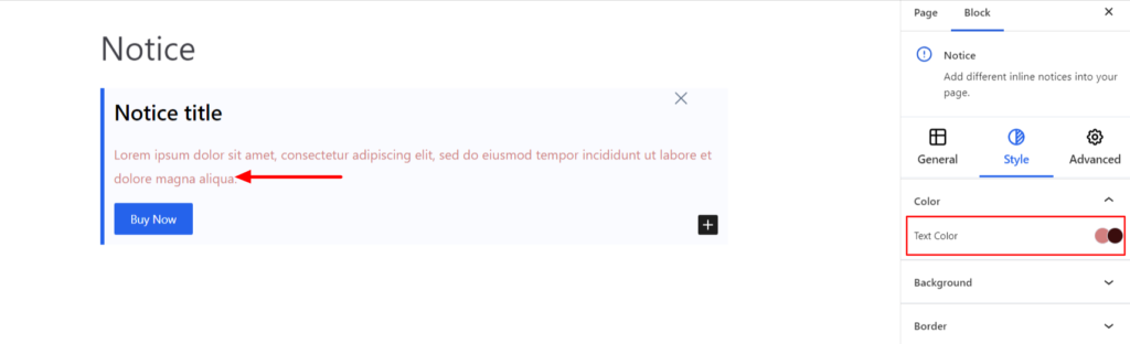
Color #
- Text Color – It changes the text color of the content in Normal and Hover Modes.
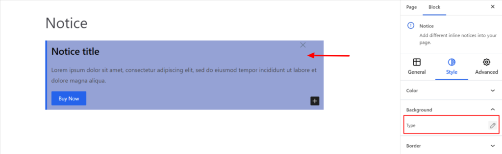
Background #
- Type – It sets the block’s background color. You can change the background’s visual appearance by changing its color or adding an image. Moreover, you can set different background colors in Normal and Hover Modes.
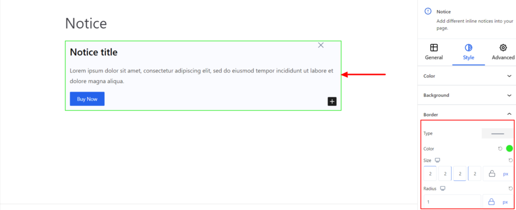
Border #
It customizes the Border area added around the Notice block and comes with the following options:
- Type – You can set the border type as Solid, Dotted, Dashed, Double, etc. Moreover, select None if you do not want to add borders.
- When you select none, you will be given the following option:
- Radius – It allows you to fix the radius value to make the round corners for the border.
However, if you select the border type to be other than none, two more options will be added. The option is listed below:
- Border Color – It allows you to choose the appropriate border color.
- Size – It provides the option to select the border size.
Advanced #
The Advanced section consists of four options for the Notice block.
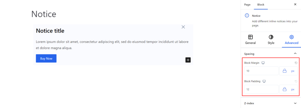
Spacing #
Under the spacing section, you can find the following options available:
- Block Margin – According to the site requirement, you can assign a specific margin value to the block along with units like px, em, %, and rem. Moreover, you can set the value of the different margins for various devices (Desktop, Tablet, and Mobile),
- Block Padding – According to the site requirement, you can assign a specific padding value to the block along with units like px, em, %, and rem. Moreover, you can set the different padding values for various devices (Desktop, Tablet, and Mobile).
Z-Index #
It allows you to set the priority of the Notice block according to the site requirement.
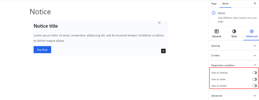
Responsive Condition #
Using the option, you can enable/disable displaying the block on various screen sizes:
- Hide on Desktop – It hides the Notice block on the Desktop.
- Hide on Tablet – It hides the Notice block on the Tablet.
- Hide on Mobile – It hides the Notice block on the Mobile.
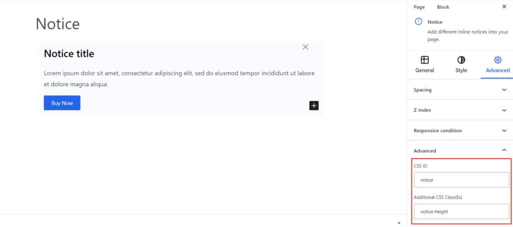
Advanced #
Under the option, you can set the CSS ID and Classes for this particular Notice block. The available options are listed below:
- CSS ID – It allows you to set specific IDs to style this particular block. Once you have set the ID, you can write the CSS Code to style the block using that particular ID.
- Additional CSS Class(es) – It allows you to add a CSS class to your block and write custom CSS to style this particular block
After creating the separate ID and Classes, visit your CSS editor and write a style for the ID and class.


