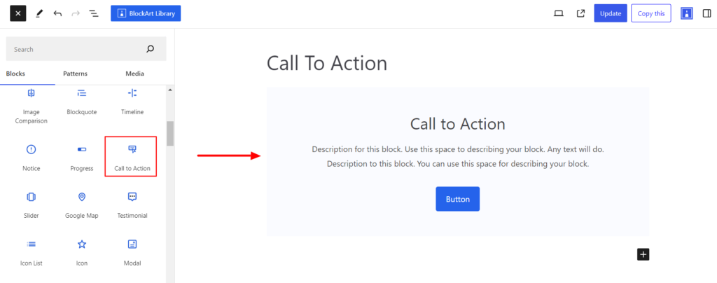
Call To Action Block is added to a site with the goal of motivating users or site visitors to complete a specific action based on its message. It’s typically written as a command such as Buy Now, Sign up, Contact Us, etc.
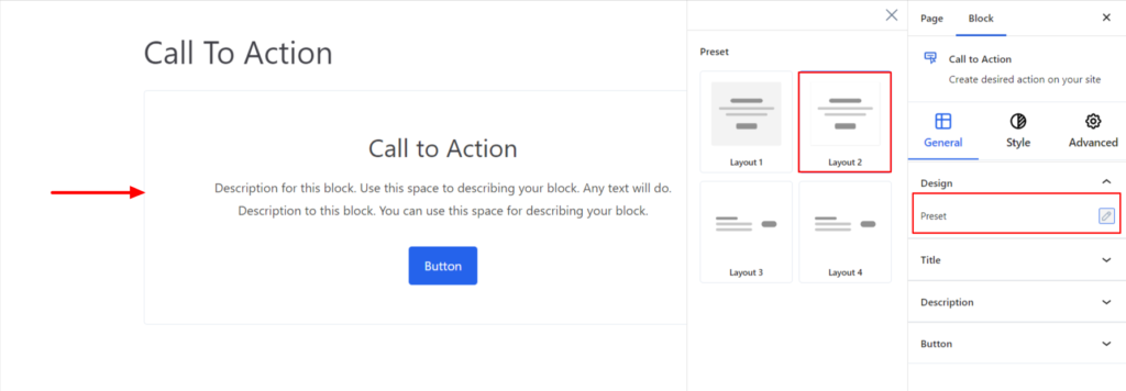
After you have chosen the Call To Action block, you’ll get a block editing panel on the right-hand side. It has three options, i.e., General, Style, and Advanced. These options customize the design and other elements of the CTA block. Let’s explore one by one below:
General #
Design #
- Preset – It refers to the styles/designs that display the Call-to-Action block. Currently, the Call-to-Action block provides four layouts.
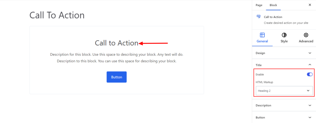
Title #
The Title appears at the top of the description and comes with the following option to customize it:
- Enable – Switch the Toggle to the right area to enable the title. Enabling the option will display the title.
- HTML Markup – It changes the title heading tag. Under the HTML Markup option, select the required markup for your post title. You can set your title to be in H1 – H6, paragraph and div.
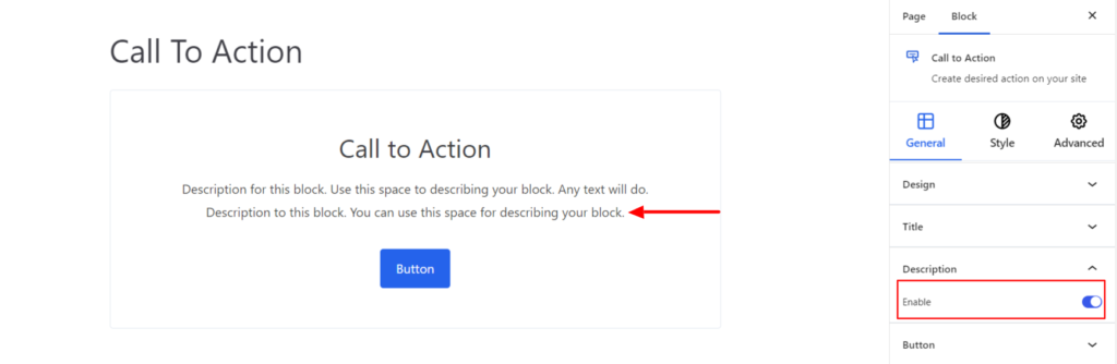
Description #
- Enable – Switch the Toggle to the right area to enable the description. Enabling the option will display the description on your end.
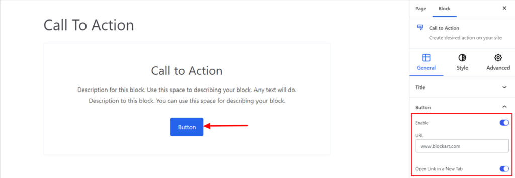
Button #
It provides the following customization options for the button that appears inside the Call To Action Block.
- Enable – Switch the Toggle to the right area to enable the Button inside the CTA Block. Enabling the option will display the Button on your end.
- URL – This option is used to add the link, which will redirect the user to a specified web address or page. Moreover enabling the option Open Link in a New Tab will open the added URL in a new tab.
Style #
Under the style settings, you’ll find the following options available:
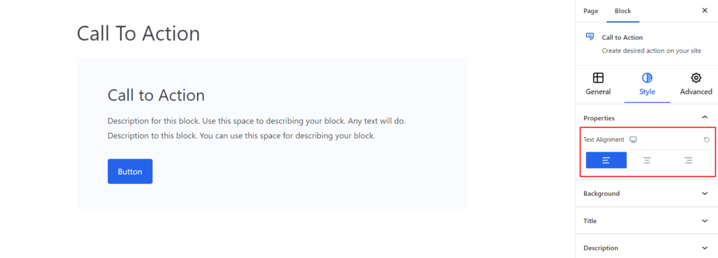
Properties #
- Text Alignment – It sets the text alignments added to the CTA Block. You can set the alignments as Left, Center, and Right. Moreover, you can also set the alignment position to be different depending on the device, i.e., desktop, tablet, or mobile.
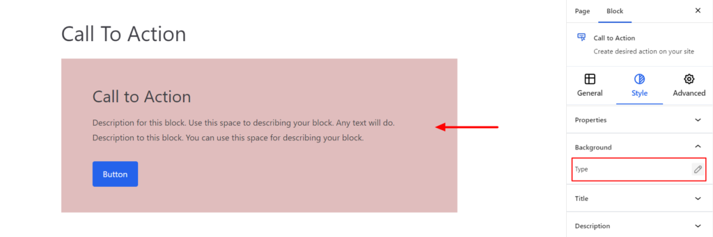
Background #
- Type – It sets the background color for the CTA Block. You can change the visual appearance of the background by changing its color or adding an image.
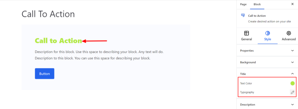
Title #
- Text Color – It allows you to change the color of the title.
- Typography – It controls the title font family, weight, and font size.
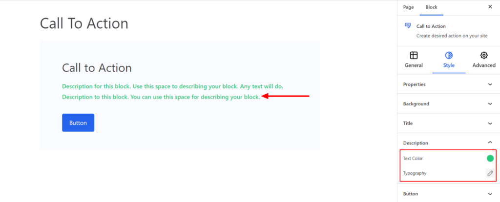
Description #
- Text Color – It allows you to change the color of the description.
- Typography – It controls the description text, including font family, weight, and font size.
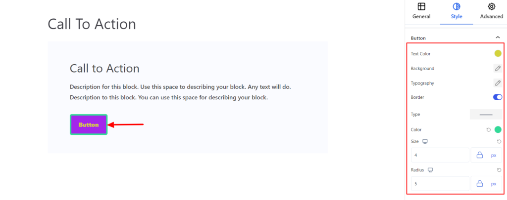
Button #
It provides the following styling options for the Button. These are listed below:
- Text Color – It allows changing the color of the text added inside the button.
- Background -It sets the background color of the button. You can change the visual appearance of the background by changing its color or adding an image.
- Typography – It allows you to control the site’s Typography, such as font family, weight, font size, line height, and other related styling properties for the text. The options are listed below:
- Font Family – The option allows you to choose the appropriate font family for the text.
- Weight – It refers to the thickness or boldness of the text.
- Size – It controls the font size of the text.
- Line Height – It manages the space above and below the text.
- Letter Spacing – It controls the amount of space between characters in the text.
- Style – Using the property, you can set the text to be Italic or Oblique.
- Transformation – It changes the case of the text, such as lowercase, uppercase, and capitalize.
- Decoration – The styling is applied to the text to make it more visually appealing. The options include underline, overline, and line through.
- Border – It customizes the Border area added around the button and comes with the following options:
- Type – You can set the border type as Solid, Dotted, Dashed, Double, etc. Moreover, select the border type to be None if you do not want to add any borders. When you select none, you will be given the following option:
- Radius – It allows you to fix the radius value to make the round corners for the border.
- Type – You can set the border type as Solid, Dotted, Dashed, Double, etc. Moreover, select the border type to be None if you do not want to add any borders. When you select none, you will be given the following option:
However, if you select the border type to be other than none, two more options will be added. The option is listed below:
- Border Color – It allows you to choose the appropriate border color.
- Size – It provides the option to select the border size.
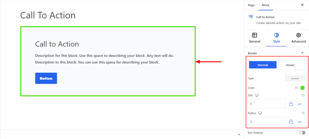
Border #
It customizes the Border area added around the CTA block and comes with the following options:
- Type – You can set the border type as Solid, Dotted, Dashed, Double, etc. Moreover, select the border type to be None if you do not want to add any borders for the CTA block.
When you select none, you will be given the following option:
- Radius – It allows you to fix the radius value to make the round corners for the border.
However, if you select the border type to be other than none, two more options will be added. The option is listed below:
- Border Color – It allows you to choose the appropriate border color for the CTA block.
- Size – It provides the option to select the border size.
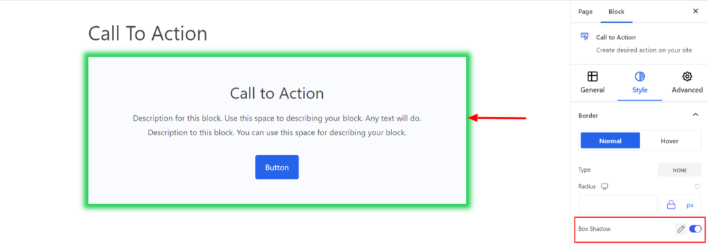
- Box Shadow – When you enable the Box Shadow option, you will get the following customization options:
- Color – It allows you to select the appropriate box-shadow color for the CTA block.
- Horizontal-X – It displays the box shadows in the horizontal position.
- Horizontal-Y – It displays the box shadows in the vertical position.
- Blur – You can set up the blur value of the box shadows appearing.
- Spread – The shadow’s spread value represents the distance to expand or contract a shadow in all directions. You can change the spread value according to the site’s requirements.
- Position – You can set the position of the box shadows as Inset or Outline.
Note – You can apply the border settings option differently for Normal and Hover Modes.
Advanced #
The Advanced section consists of four options for the CTA block.
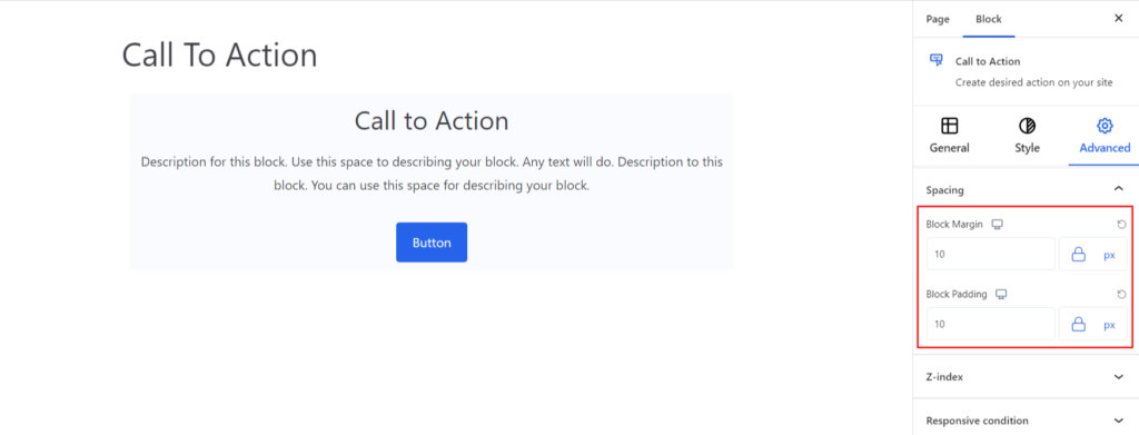
Spacing #
Under the spacing section, you can find the following options available:
- Block Margin – According to the site requirement, you can assign a specific margin value to the block along with units like px, em, %, and rem. Moreover, you can set the value of the different margins for various devices (Desktop, Tablet, and Mobile).
- Block Padding – According to the site requirement, you can assign a specific padding value to the block along with units like px, em, %, and rem. Moreover, you can set the value of the different padding for various devices (Desktop, Tablet, and Mobile).
Z-Index #
It allows you to set the priority of the CTA block according to the site requirement.
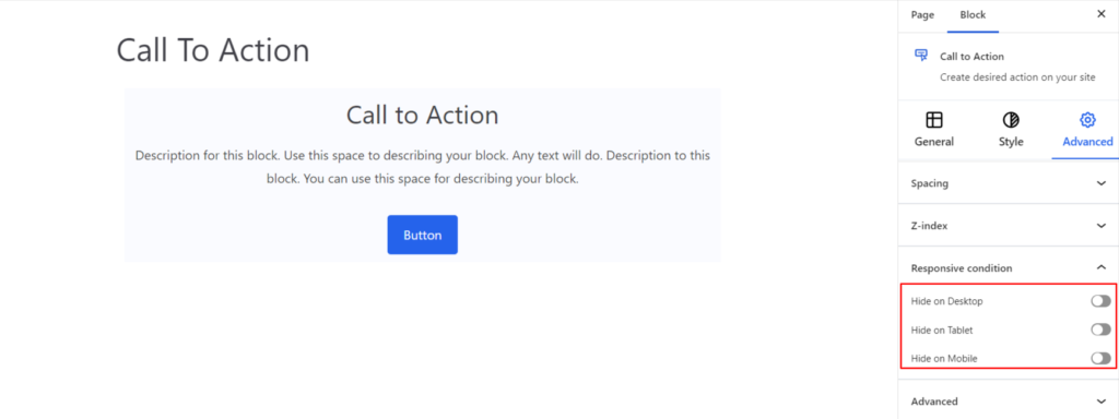
Responsive Condition #
Using the option, you can enable/disable displaying the block on various screen sizes:
- Hide on Desktop – It hides the CTA block on the Desktop.
- Hide on Tablet – It hides the CTA block on the Tablet.
- Hide on Mobile – It hides the CTA block on the Mobile.
Advanced #
Under the option, you can set the CSS ID and Classes for this particular CTA block. The available options are listed below:
- CSS ID – It allows you to set specific IDs to style this particular block. Once you have set the ID, you can write the CSS Code to style the block using that particular ID.
- Additional CSS Class(es) – It allows you to add a CSS class to your block and write custom CSS to style this particular block.
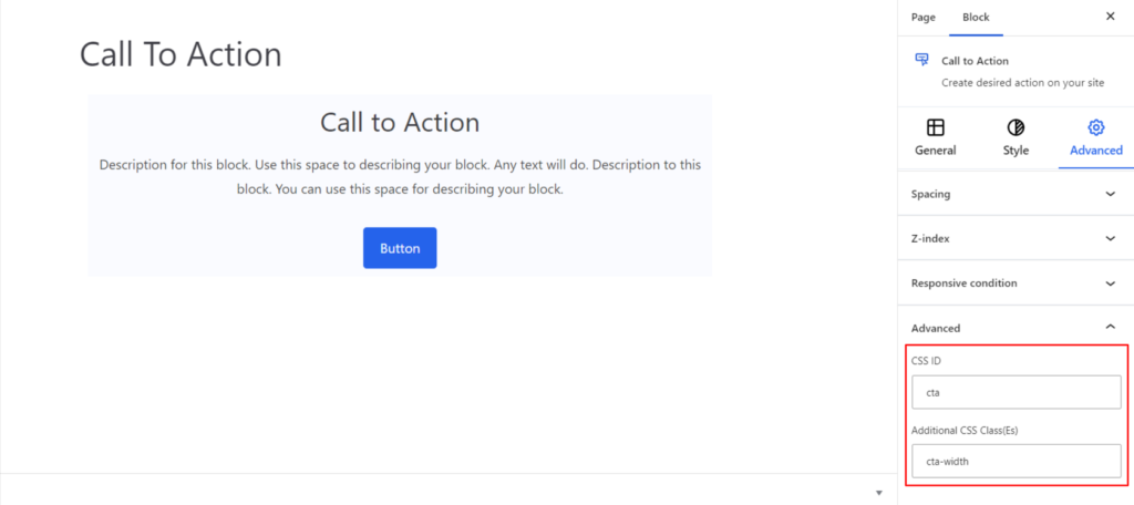
After creating the separate ID and Classes, visit your CSS editor and write a style for the ID and class.


