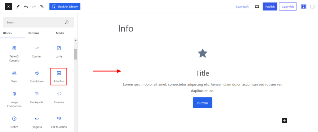
The Info block lets you add any information, such as contact, product features, address, etc, to any post or page. Using this block, you can add Icon, Title, Text, and Button within the Info Block.
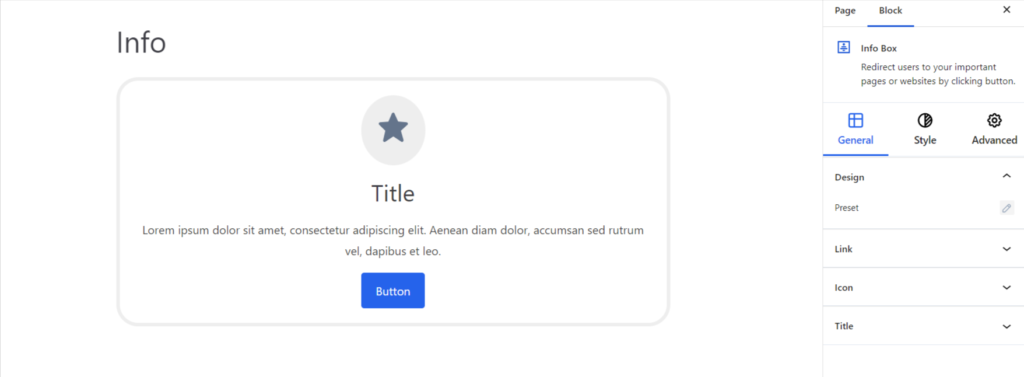
After you have chosen the Info block, you’ll get a block editing panel on the right-hand side. It has three options, i.e., General, Style, and Advanced. These options customize the design and other elements of the block. Let’s explore one by one below:
Design #
- Preset – It changes the design of the Info Block. The Info Block can be displayed in various layouts depending on your requirements.
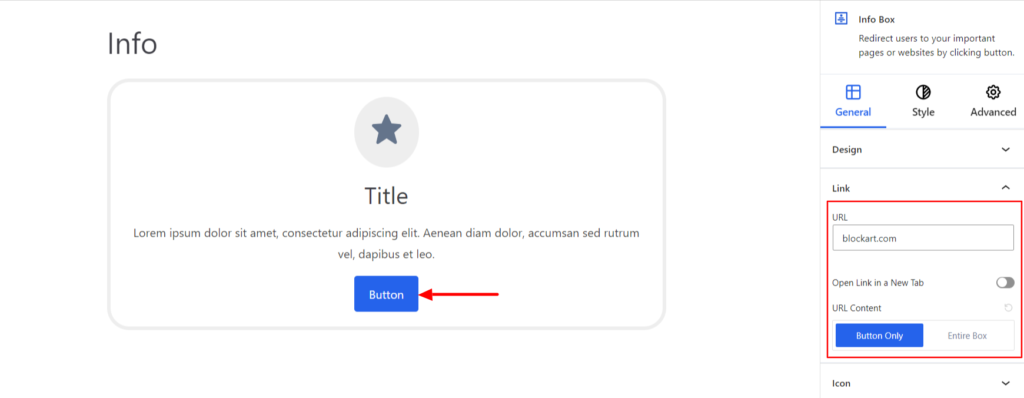
Link #
It allows customizing the Link added on the Info block and comes up with the following customization options:
- URL – This option is used to add the link, which will redirect the user to a specified web address or page.
- Open Link in a New tab – Switch the Toggle to the right area to open the link in a new tab.
- URL Content – It determines the clickable area of the Button and the Entire Box. If you choose the Button option, only the Button can be clicked to open the URL. However, if you choose the Entire Box, the whole info box will be clickable, and you can click on any area to open the URL.
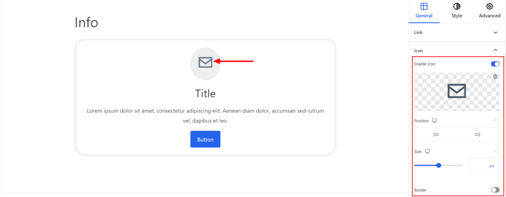
Icon #
Within the Info Box, you can add the icons and come up with the following options:
- Enable – Switch the Toggle to the right area to enable the Icons for the Info Block. Enabling the option will provide you with Icon Library through which you can choose the one appropriate for the Info box.
- Size – It determines the size of the Icon. You can also set the icon size for various devices (Desktop, Tablet, and Mobile).
- Border – It customizes the Border area added around the icon and comes with the following options:
- Type – You can set the border type as Solid, Dotted, Dashed, Double, etc. Moreover, select the border type to be None if you do not want to add any borders.
When you select none, you will be given the following option:
- Radius – It allows you to fix the radius value to make the round corners for the border.
However, if you select the border type to be other than none, two more options will be added. The option is listed below:
- Border Color – It allows you to choose the appropriate border color.
- Size – It provides the option to select the border size.
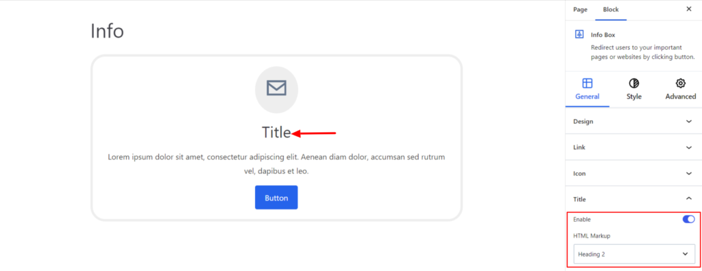
Title #
The settings work for the title of the Info Block and come with the following options:
- Enable – Switch the Toggle to the right area to enable the Title for the Info Block. Enabling the option will display the title inside the Info Block.
- HTML Markup – Under the Markup option, select the required markup for the title. You can set your title to be in Heading, Paragraph, or Div.
Style #
It provides the following styling options for the Info Block. These are listed below:
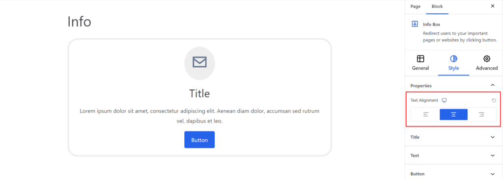
Properties #
- Text Alignment – It sets the alignments for the Info Block. You can set the alignments as Left, Center, and Right. Moreover, you can also set the alignment position on different devices (Desktop, Tablet, and Mobile).
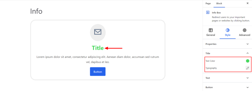
Title #
The settings work for styling the title of the Info Block and come with the following options:
- Text Color – It changes the color of the Title added inside the info box.
- Typography – It allows you to control the Typography, such as font family, weight, font size, line height, and other related styling properties. The options are listed below:
- Font Family – The option allows you to choose the appropriate Font Family for the title.
- Weight – It refers to the thickness or boldness of the title.
- Size – It controls the font size of the title.
- Line Height – It manages the space above and below the title.
- Letter Spacing – It controls the amount of space between characters in the title.
- Style – Using the property, you can set the title to be Italic or Oblique.
- Transformation – It changes the case of the title such as lowercase, uppercase, and capitalize.
- Decoration – The styling is applied to the title to make it more visually appealing. The options include underline, overline, and line through.
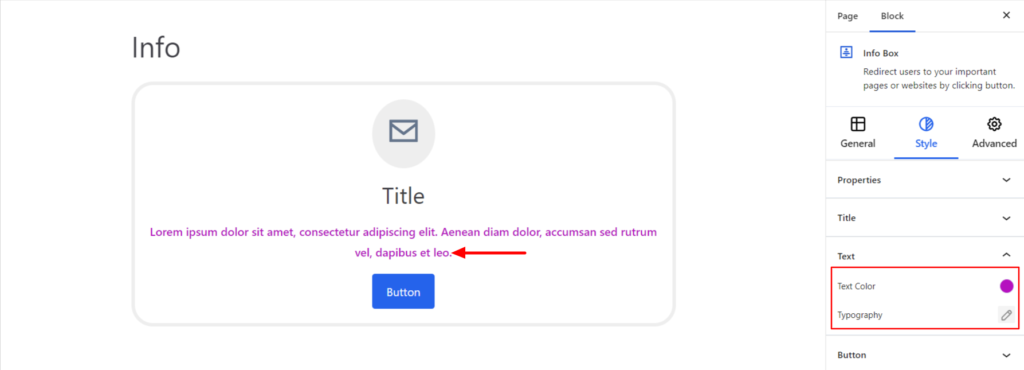
Text #
The settings work for styling the text of the Info Block and come with the following options:
- Text Color – It changes the color of the text added inside the info box.
- Typography – It controls the text typography options, such as font family, font size, line spacing, text decoration, etc.
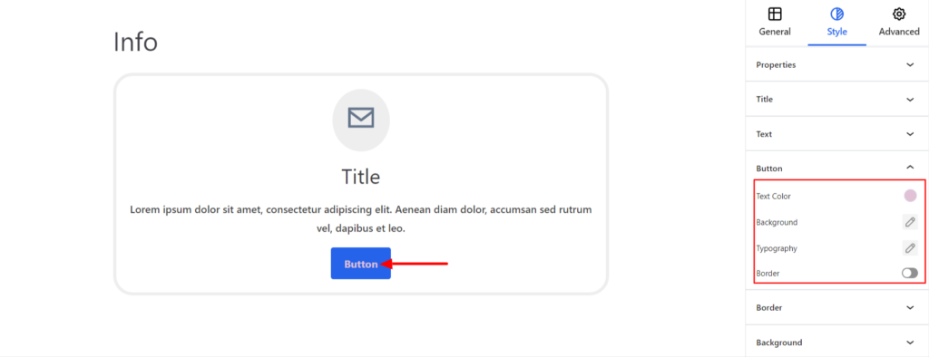
Button #
It styles the Button added inside the Info Box and comes up with the following options:
- Text Color – It changes the color of the Button Text.
- Background – It sets the background of the Button. You can change the visual appearance of the background by changing its color or adding an image.
- Typography – It controls the Button text typography options, such as font family, font size, line spacing, text decoration, etc.
- Border – It customizes the Border area added around the Button and comes with the following options:
- Type – You can set the border type as Solid, Dotted, Dashed, Double, etc. Moreover, select the border type to be None if you do not want to add any borders.
When you select none, you will be given the following option:
- Radius – It allows you to fix the radius value to make the round corners for the borders.
However, if you select the border type to be other than none, two more options will be added. The option is listed below:
- Border Color – It allows you to choose the appropriate border color for the borders.
- Size – It provides the option to select the border size.
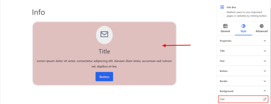
Background #
- Type – It sets the background color of the Info Box. You can change the visual appearance of the background by changing its color or adding an image. Moreover, you can set the different background colors on Normal and Hover Modes.
Border #
It customizes the Border area added around the Info Box and comes with the following options:
- Type – You can set the border type as Solid, Dotted, Dashed, Double, etc. Moreover, select the border type to be None if you do not want to add any borders.
When you select none, you will be given the following option:
- Radius – It allows you to fix the radius value to make the round corners for the block.
However, if you select the border type to be other than none, two more options will be added. The option is listed below:
- Border Color – It allows you to choose the appropriate border color.
- Size – It provides the option to select the border size.

Advanced #
The Advanced section consists of four customization options for the Info Block.
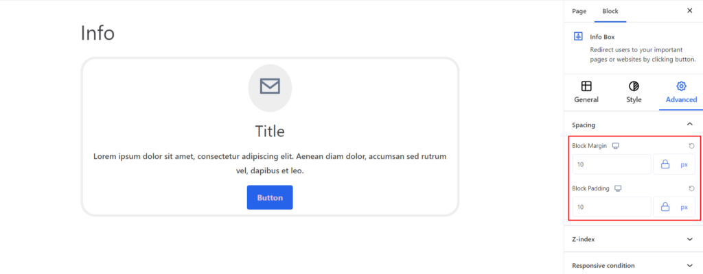
Spacing #
Under the spacing section, you can find the following options available:
- Block Margin – According to the site requirement, you can assign a specific margin value to the block along with units like px, em, %, and rem. Moreover, you can set different margin values for various devices (Desktop, Tablet, and Mobile).
- Block Padding – According to the site requirement, you can assign a specific padding value to the block along with units like px, em, %, and rem. Moreover, you can set different padding values for various devices (Desktop, Tablet, and Mobile).
Z-Index #
It allows you to set the priority of the Info Block according to the site requirement.
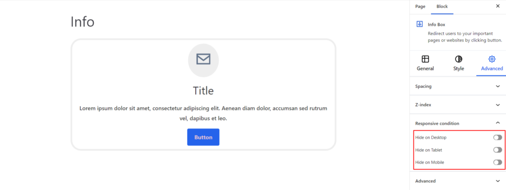
Responsive Condition #
Using the option, you can enable/disable displaying the block on various screen sizes:
- Hide on Desktop – It hides the Info block on the Desktop.
- Hide on Tablet – It hides the Info block on the Tablet.
- Hide on Mobile – It hides the Info block on the Mobile.
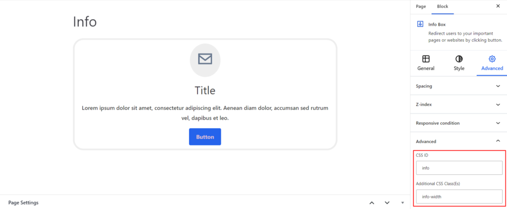
Advanced #
Under the option, you can set the CSS ID and Classes for this particular Info block. The available options are listed below:
- CSS ID – It allows you to set specific IDs to style this particular block. Once you have set the ID, you can write the CSS Code to style the block using that particular ID.
- Additional CSS Class(es) – It allows you to add a CSS class to your block and write custom CSS to style this particular block.
After creating the separate ID and Classes, visit your CSS editor and write a style for the ID and class.


