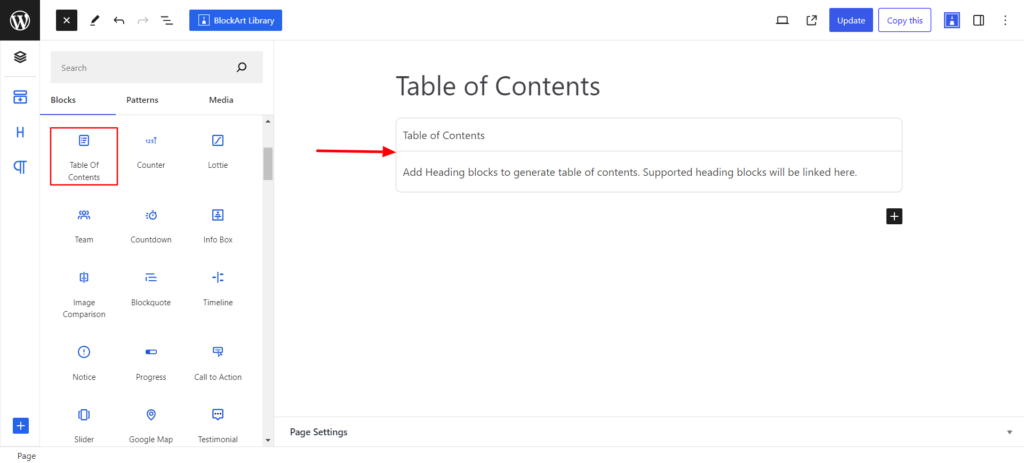
The Table of Contents (TOC) Block creates a Table of Contents on your page. The block automatically recognizes the heading and lists all the headings. This will help visitors quickly navigate to specific headings of interest without the need to scroll manually below.
After you have chosen the Table of Contents block, you’ll get a block editing panel on the right-hand side. It has three options, i.e., General, Style, and Advanced. These options customize the design and other elements of the block. Let’s explore one by one below:
General #
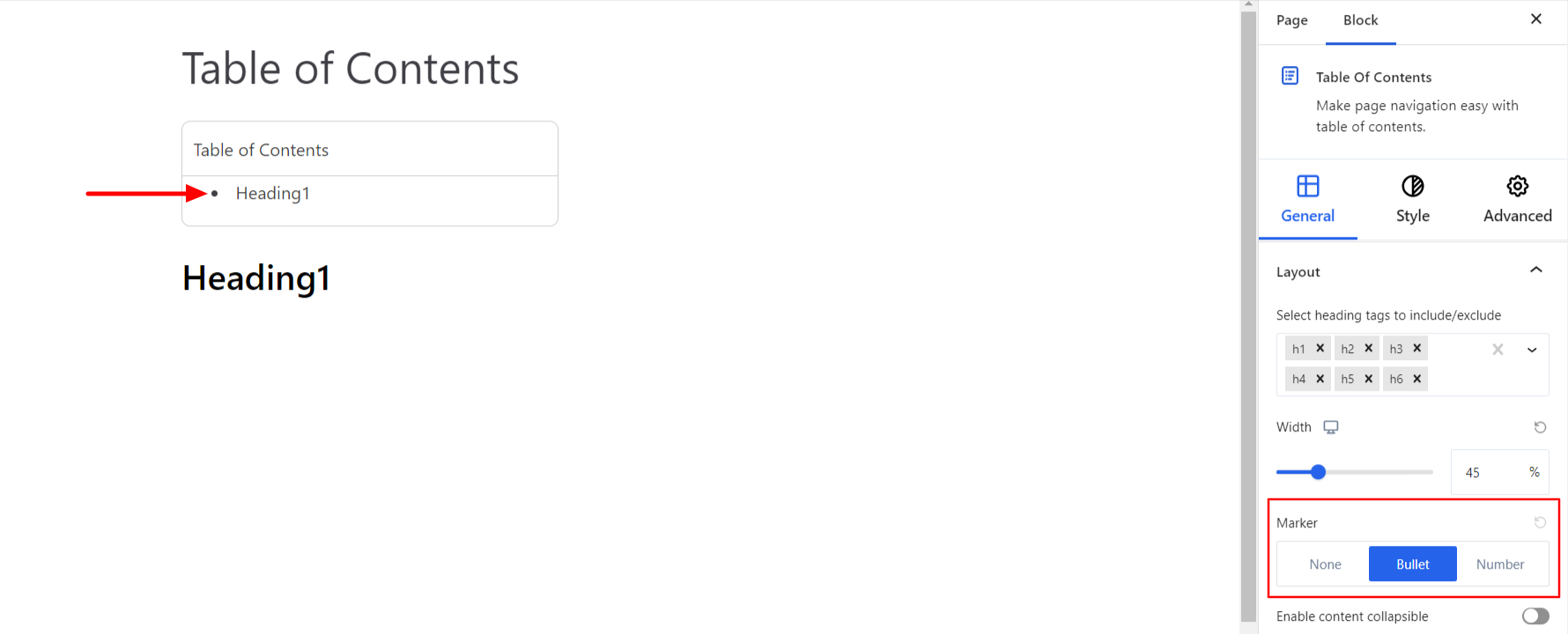
Layout #
- Heading Tags – By default, all the heading tags are displayed inside the Table of Contents. However, you can exclude the heading that does not need to be displayed inside the TOC block.
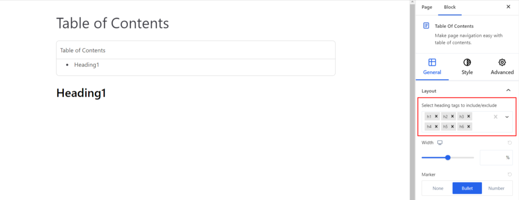
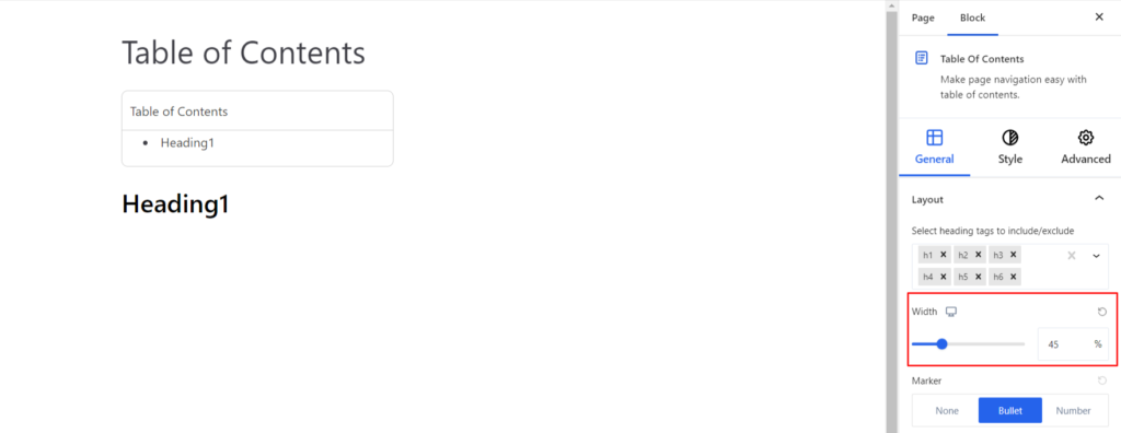
- Width – It determines the width of the overall TOC block. You can adjust the width of the block with the slider available. Moreover, you can set the width to be different on various devices (Desktop, Tablet, and Mobile).
- Marker – You can use the marker to distinguish the heading appearing on the TOC block. You can use either the bullets or number marker types.
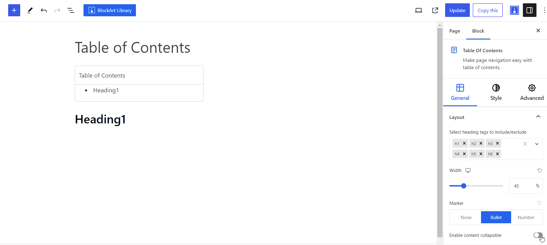
- Enable Content Collapsible – Enabling the option will display a hide/show option on the TOC block. If you click on hide, it will hide all the headings appearing inside the TOC block, and clicking on show will display the headings. Basically, it expands or collapses the TOC block content.
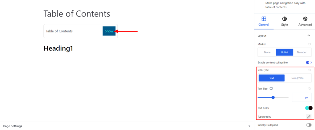
- Icon Type – By default, a text Hide/Show appears that denotes the Content Collapsible. However, you can use icons instead of text. Under the Icon Type section, you can choose between Text and Icons.
If you go with the text, you’ll get the following customization options:
- Text Size – It changes the font size of the text. Moreover, you can set the different font sizes on various devices (Desktop, Tablet, and Mobile)
- Typography – It allows you to control the Typography, such as font family, weight, font size, line height, and other related styling properties for the text. The options are listed below:
- Font Family – The option allows you to choose the appropriate font family of the text.
- Weight – It refers to the thickness or boldness of the text.
- Size – It controls the font size of the text.
- Line Height – It manages the space above and below the text.
- Letter Spacing – It controls the amount of space between characters in the text.
- Style – Using the property, you can set the text to be Italic or Oblique.
- Transformation – It changes the case of the text, such as lowercase, uppercase, and capitalize.
- Decoration – The styling is applied to make the text more visually appealing. The options include underline, overline, and line through.
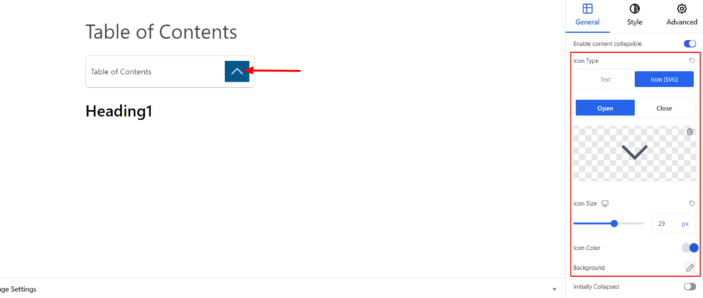
If you choose the Icons, you’ll get the following options:
- Open Icon – It allows you to change the Open Icon
- Close Icon – It allows you to change the Close Icon.
- Icon Size – It determines the size of the social icon. Moreover, you can set the different sizes of the icon on various devices (Desktop, Tablet, and Mobile).
- Icon Color – It changes the color of the Icon. You can set the different colors on Normal and Hover Modes.
- Background – It sets the background color of the Icon. You can change the visual appearance of the background by changing its color or adding an image. Moreover, you can set the different background colors on Normal and Hover Modes.
Style #
It provides the following styling options for the Table of Contents Block. These are listed below:
Properties #
- Overall Alignment – It sets the alignments for the overall TOC Block. You can set the alignments as Left, Center, and Right. Moreover, you can set the alignment position on different devices (Desktop, Tablet, and Mobile).
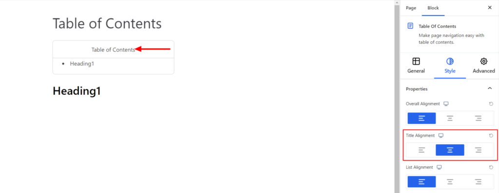
- Title Alignment – It sets the alignments for the Title (Headings) of the TOC Block. You can set the alignments as Left, Center, and Right. Moreover, you can also set the alignment position on different devices (Desktop, Tablet, and Mobile).
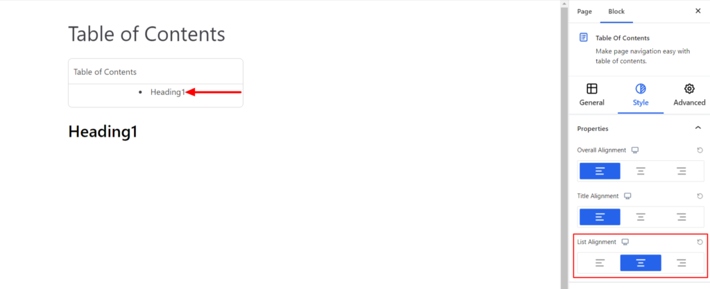
- List Alignment – It sets the alignments for the List (Headings) of the TOC Block. You can set the alignments as Left, Center, and Right. Moreover, you can also set the alignment position on different devices (Desktop, Tablet, and Mobile).
Title #
The settings work for the title of the TOC Block and come with the following options:
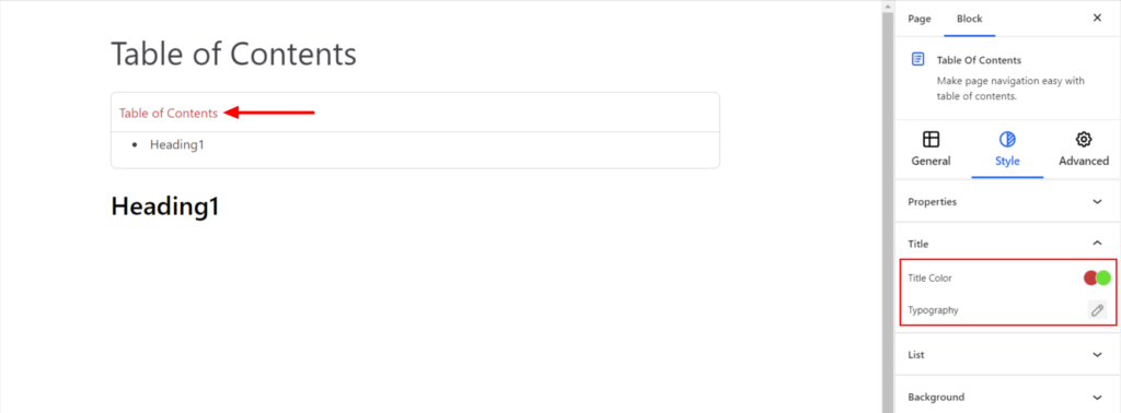
- Title Color – It changes the color of the TOC Title. You can set different colors in Normal and Hover Modes.
- Typography – It controls the TOC Title typography option, such as font family, font size, line spacing, text decoration, etc.
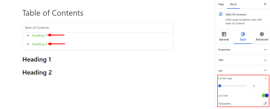
List #
The settings work for the List items of the TOC Block and come with the following options:
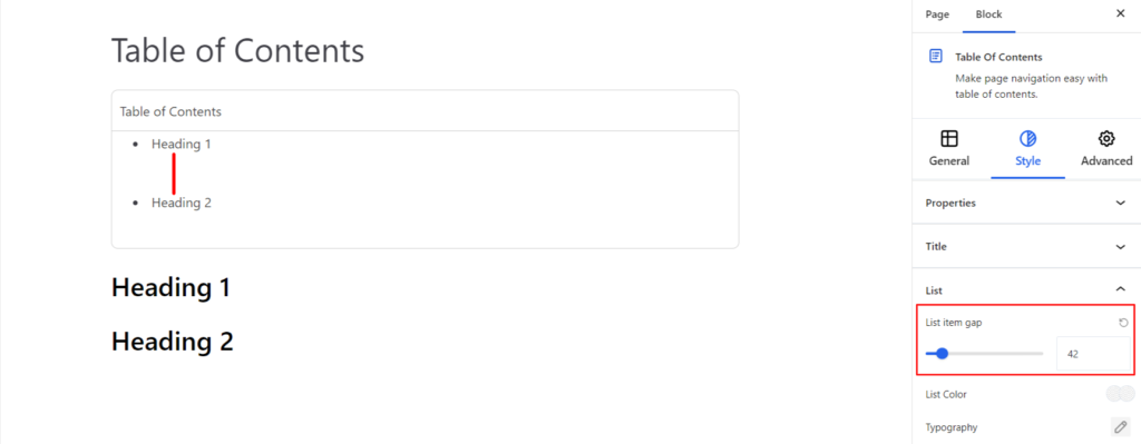
- List Gap – It adjusts the space between two list items/headings.
- List Color – It changes the color of the List items. You can set different colors in Normal and Hover Modes.
- Typography – It controls the List Items typography option, such as font family, font size, line spacing, text decoration, etc.
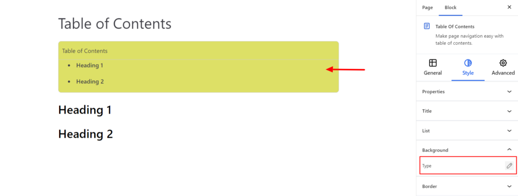
Background #
- Type – It sets the background color of the TOC Block. You can change the visual appearance of the background by changing its color or adding an image. Moreover, you can set different background colors in Normal and Hover Modes.
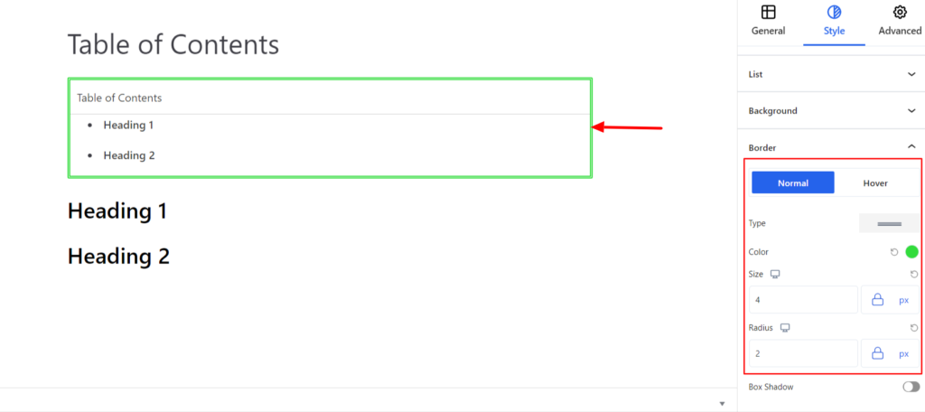
Border #
It customizes the Border area added around the TOC block and comes with the following options:
- Type – You can set the border type as Solid, Dotted, Dashed, Double, etc. Moreover, select the border type to be None if you do not want to add any borders. When you select none, you will be given the following option:
- Radius – It allows you to fix the radius value to make the round corners for the border.
However, if you select the border type to be other than none, two more options will be added. The option is listed below:
- Border Color – It allows you to choose the appropriate border-color.
- Size – It provides the option to select the border size.
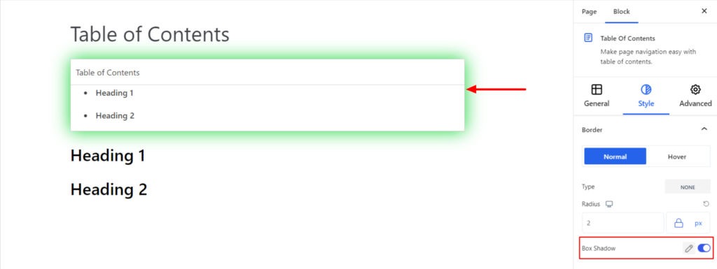
- Box Shadow – When you enable the Box Shadow option, you will get the following customization options:
- Color – It allows you to select the appropriate box-shadow color for the block.
- Horizontal-X – It displays the box shadows in the horizontal position.
- Horizontal-Y – It displays the box shadows in the vertical position.
- Blur – You can set up the blur value of the box shadows appearing.
- Spread – The shadow’s spread value represents the distance to expand or contract a shadow in all directions. You can change the spread value according to the site’s requirements.
- Position – You can set the position of the box shadows as Inset or Outline.
Note – You can apply the border settings option differently for Normal and Hover Modes.
Advanced #
The Advanced section consists of four customization options for the TOC Block.
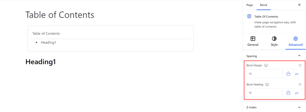
Spacing #
Under the spacing section, you can find the following options available:
- Block Margin – According to the site requirement, you can assign a specific margin value to the block along with units like px, em, %, and rem. Moreover, you can set different margin values for various devices (Desktop, Tablet, and Mobile).
- Block Padding – According to the site requirement, you can assign a specific padding value to the block along with units like px, em, %, and rem. Moreover, you can set different padding values for various devices (Desktop, Tablet, and Mobile).
Z-Index #
It allows you to set the block’s priority according to the site’s requirements.
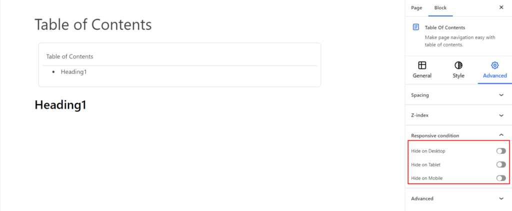
Responsive Condition #
Using the option, you can enable/disable displaying the block on various screen sizes:
- Hide on Desktop – It hides the TOC Block on the Desktop.
- Hide on Tablet – It hides the TOC Block on the Tablet.
- Hide on Mobile – It hides the TOC Block on the Mobile.
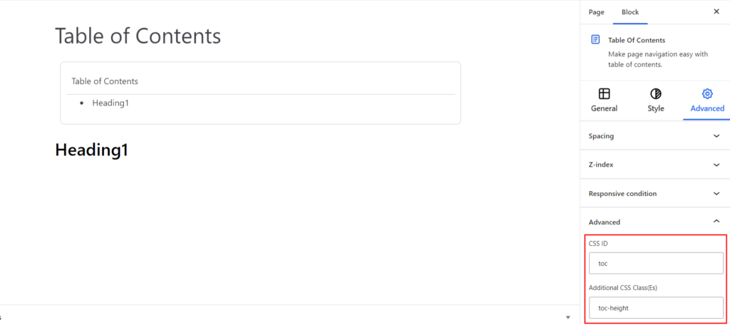
Advanced #
Under the option, you can set the CSS ID and Classes for the TOC Block. The available options are listed below:
- CSS ID – It allows you to set specific IDs to style to the title. Once you have set the ID, you can write the CSS Code to style the title using that particular ID.
- Additional CSS Class(es) – It allows you to add a CSS class to your block and write custom CSS to style the title.