The Heading Block lets you organize your site’s headings and subheadings, introducing new sections and organizing the content on the page. Moreover, it makes the website more readable by humans and search engines.
After you have chosen the Heading block, you’ll get a block editing panel on the right-hand side. It has three options, i.e., General, Style, and Advanced. These options customize the design and other elements of the Heading block. Let’s explore one by one below:
General #
It provides the following customization options for the Heading Block.
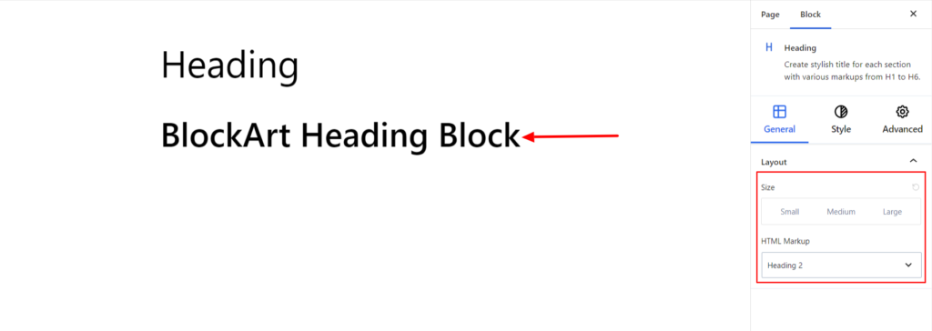
Layout #
- Size – It represents the size of the heading block. You can set the block size to small (S), medium (M), or large (L).
- HTML Markup – Under the Markup option, select the required markup for your heading. You can set your title to be in Heading, Paragraph, or Div.
Style #
It provides the following styling options for the Heading Block. These are listed below:
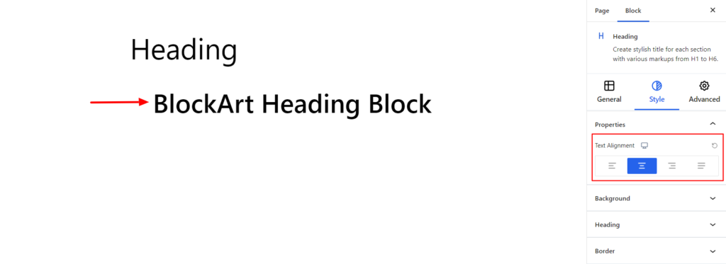
Properties #
- Alignment – It sets the alignment for the Heading Block. You can set the alignments as Left, Center, Right, and Justify. Moreover, you can also set the alignment position on different devices (Desktop, Tablet, and Mobile).
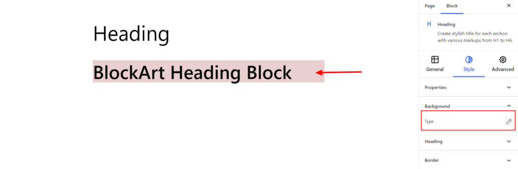
Background #
- Type – It sets the background color of the heading. You can change the visual appearance of the background by changing its color or adding an image. Moreover, you can set the different background colors on Normal and Hover Modes.
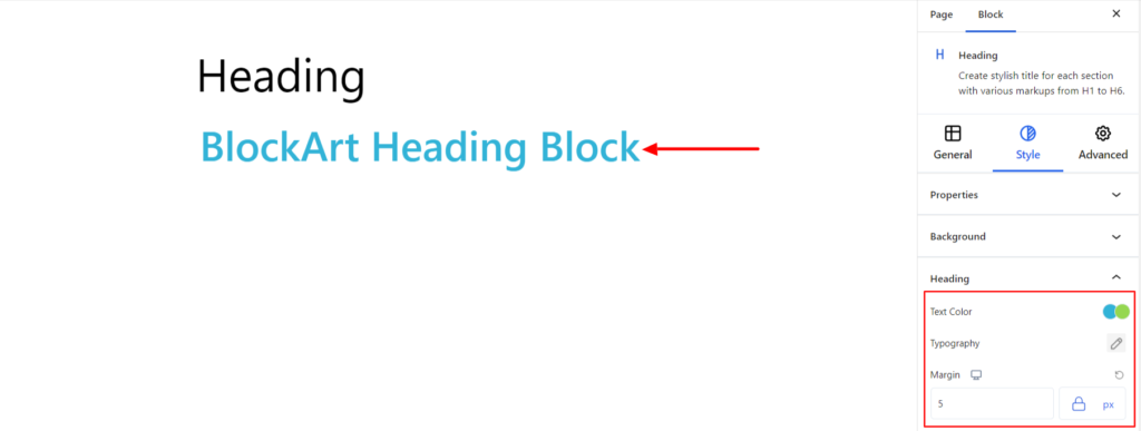
Heading #
- Text Color – It changes the color of the heading block text. You can set different colors on Normal and Hover Modes.
- Typography – It allows you to control the heading text’s typography, such as font family, weight, font size, line height, and other related styling properties. The options are listed below:
- Font Family – The option allows you to choose the appropriate font family for the heading text.
- Weight – It refers to the thickness or boldness of the heading text.
- Size – It controls the font size of the heading text.
- Line Height – It manages the space above and below the heading text.
- Letter Spacing – It controls the amount of space between characters in the heading text.
- Style – Using the property, you can set the heading text to be Italic or Oblique.
- Transformation – It changes the case of the text, such as lowercase, uppercase, and capitalized.
- Decoration – The styling is applied to the heading text to make it more visually appealing. The options include underline, overline, and line through.
- Margin – Using the option, you can set the Margin to all four sides of the heading text, creating spaces in all four areas.
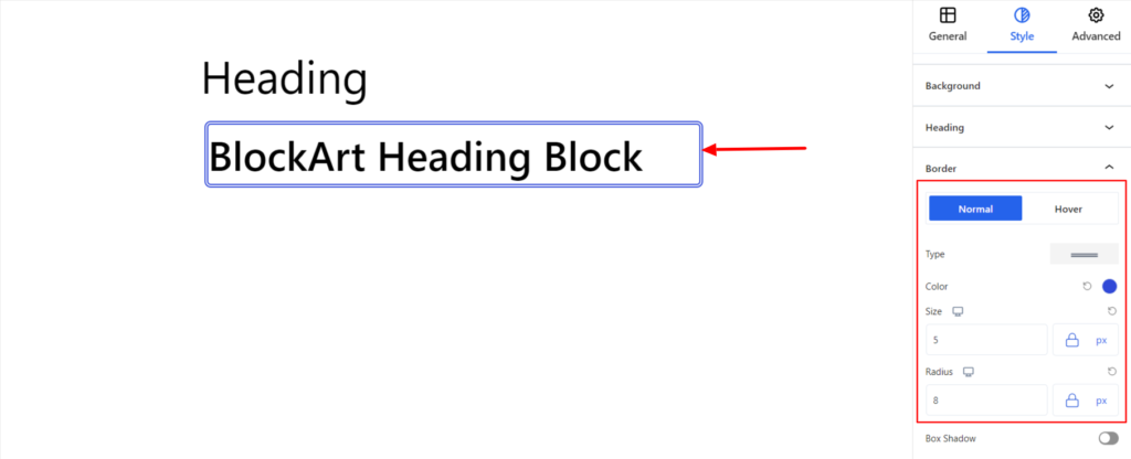
Border #
It customizes the Border area added around the heading block and comes with the following options:
- Type – You can set the border type as Solid, Dotted, Dashed, Double, etc. Moreover, select None if you do not want to add borders.
When you select none, you will be given the following option:
- Radius – It allows you to fix the radius value to make the round corners around the border.
However, if you select the border type to be other than none, two more options will be added. The option is listed below:
- Border Color – It allows you to choose the appropriate border color.
- Size – It provides the option to choose the border size.
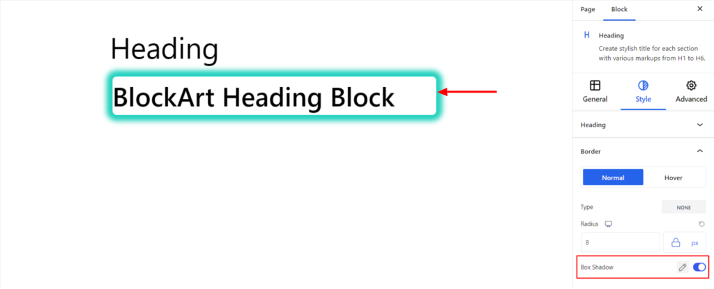
- Box Shadow – When you enable the Box Shadow option, you will get the following customization options:
- Color – It allows you to select the appropriate box-shadow color for the heading block.
- Horizontal-X – It displays the box shadows in the horizontal position.
- Horizontal-Y – It displays the box shadows in the vertical position.
- Blur – You can set up the blur value of the box shadows appearing.
- Spread – The shadow’s spread value represents the distance to expand or contract a shadow in all directions. You can change the spread value according to the site’s requirements.
- Position – You can set the position of the box shadows as Inset or Outline.
Note – You can apply the border settings option differently for Normal and Hover Modes.
Advanced #
The Advanced section consists of four customization options for the Heading Block.
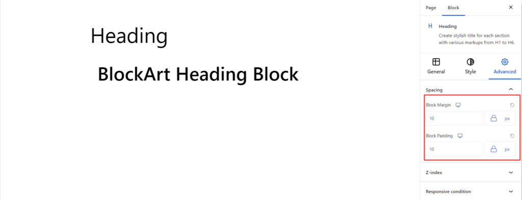
Spacing #
Under the spacing section, you can find the following options available:
- Block Margin – According to the site requirement, you can assign a specific margin value to the block along with units like px, em, %, and rem. Moreover, you can set different margin values for various devices (Desktop, Tablet, and Mobile).
- Block Padding – According to the site requirement, you can assign a specific padding value to the block along with units like px, em, %, and rem. Moreover, you can set different padding values for various devices (Desktop, Tablet, and Mobile).
Z-Index #
It allows you to set the priority of the heading block according to the site requirement.
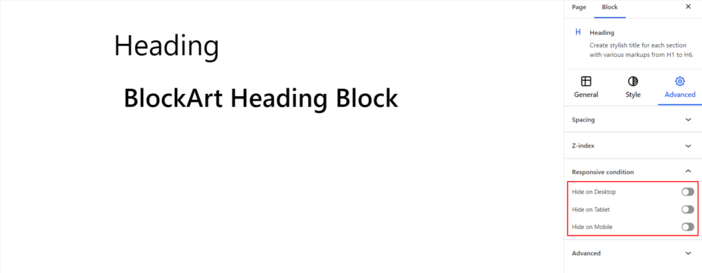
Responsive Condition #
Using the option, you can enable/disable displaying the block on various screen sizes:
- Hide on Desktop – It hides the Heading block on the Desktop.
- Hide on Tablet – It hides the Heading block on the Tablet.
- Hide on Mobile – It hides the Heading block on Mobile.
Advanced #
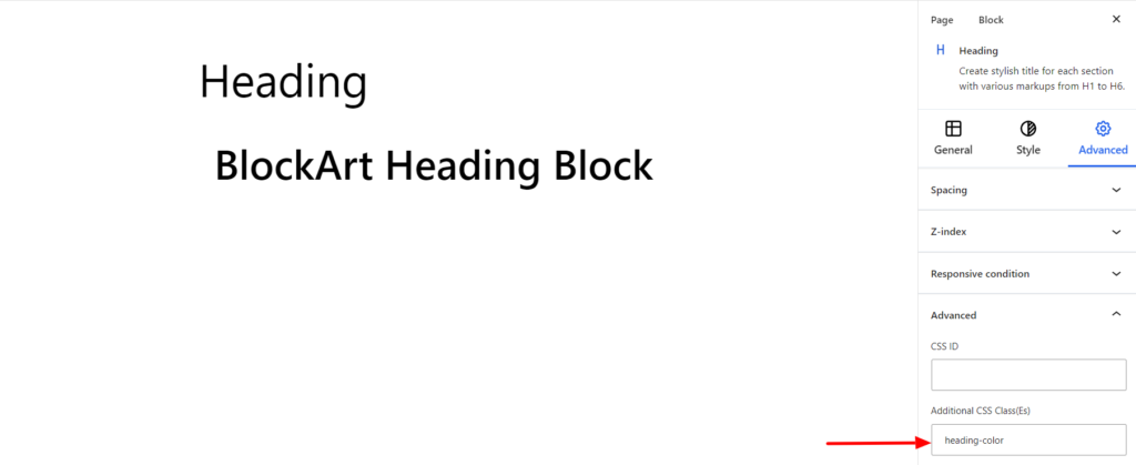
Under the option, you can set the CSS ID and Classes for this particular Heading block. The available options are listed below:
- CSS ID – It allows you to set specific IDs to style this particular block. Once you have set the ID, you can write the CSS Code to style the block using that particular ID.
- Additional CSS Class(es) – It allows you to add a CSS class to your block and write custom CSS to style this particular block.
For e.g., There might be two heading blocks on a page, and you want to make some changes to one but leave another untouched. In this case, you can define the CSS classes for the one heading block you want to make changes to.
Moreover, you can add more than one class separately by commas.
For example, if you want to change the heading color of the heading block, you can add the class heading-color under the Additional CSS Class field. After that, visit your CSS editor and write a style for the class as below:
h2.heading-color{
color:#000000;
}
Adding the code will change only this particular Heading block.