The Testimonial block allows you to share the customer/client feedback, which explains how they have benefited from your product or services. The block adds social proof by letting your site visitors know what other people say about you.
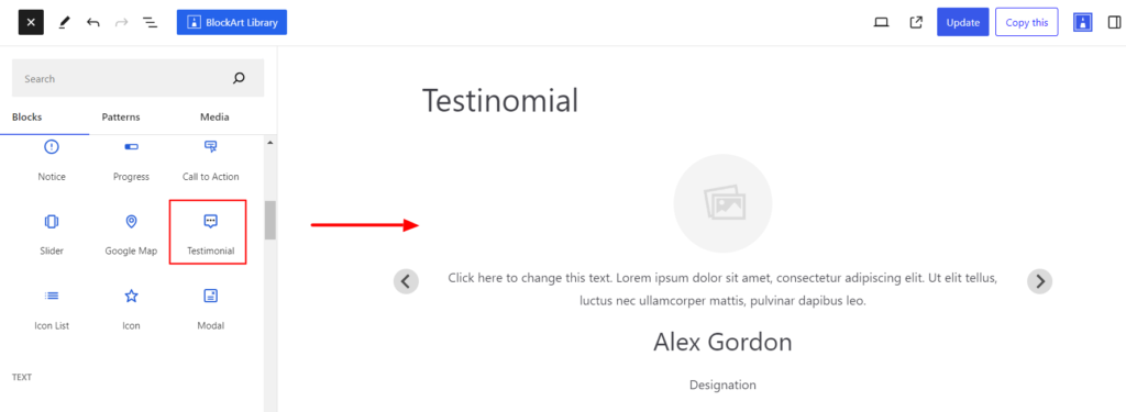
After you have chosen the Testimonial block, you’ll get a block editing panel on the right-hand side. It has three options, i.e., General, Style, and Advanced. These options customize the design and other elements of the Testimonial block. Let’s explore one by one below:
General #
General #
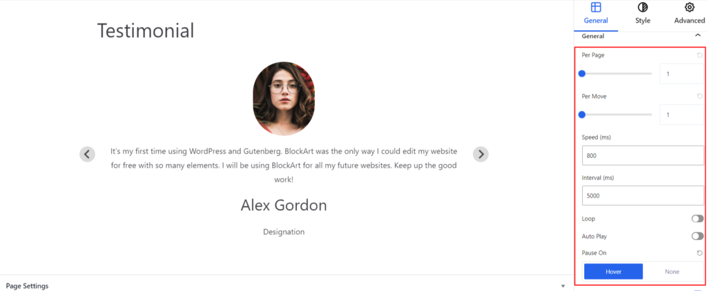
- Per Page – It determines the number of testimonials you want to display on a page.
- Per Move – It determines the number of testimonials changed during the slide.
- Speed – It refers to how quickly the slides transition from one to another. If you add a higher slider value, the slides change slowly, and if you add a lower slider value, the slides change quickly.
- Interval – It determines the time interval between each slide translation or how long each slide is visible before the next one appears.
- Loop – Enabling the loop creates a continuous slideshow experience. Once the slider reaches the end, it automatically starts from the first slide.
- AutoPlay – It automatically translates the slide from one to another without the need for any user to manually navigate through them.
- Pause On – The option pauses the testimonial slide when hovering the cursor over the slider if you choose the Hover option.
- Arrows – Enabling the arrow displays the icons (left and right) that help manually move the slider forward and backward.
- Pagination – It adds dot icons to the slider area that indicate the current testimonial position and the number of total testimonials.
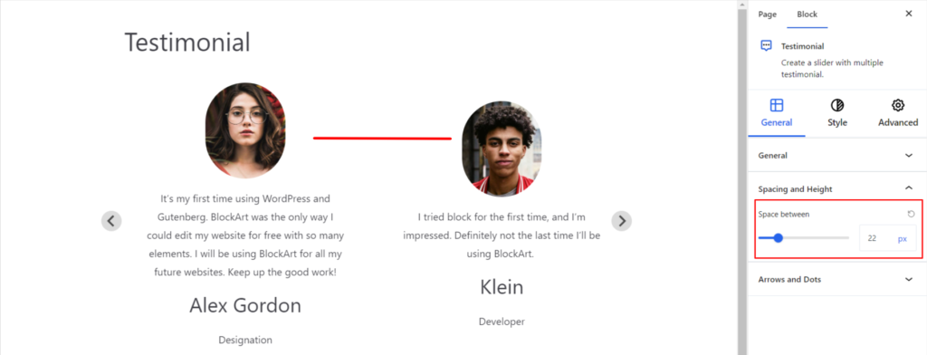
Spacing and Height #
- Space Between – It determines the space between two testimonials.
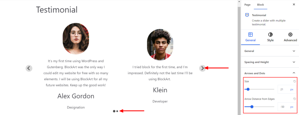
Arrow and Dots #
It styles the arrow and dot icons appearing over the slider image and comes up with the following options:
- Size – It determines the size of the arrow icon.
- Arrow Distance from Edges – It determines the space between the arrow and testinomial edge.
Style #
It provides the following styling options for the Testimonial Block. These are listed below:
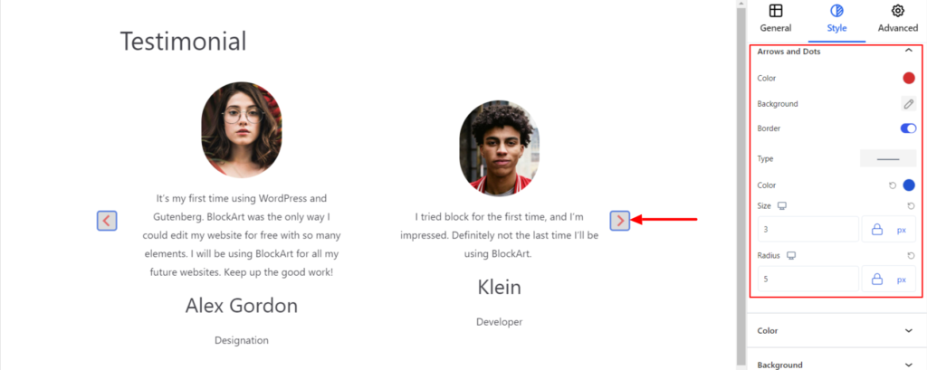
Arrows and Dots #
- Color – It allows you to change the color of the Arrow and Dots icon added to the Testimonial block.
- Background – It sets the background color and image of the arrow and dots.
- Border – It customizes the Border area added around the arrow and comes with the following options:
- Type – You can set the border type as Solid, Dotted, Dashed, Double, etc. Moreover, select the border type to be None if you do not want to add any borders. When you select none, you will be given the following option:
- Radius – It allows you to fix the radius value to make the round corners for the border.
However, if you select the border type to be other than none, two more options will be added. The option is listed below:
- Border Color – It allows you to choose the appropriate border color.
- Size – It provides the option to select the border size.
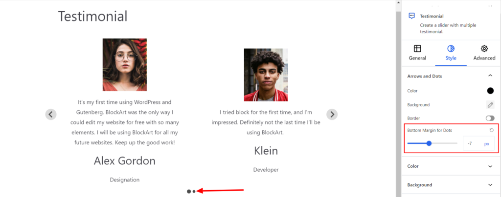
- Bottom Margins for Dots – It manages the dot’s margin-bottom value.
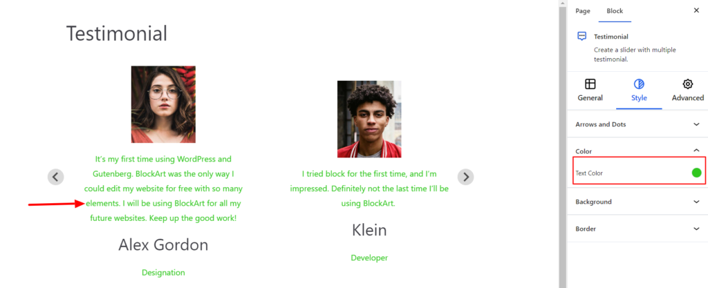
Color #
- Text Color – It allows you to change the color of the Testimonial text.
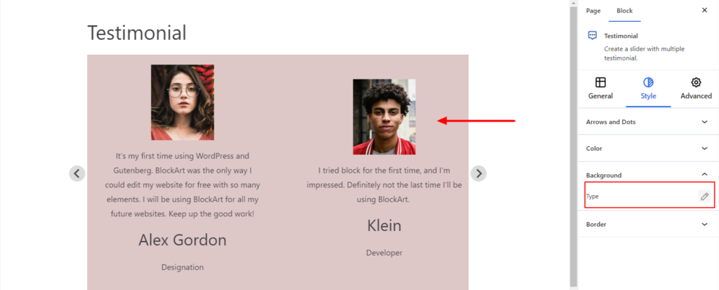
Background #
- Type – It sets the background color of the Testimonial. You can change the visual appearance of the background by changing its color or adding an image.
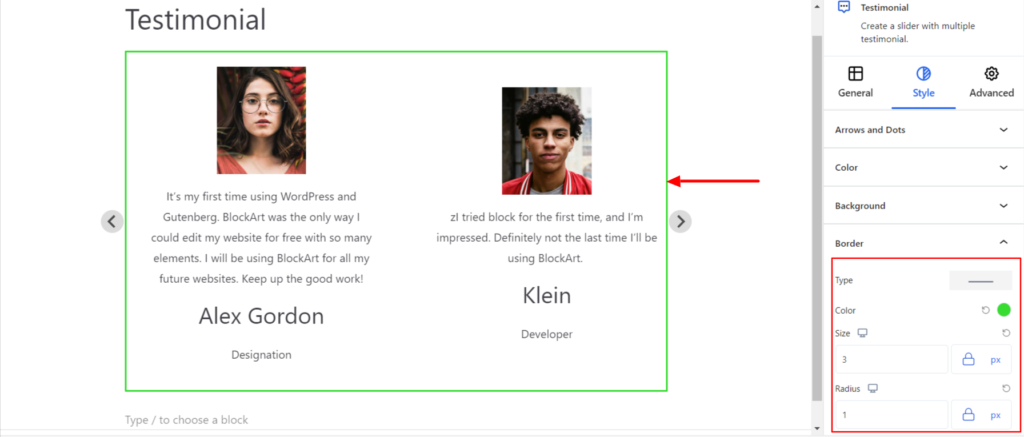
Border #
It customizes the Border area added around the testimonial block and comes with the following options:
- Type – You can set the border type as Solid, Dotted, Dashed, Double, etc. Moreover, select the border type to be None if you do not want to add any borders for the section block. When you select none, you will be given the following option:
- Radius – It allows you to fix the radius value to make the round corners for the border.
However, if you select the border type to be other than none, two more options will be added. The option is listed below:
- Border Color – It allows you to choose the appropriate border color.
- Size – It provides the option to select the border size.
Advanced #
The Advanced section consists of four options for the Testimonial block.
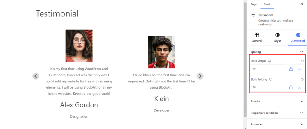
Spacing #
Under the spacing section, you can find the following options available:
- Block Margin – According to the site requirement, you can assign a specific margin value to the block along with units like px, em, %, and rem. Moreover, you can set the value of the different margins for various devices (Desktop, Tablet, and Mobile).
- Block Padding – According to the site requirement, you can assign a specific padding value to the block along with units like px, em, %, and rem. Moreover, you can set the different padding values for various devices (Desktop, Tablet, and Mobile).
Z-Index #
It allows you to set the priority of the Testimonial block according to the site requirement.
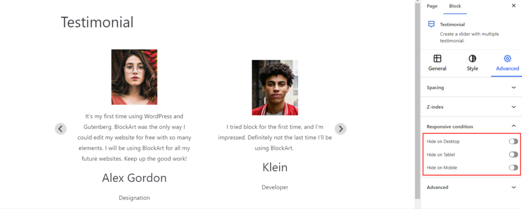
Responsive Condition #
Using the option, you can enable/disable displaying the block on various screen sizes:
- Hide on Desktop – It hides the Testimonial block on the Desktop.
- Hide on Tablet – It hides the Testimonial block on the Tablet.
- Hide on Mobile – It hides the Testimonial block on the Mobile.
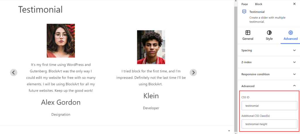
Advanced #
Under the option, you can set the CSS ID and Classes for this particular Testimonial block. The available options are listed below:
- CSS ID – It allows you to set specific IDs to style this particular block. Once you have set the ID, you can write the CSS Code to style the block using that particular ID.
- Additional CSS Class(es) – It allows you to add a CSS class to your block and write custom CSS to style this particular block.
After creating the separate ID and Classes, visit your CSS editor and write a style for the ID and class.