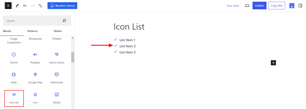
The Icon List block allows you to create a list using different icons. It replaces the bullet and number list with different fontawesome icons.
After you have chosen the Icon List Block, you’ll get a block editing panel on the right-hand side. It has three options: General, Style, and Advanced. These options customize the design and other elements of the block. Let’s explore one by one below:
General #
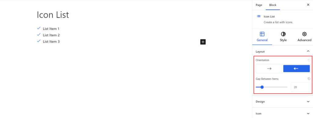
Layout #
- Orientation – It allows displaying the list of items horizontally or vertically.
- Gap Between Items – It determines the space between each list of items.
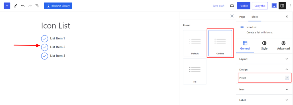
Design #
- Preset – It refers to the predefined styles of the icons, which include Fill, Outline, etc.
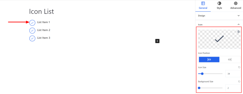
Icon #
- Icon – Choose the appropriate Icon on your end. You can choose the appropriate icons from the list available.
- Icon Position – It displays the icon before or after the label.
- Icon Size – It determines the size of the icon.
- Background Size – It determines the background size of the icon.
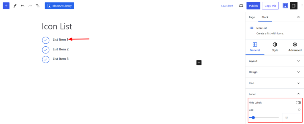
Label #
- Hide – Enabling the option hides the icon label.
- Gap – It determines the gap between the icon and the label.
Style #
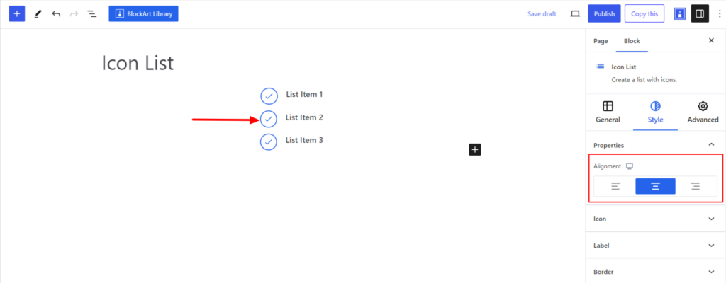
Properties #
- Alignment – It sets the block’s position to the Left, Center, and Right. Moreover, you can set the position to be different on various devices (Desktop, Tablet, and Mobile).
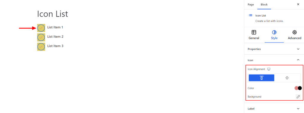
Icon #
- Icon Alignment – It allows the icon position to be slightly above or aligned with the label.
- Color – It allows you to set up the color of the Icons in Normal and Hover Modes.
- Background – It sets the background color for the icons. You can change the visual appearance of the background by changing its color. Moreover, you can set different colors for the background in the Normal and Hover modes.
Label #
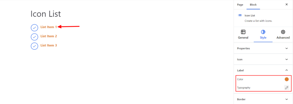
- Color – It allows you to change the Label Text color.
- Typography – It allows you to control the Label Text Typography, such as font family, weight, font size, line height, and other related styling properties. The options are listed below:
- Font Family – The option allows you to choose the appropriate Font Family for the label text.
- Weight – It refers to the thickness or boldness of the label text.
- Size – It controls the font size of the label text.
- Line Height – It manages the space above and below the label text.
- Letter Spacing – It controls the amount of space between characters in the label text.
- Style – Using the property, you can set the post title to be Italic or Oblique.
- Transformation – It changes the case of the text, such as lowercase, uppercase, and capitalize.
- Decoration – The styling is applied to the label text to make it more visually appealing. The options include underline, overline, and line through.
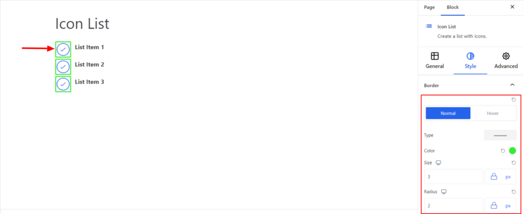
Border #
It customizes the Border area added around the Icon and comes with the following options:
- Type – You can set the border type as Solid, Dotted, Dashed, Double, etc. Moreover, select the border type to be None if you do not want to add borders for icons.
When you select none, you will be given the following option:
- Radius – It allows you to fix the radius value to make the round corners for the border.
However, if you select the border type to be other than none, two more options will be added. The option is listed below:
- Border Color – It allows you to choose the appropriate color for the border.
- Size – It provides the option to select the border size.
Note – You can apply the border settings option differently for Normal and Hover Modes.
Advanced #
The Advanced section consists of four options for the Icons List block.
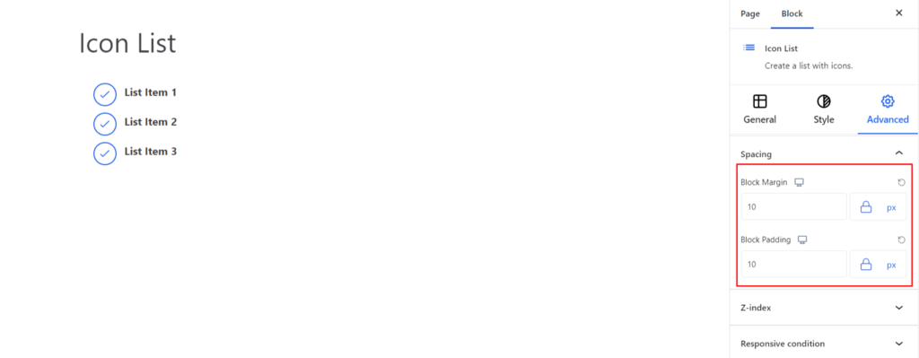
Spacing #
Under the spacing section, you can find the following options available:
- Block Margin – According to the site requirement, you can assign a specific margin value to the block along with units like px, em, %, and rem. Moreover, you can set the value of the different margins for various devices (Desktop, Tablet, and Mobile).
- Block Padding – According to the site requirement, you can assign a specific padding value to the block along with units like px, em, %, and rem. Moreover, you can set the value of the different padding for various devices (Desktop, Tablet, and Mobile).
Z-Index #
It allows you to set the priority of the Icon List block according to the site requirement.
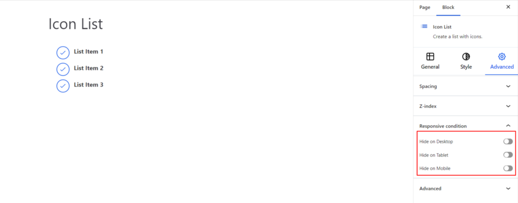
Responsive Condition #
Using the option, you can enable/disable displaying the block on various screen sizes:
- Hide on Desktop – It hides the Icon List block on the Desktop.
- Hide on Tablet – It hides the Icon List block on the Tablet.
- Hide on Mobile – It hides the Icon List block on the Mobile.
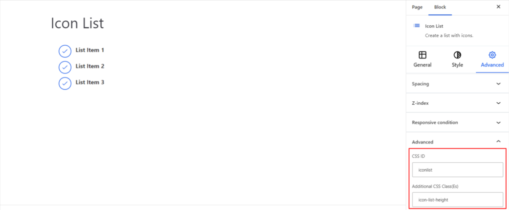
Advanced #
Under the option, you can set the CSS ID and Classes for this particular Icon List block. The available options are listed below:
- CSS ID – It allows you to set specific IDs to style this particular block. Once you have set the ID, you can write the CSS Code to style the block using that particular ID.
- Additional CSS Class(es) – It allows you to add a CSS class to your block and write custom CSS to style this particular block.
After creating the separate ID and Classes, visit your CSS editor and write a style for the ID and class.


